Brand recognition and interior decorating ideas association influences the market and the buying public.
Shopping in retail, grocery, electronics, big box, dollar and home improvement stores for the items that keep the all things house that make a home process up, running and connected is what you make out of it.
Some love the thrill of the shop, search and source while others find the process about us much fun as spending the day in the dentist chair getting a root canal.
My approach and attitude toward this necessary ritual is rooted, no pun intended, in the glass half full it’s what you make of it attitude.

I have a resourceful tool of spin I use when the aisles begin to close in- a friendly game of brand recognition and the interior decorating ideas association.
I am not endorsing or granting preferential product treatment or mention, but it’s not hard to connect the dots.
This is simply a shared exercise that serves as just another source of inspiration for incorporating beauty, color and style into the day.
![]() The Quaker Oats Company
The Quaker Oats Company
The stately portrait of the white haired gentleman framed in attire and colors befitting the home of the red, white and blue is the brand hallmark of a classic breakfast cereal.
This famous logo never fails to bring to mind the Federal era, American antiques and star spangled decor.
Well, hello!
Talk about gorgeous on a most colorful scale.
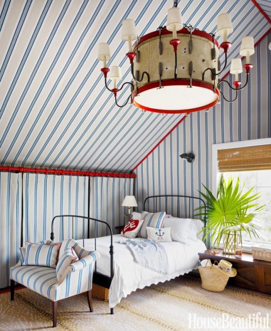
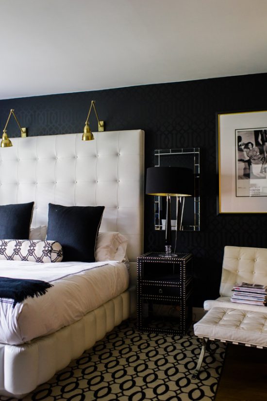
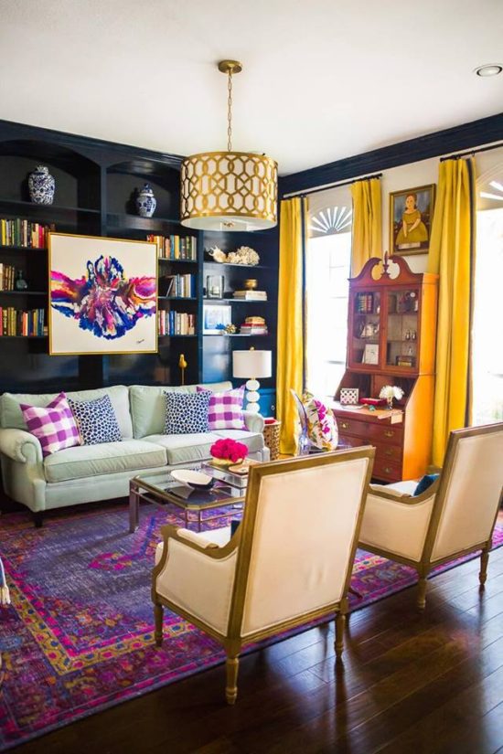 House Beautiful
Going boldly with bold color, furnishings in unique form and placement, and pattern play perfection are design and decor treatments that will have people talking.
 Black and White Marble
Black and white and basic.
Or is it?
Twenty odd years ago a major grocery chain in our area introduced a line of generic brand products packaged in no-frill black and white packaging.
I mean this packaging was straightforward and to the point with white being the predominate color choice accompanied by plain text black lettering.
One would think the plain, ordinary, lackluster, non-descriptive packaging would have faded into shelf obscurity, but not in this case.
The complete opposite effect took place, and the basic packaging stood out above all the others.
Why?
I can only venture a guess, but I think as eye catching as colorful and bold packaging can be, it served as a frame to draw the eye and attention to the generic brand and away from all others.
 The Glitter Guide
Visually commanding focal points are not decoratively exclusive to interior design and home decor accents.
The generic brand packaging successfully caught the eye in spite of the basic branding.
Less is more proved brilliant in this case.
Connecting the dots to decorating yet?
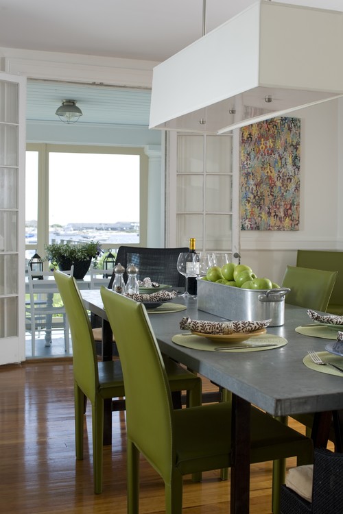
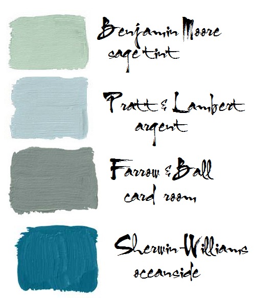
It is amazing how many brands utilize the color combination green and blue in product packaging.
I’m beginning to catch on to the genius behind this clever marketing choice.
It’s hard to deny the power of this color combination and the association of it to the calm and cool coastal waters of Any Beach, USA.
From sea to salad, tranquility sells, sales and sails!
The next time you are shopping, searching and sourcing, remember this decorating exercise in brand recognition and interior decorating ideas association.
Inspiration is everywhere!