The popularity of inspiring gray rooms proves the color crush on this interior design and decorating darling is stronger than ever.
Rooms vs. spaces.
What say you?
Jessica Helgerson Interior Design
There’s been no break-up with or we’re done color revelation. In fact, most of us asked gray to move in and stay awhile.
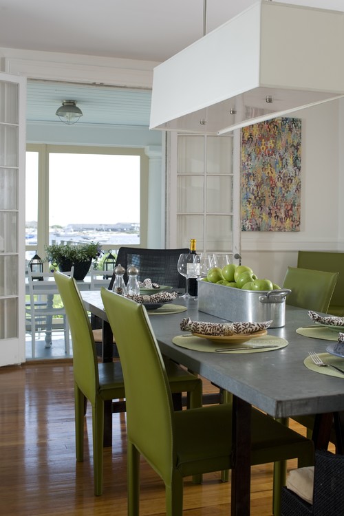
Gray is experiencing quite the color your world love affair with many a living room, bedroom and kitchen.
Design and decorating relationships between a proven color base of space and go-to neutral is color palette perfection; one that beautifully creates flawless and inspiring gray rooms.

“The tones of gray, pale turquoise and pink will prevail.”
-Christian Dior
Neutral colors are no longer being thought of as dull, boring or unimaginative home decorating, accents, paint and furnishings options.
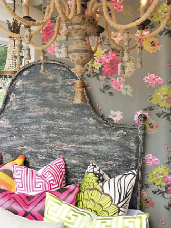
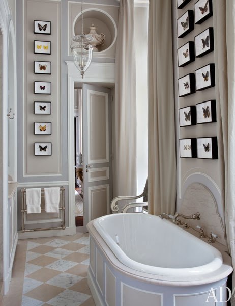
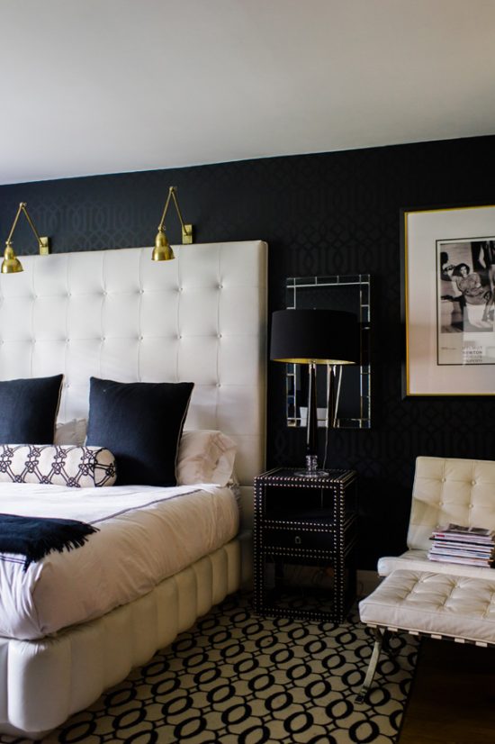
As seen in the image above, gray is a strong neutral- a formidable color that refuses to simply fade away into the background of the wallpaper, chandelier patina, or the headboard.
Tones subtlety take control, guiding the eye to the prevalent and pronounced color pops.
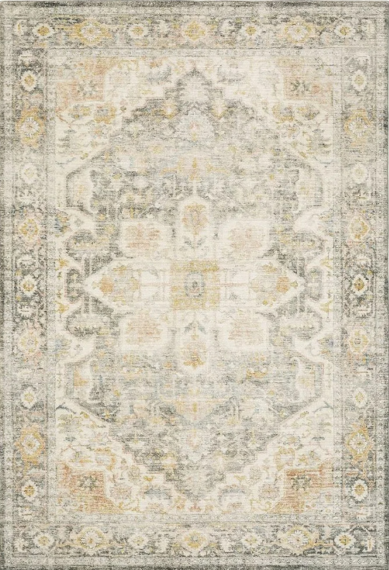
Traditional Oriental Area Rug Grey
Colors and patterns play so well together on this stylish playground.
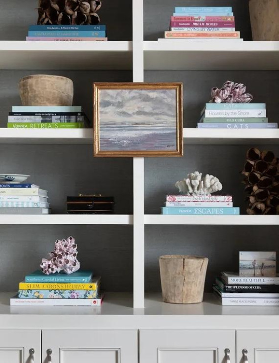
As the color foundation of the space, gray does not overpower nor underwhelm. It this case, however, the different shades do command attention to detail.

Recognized in design circles as a space changing tour de force, a gray color palette exhibits the decorative power trio we all look for in design and decorative execution- drama, elegance and style.
Accent colors take to the depth gray offers, proving its impressive ability for enhancing color and creating flawless gray areas.
It is quite an amazing and appreciated foundation shade.

A-Street Prints Carriage House Wood Wallpaper -Gray
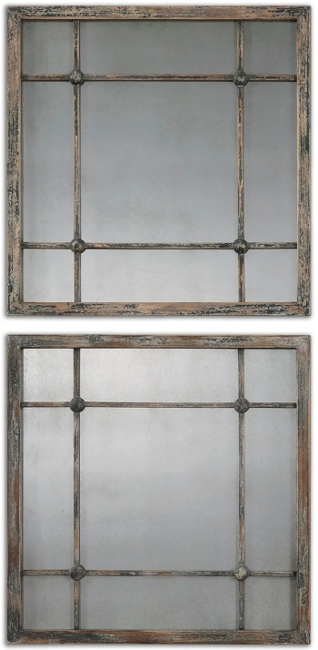
Uttermost Saragano Slate Blue Square Mirrors (Set of 2)
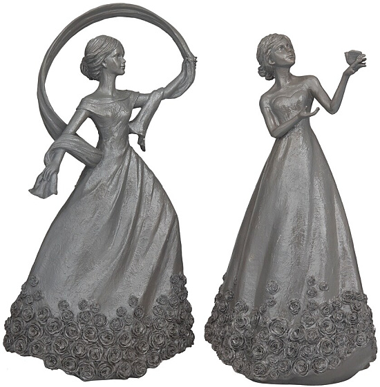
Grey Resin Traditional Sculpture (Set of 2)
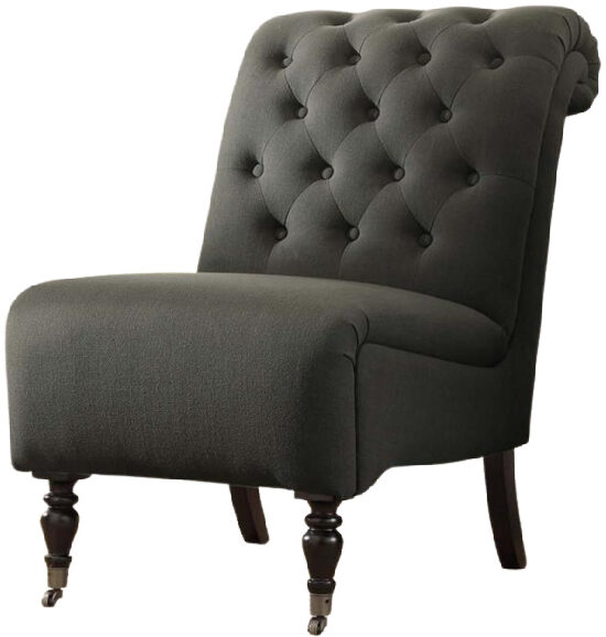
Linon Cora Roll Back Tufted Chair
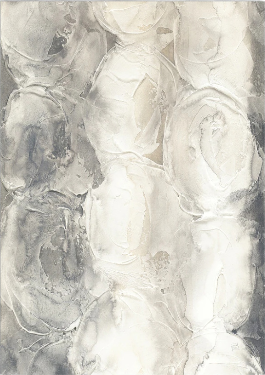
Gray Circles Premium Canvas Wall Art
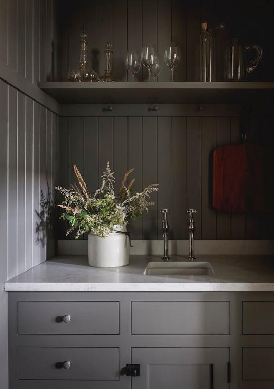
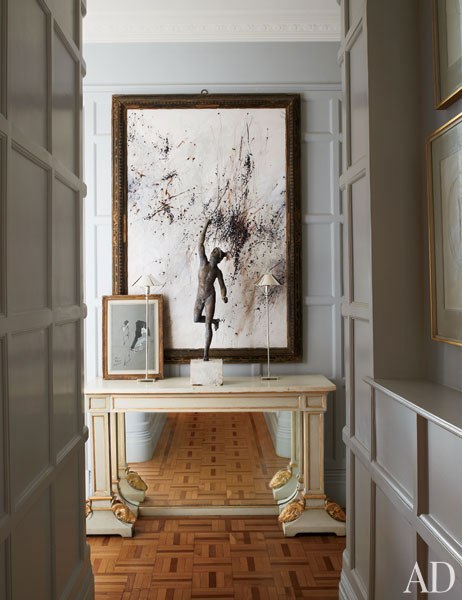
Gray is a stunning neutral, a color that has come into its own as both an elegant anchor and palette powerhouse.

Complementing shades of gray frames the walls, marble floors and millwork as an interior design work of art.
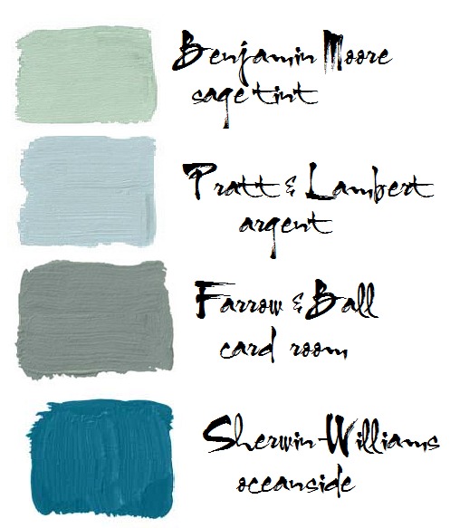
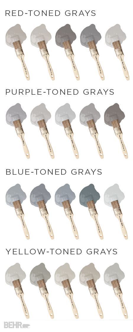
Nine impressive shades of gray from Benjamin Moore paints proving as the base or simply as the focal accent color, gray is color capable.
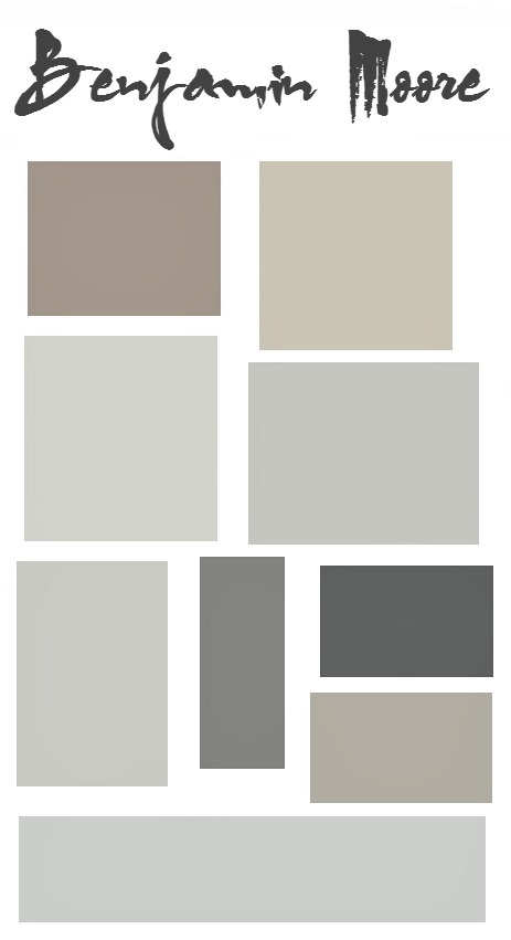
Ashley Gray || Revere Pewter || Gray Owl || Silver Chain || Stonington Gray || City Shadow || Street Chic || Smoke & Mirrors || Perspective
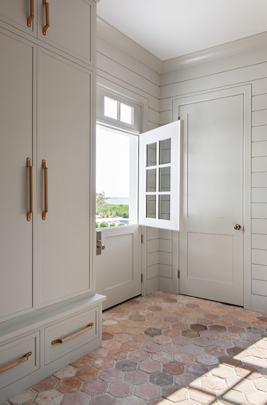
If that’s not reason enough to consider incorporating the color gray in your décor take a look at the gorgeous image below.
Shades of gray, when paired with elegant accents in think outside the matchy-matchy box contrasting colors, give the space its personality and command a sublime reaction.


 House Beautiful
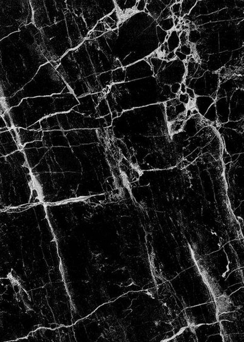 Black and White Marble
 The Glitter Guide