Matching paint colors to our favorite collections and collectibles is one way to carry out a personal treasure theme.
 Game Shop Utopia
When a client, friend or family member enlist my services in the color selection process, it often begins like a Kohler faucet commercial.
I am shown an item and asked to design or decorate around the color(s) of the collection.
Let the match game matching paint colors magic begin!

I’ve been introduced to new blogs this week via fall/autumn link parties, with one particular fall mantel display immediately captured my attention.
The author used pieces of blue and white French china from her personal collection.
Another blog showed how a beautiful collection of leather books influenced the color scheme of a space.
Decorating inspiration comes from many different influences.
I realized I am among those who have been, and will continue to be, influenced by items they collect or hope to start collecting.
I also thought it might be informative to play a round or two of Match Game: matching paint colors to items known to be collected for future decorative reference.
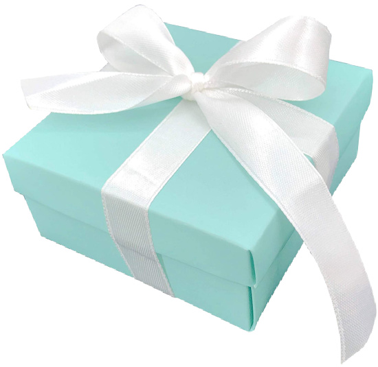
Probably one of the most recognizable colors in the world, iconic Tiffany Blue® was the referenced example used time and time again when selecting the paint color for our bedroom.
Sweet Rhapsody by Behr is close, close, close.

Little Blue Box by Sherwin Williams is my second choice.

Gone With The Wind remains one of the most watched and loved Hollywood classics of all time.
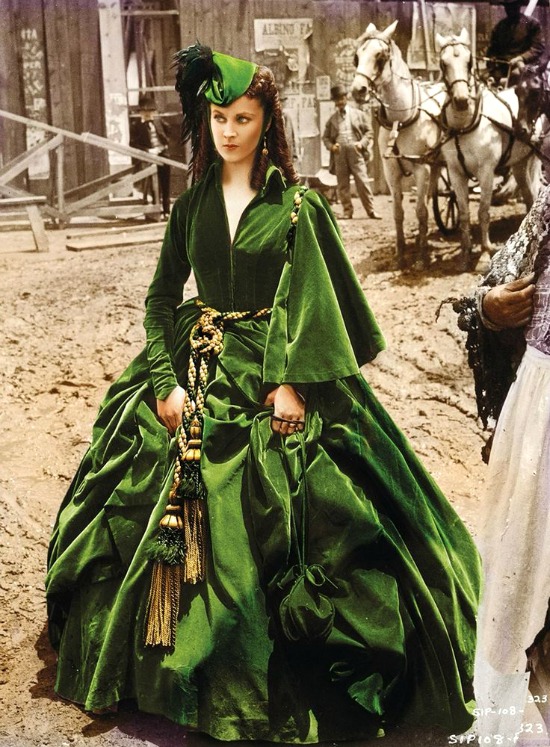
I fell in love with the movie when I was six years old, and it still comes in as an all-time favorite.

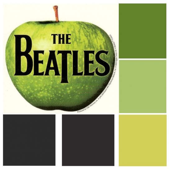
Vegas Green – Valspar
Mecca Gold – Olympic
Offbeat Green – Sherwin Williams
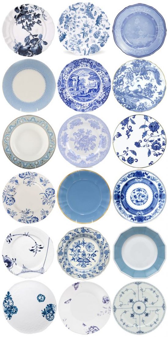
Blue & white porcelain and pottery collections are both popular and stylish.
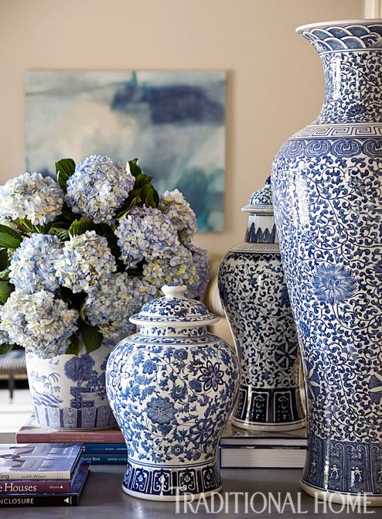
Traditional blue and white wares of Chinese, English and Italian origin merge well with modern patterns to create beautiful displays.
The varied shades of blue play well off of each other and the result is a visual treat.
 Pinterest
 Olympic
Blueberry Buckle || Rainbow Bright || Annapolis Blue || Stunning Sapphire

Benjamin Moore
Prussian Blue || Blue Suede Shoes || Delphinium || Stratford Blue

Sherwin-Williams
Loyal Blue || Georgian Bay || Commodore
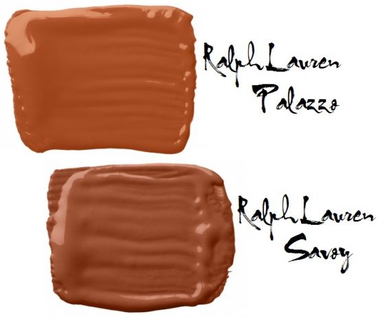
Staffordshire dogs are highly collectible ceramic items.
Dating back to the 1700’s, Staffordshire figurines were made in pottery companies located in the County of Staffordshire, England.
Authentic Staffordshire figurines are rare beauties with proper and notable markings.
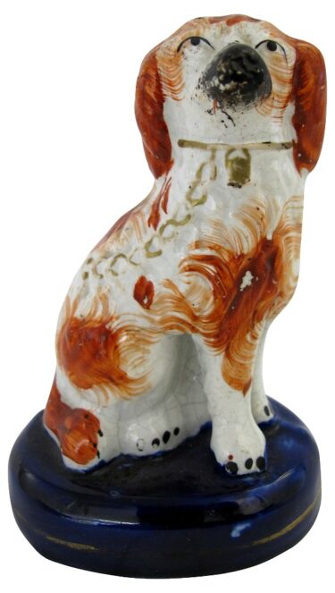 Antique Staffordshire King Charles Spaniel dog
Vintage Staffordshire dog figurines can be valued in the hundreds of dollars.
Staffordshire inspired reproductions or in the style off knock-offs are less expensive copies, making ownership more affordable.
I’ve come to love authentic Staffordshire spaniel figurines, and some of the better quality reproduced Staffordshire dog figurines.

Old Navy – Benjamin Moore
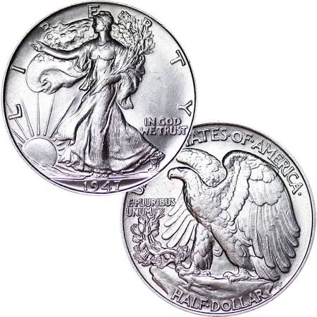
Coins come in as one of the top ranked collectibles.
Years ago when my parents were big time Vegas visitors, my mother would bring back silver fifty cent pieces as souvenirs.
 Great American Coin Company
My fascination with the metallic paints began right then and there.
The fifty cent pieces are long gone and spent, but I’m rich in my love of the colors silver and copper.

French Silver – Behr
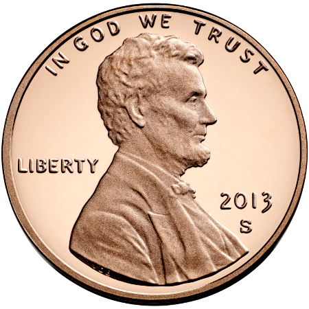
 Maple Glaze – Behr
This iconic example speaks for itself.
Sherwin-Williams
Tricorn Black || Caviar || Paradise || Overt Green || Nervy Hue
It’s no surprise that matching paint colors to collections resonates with the decorating choices made by collectors.