Reflecting back on 2013 and looking forward to things to come in 2014 takes center stage for a whole lot of people at this time of year.
Once I weed through the resolution staples- lose weight, get organized, get healthy- I get down to the business of business that is decorating.
With decorating comes hours of sourcing, viewing and discovering interiors.
Commercial complexes, residential homes, restaurants, lounges, chain and luxury hotels- I’ve never met an interior I didn’t appreciate.
The common denominator of design swoon and decorative admiration becomes more clear with each and every image.
Fearless and fabulous color excites the eye, races the heart and commands attention.
Isn’t that the idea?

If we insist on beauty and style and in our homes, why not factor that in when we select places and spaces to celebrate a special occasion?
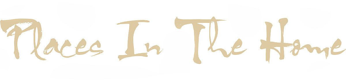
 Wynn Las Vegas- photo by Barbara Kraft
Color is at the core of detail.
Color excites, enhances and engages diners, travelers and celebrators. I
t is a measured ingredient, sometimes in appropriate hit you over the head excess, sometimes in take you by surprise I didn’t realize I like that color discovery.
My personal measure of fearless and fabulous color done right is when the balancing act of hue, tone and saturation come together to engage the eye in real time without sensory intrusion, but makes it’s biggest impact in memorable afterthought.
That’s a color your world impression, and isn’t that the idea?
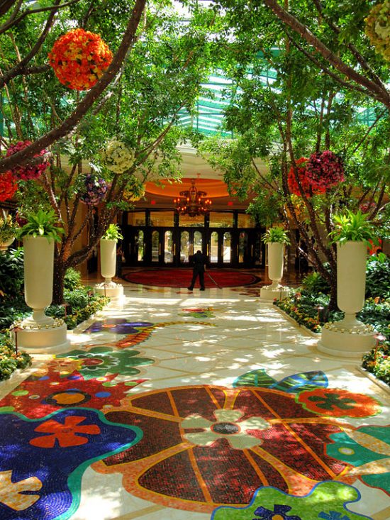
 Wynn Las Vegas
Dave the Builder and I had the pleasure of staying at Wynn and Encore Las Vegas for our 25th anniversary.
The celebration and importance of the milestone could not have been better framed for a more memorable experience than by the impressive design and decor attributes richly bathed in color.

The vision, creation and execution of these memorable and notable interiors begin with Roger Thomas, Executive Vice President of Design for Wynn Design and Development.
 Roger Thomas ~ Home Accents Today
There is absolutely nothing common about the design and decor details of the common areas.
I do like and appreciate the tone down of color in the guest rooms.
At home or on the holiday road, decompressing and relaxing is so much easier when a space is done in a tasteful, tranquil palette.
In the case of Wynn and Encore, the serene Californicated neutrality reserved for the guest rooms is a well thought out color application.

Switching gears and geographical locations to further the point is the fabulous guest rooms of the SLS Hotel South Beach.
 Philippe Starck
Architect and designer Philippe Starck brilliantly succeeds in pairing quintessential South Beach elegance with French influences that fascinate the eye and relaxes the soul.
Let me ask you this:
How long did it take to draw your eye straight to the pink accent pillow?
There are times when just a blush touch of color is all it takes.
Stark (no pun intended) white with a fearless hint or fabulous from floor to ceiling saturation – fearless and fabulous color has the will and the power to influence, inspire and impress.
Isn’t that the idea?
