This week’s Fetching Friday features signature design and decor interpretation, fashionable words, a perfect blend of antiques and modern, a summer settee, a full on fall preview, and a question for you all.
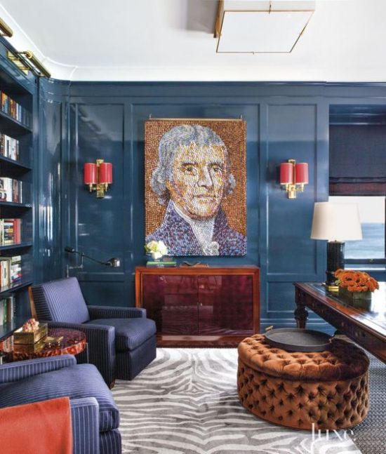
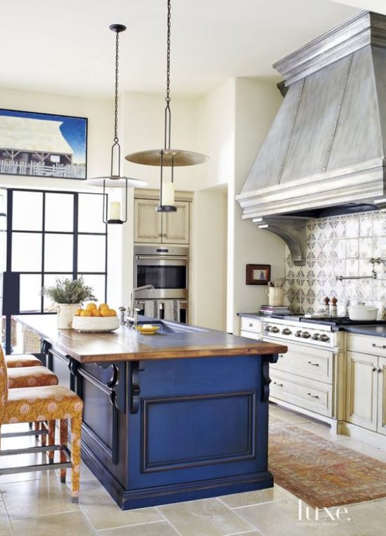
As illustrated in the Domino magazine feature “High Style Made Easy”, Interior designer Mary McDonald captures decorating lightening in a bottle in this office kitchen with her signature bold design choices.
Decorating in a straightforward fashion strictly based on the function and purpose of the space does not always a statement make.
Doesn’t this office/workspace with its playing it not so safe accents and accessories pop a bit more than a conventional just get the job done look?
The pairing, mixing and blending of antiques with modern and contemporary style elements is a decorative endeavor I highly recommend trying.
Nothing ventured, nothing gained.
Style at Home
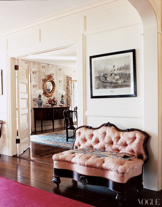
A Marina Rust, Penobscot Bay, Maine summer home and a pink settee seasonally in Vogue.
The already overloaded Excursion and U-Haul ( it was very normal for us to pick, hunt and buy enough treasures, trinkets and trash to warrant renting a u-Haul).
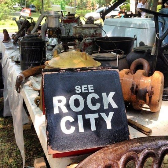
Have any of you ever been to The World’s Largest Yard Sale?
Please share!
I love this pic from Authentica Classics on Facebook.
Discovered Treasures – World’s Longest Yard Sale via Authentica Classics
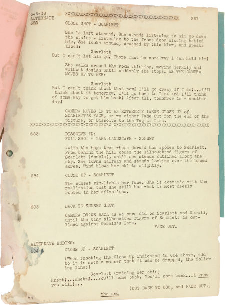
Gone with the Wind is as famous for its lines as it is for the movie itself.
If I had a nickel for every time “Frankly, my dear, I don’t give a damn” has been quoted well, you know.
Good Housekeeping recently informed its readers the infamous ending almost wasn’t the famous ending as we know it.
An alternate ending has been revealed through the recent findings of a script.
Take a look at what words Scarlett may have spoken over at Good Housekeeping.
Heritage Auctions
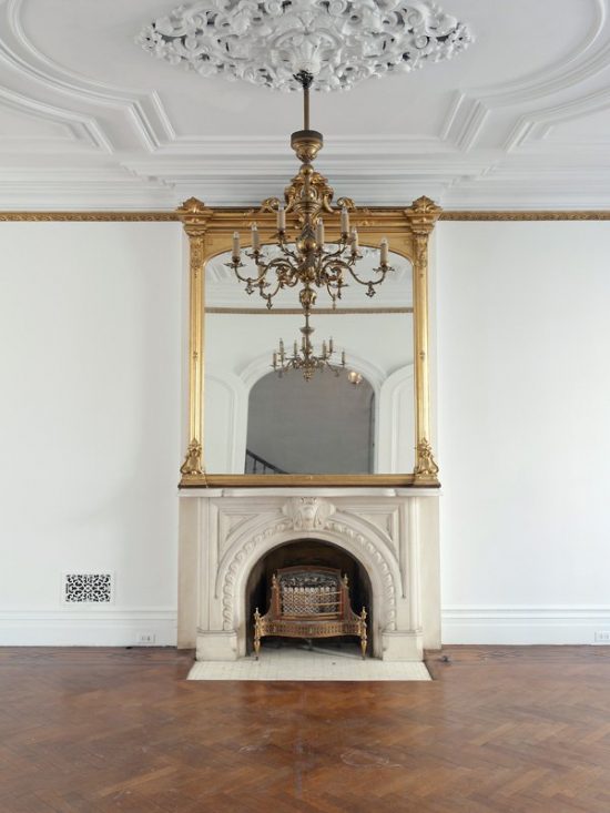
Speaking of iconic, the image below is of the interior of the actual brownstone on 64 Perry Street, New York, New York -otherwise known as Carrie Bradshaw’s apartment in Sex and the City.
Pop Sugar – Sotheby’s Realty
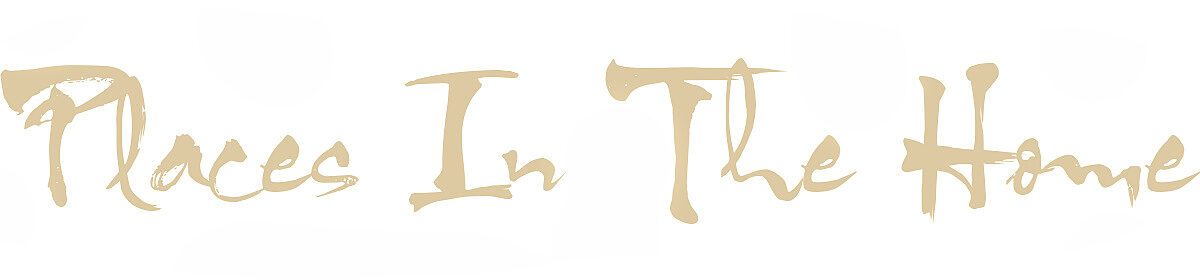
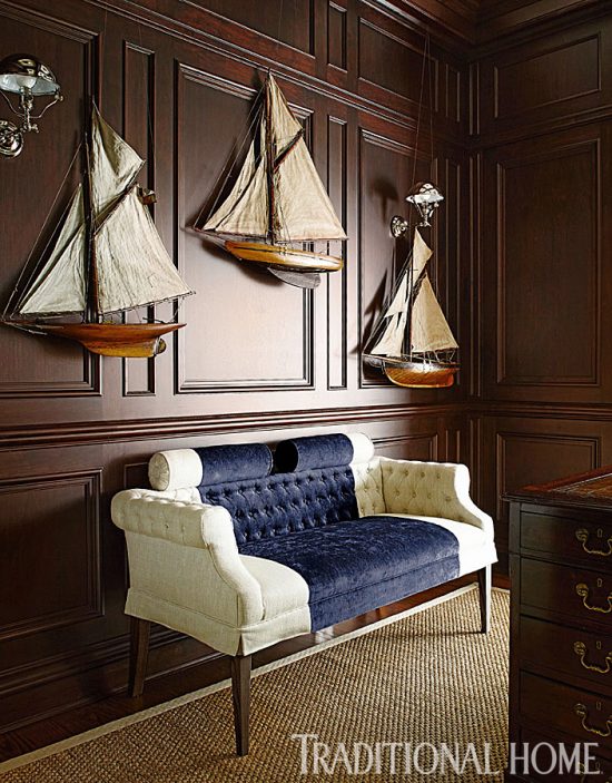
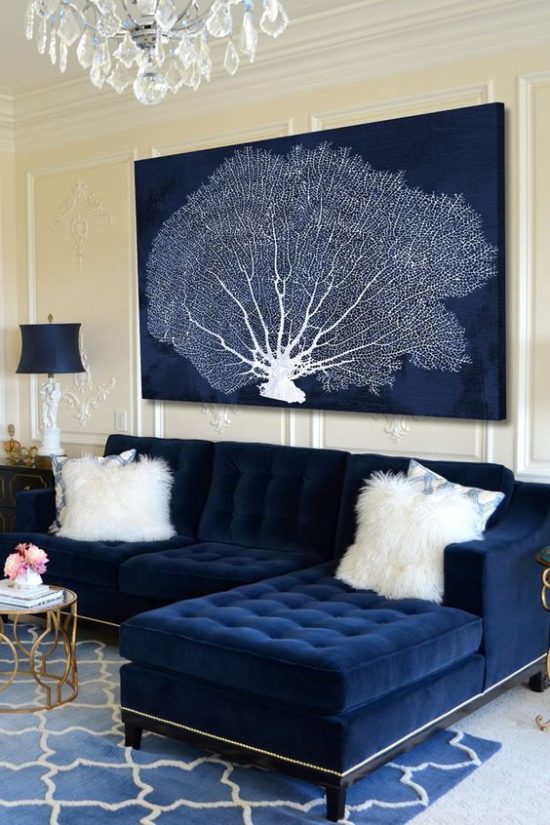
Classic navy never looked so beautiful! via Traditional Home
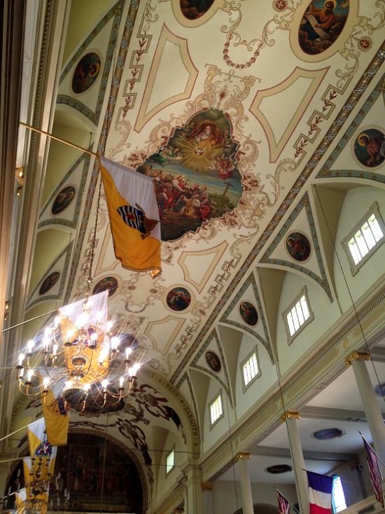
The classic interior beauty and architecture of the St. Louis Cathedral make it a premier historical New Orleans landmark.
Attention grabbing titles stump me at times. The backspace on this keyboard should start up its own CrossFit class because this baby gets in an impressive and exhaustive daily workout erasing first drafts, not so PG-13 wording and the like.
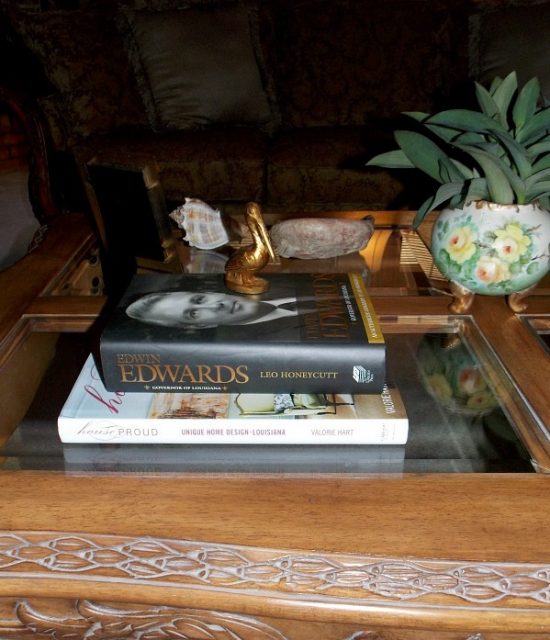
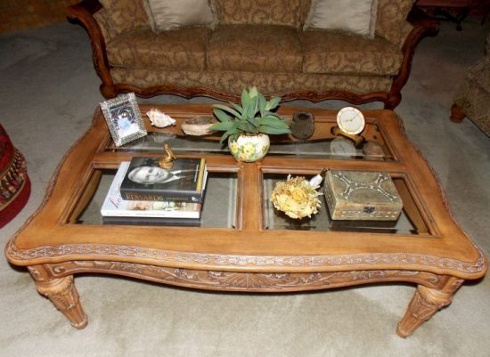
Title considerations for this post ranged from Not Another Boring How To Style a Coffee Table Post, Putting Stuff on the Coffee Table and Why It Matters and the winner, Styling The Table Between Two Sofas.
Anyway you title it, how to style a coffee table is a hot topic of decorating interest.
I like to incorporate individual style and objects that capture the soul of the life lived within your home.
The only hard-and-fast rule I follow in regards to how to style a coffee table is no sight obstruction.
I don’t know about you, but I hate to sit down to gab, read or watch television only to get right back up to move a decorative accent out of my sight line.
High, medium and low is a working concept with considerations to factor in.
When I’m styling a coffee table I sit down on sofa, chair, etc… and choose the primary sight line.
X marks the center spot- the prime location for a medium or low height object placement.
The “outer” areas balance the method with graduated heights to continue the flow, theme and visual engagement.
The rule of you effectively applies to decorating and should be beautifully evident throughout your home.
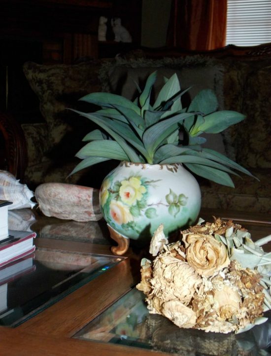
Styling a coffee table with a sense of individual style is easy.
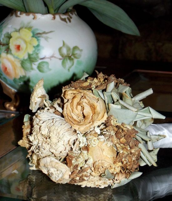
A treasured keepsake, great read, conversation piece, a decorative box to house remotes (a necessary evil), framed picture of something, somewhere or someone that when you look at it a smile instantly touches your heart- the essentials!
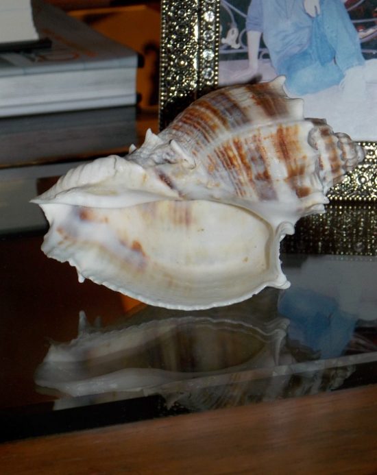
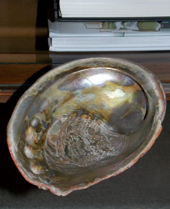
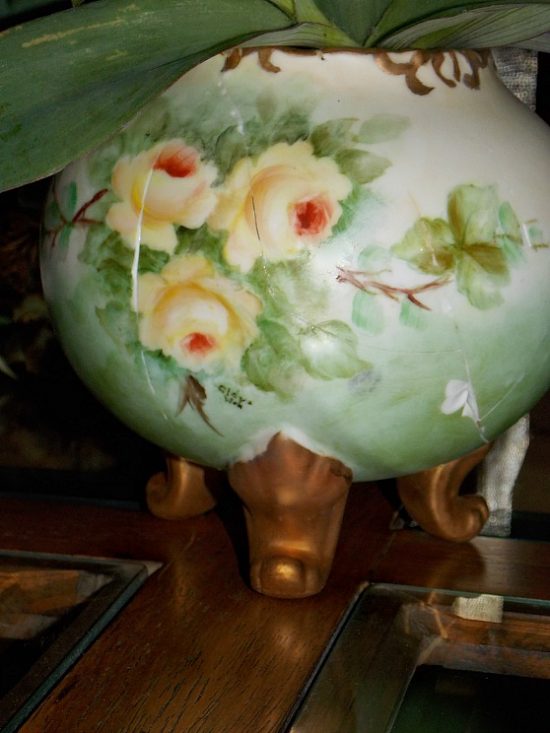
Here’s the background on the pieces presently calling the top of my coffee table home.
The shells were found on the beach in Corpus Christi, Texas by my mother when she was eight years old.
My great-grandparents owned tourist courts in the beach area, and on one of the many trips to Corpus my mother picked up these shells.
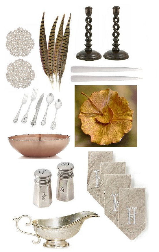
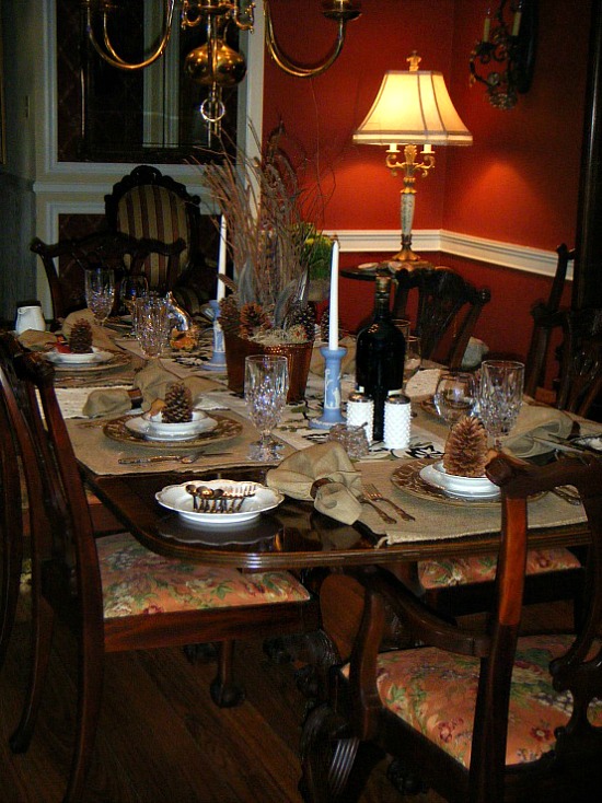
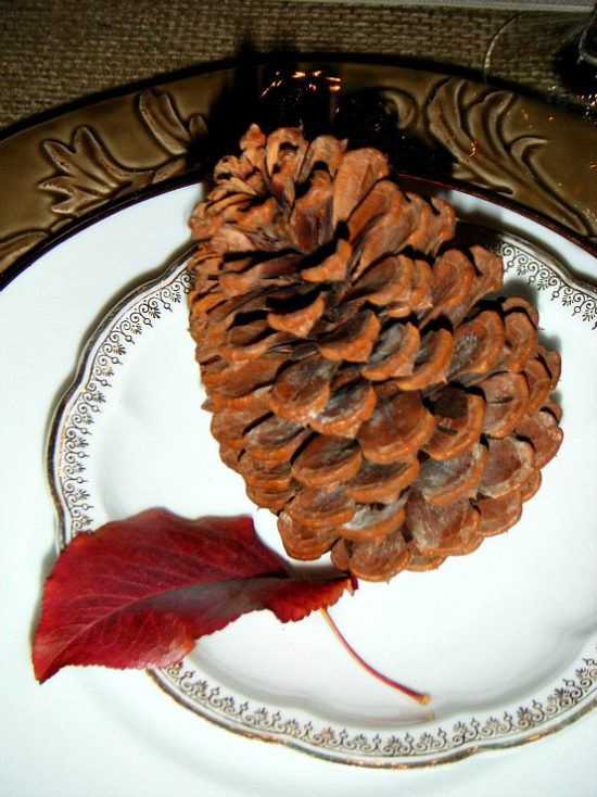
Planning a fall tablescape is both a labor of love and one of the best parts of the fall home decorating season.
Blending the best of the season can carry the theme through to a harvest and a Thanksgiving tablescape.
Natural elements provide a canvas easy to work with, color that only nature can produce, and the opportunity to treasure hunt close to home outdoors as well as indoors.
That which nature doesn’t provide, Hobby Lobby, Tractor Supply, eBay, and my brother the avid goose hunter does!
A savvy tablescaper keeps an eye out for future holiday table setting ideas and clearance sales from holidays past.
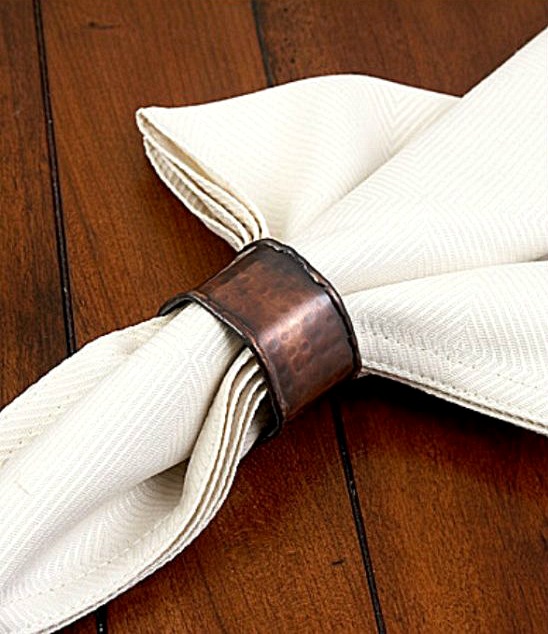
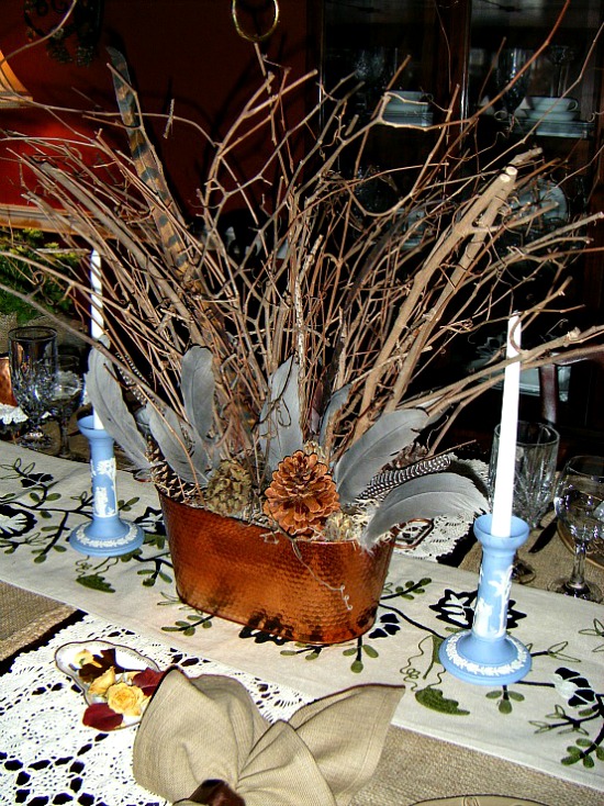
Patience and an additional 40% off clearance sale at Dillard’s secured the six new dinner plates, dinner napkins, and hammered copper napkin rings for my fall tablescape.
Burlap sandbags from Tractor Supply make casually chic, virtually indestructible and very affordable placemats.
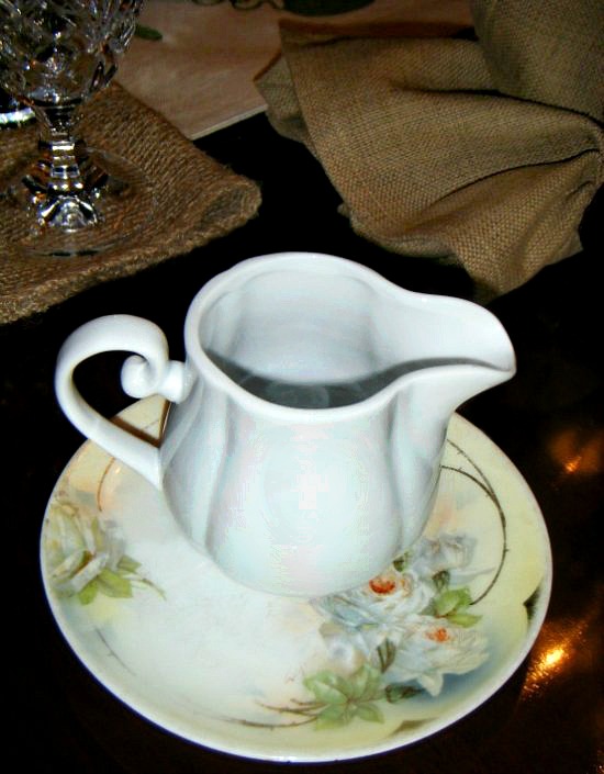
To know me is to know I love the opportunity to show and display items from my antique plate and creamer collection.
The Prussia Royal Rudolstadt bread and butter plate is a find from our last antiques inventory shopping trip.
It’s odd how decorative accessories that normally would not be paired together do, in fact, create the perfect look.
When Dave the Builder brought the Wedgwood candlesticks home from the antique shop I was not feeling it.
But wait.
After careful reconsideration it dawned on me that the steel gray goose feathers in the centerpiece cast an elegant shade of Wedgwood blue all their own.
“A September to remember. An October full of splendor.
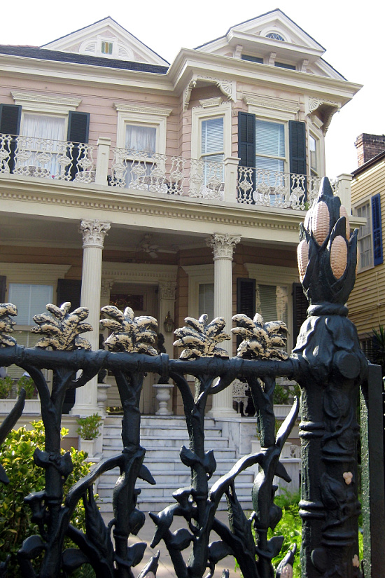
Restoration efforts and day to day upkeep of historic homes can be financially mind boggling.
Another consideration is the sheer expense of replicating these styles in today’s market which can create financial hurdles too difficult to clear.
Aging and changing neighborhoods coupled with a natural progression away from this style of living places most of these homes in the private sector on an endangered species list.
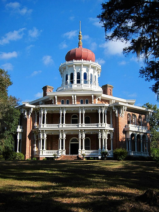
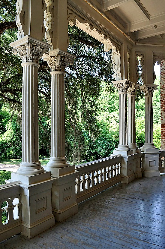
Locally we have a block of homes known as Mansion Row.
Anchoring the far left corner of the block stands the Thompson-Hargis Mansion.
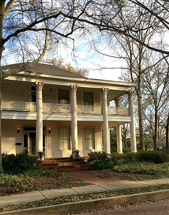
Built in 1907, this Greek Revival home with characteristic Ionic columns,porte-cochère, triangle pediment, and transom entry was once a jewel in the crown of our city history.
Exterior and grounds showed the weathered look of sun and time- nothing paint and repair could not fix as the property was structurally sound and the architectural integrity intact.
Removal of the furnishings was conducted years ago, windows and doors boarded, and the grand dame beautifully sat idling until this past Sunday evening when she fell victim to a senseless demise.
Neighbors who recall the elegance of what was and admirers of what could have been mourn the total loss of of property, history, and hope.
It’s a sad turn of events and an even sadder realization that original, historic, and one of a kind architectural elements were destroyed.
Dollars do not factor into the equation, there is no replacement value for the architectural integrity of this 105 year old home.
RIP Thompson-Hargis Mansion.
images: Louisiana Trust for Historic Preservation, We Saw That
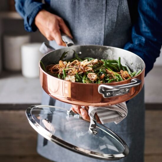
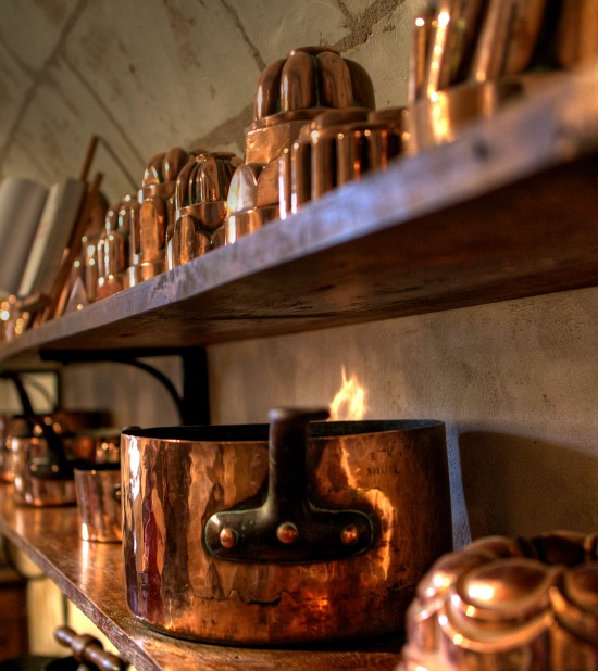
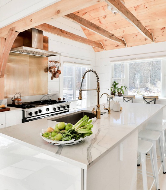
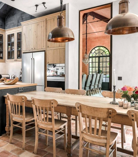
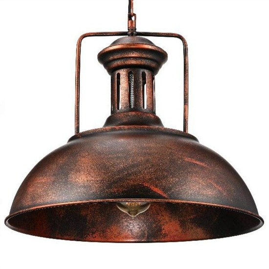
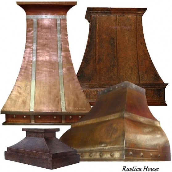
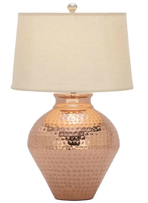
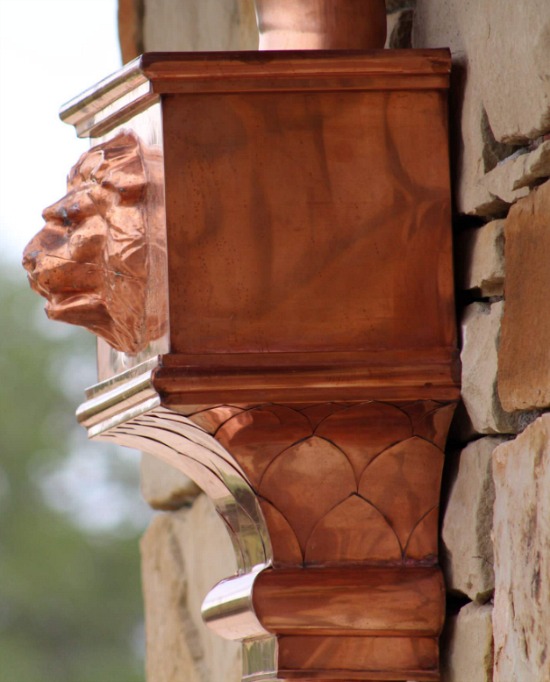
That’s one way to sum up the beauty of the copper home decor accessories.
The patina, richness and versatility of copper lends a distinctive presence and truly unique color palette choice to interior design accents and home decor accessories.
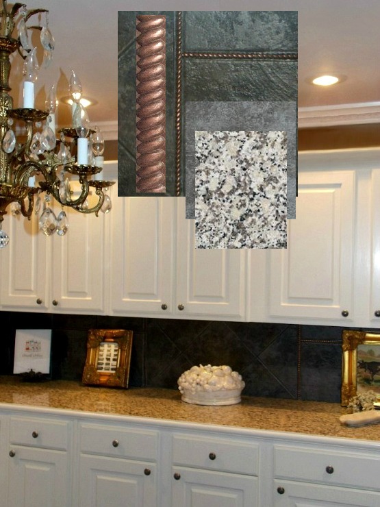
When it came down to countertop selections for our kitchen remodel I knew the direction I was going in, but how much of my choice to incorporate into the scheme was the question I struggled with.
Dave the Builder and I drove to Home Depot and soon the question was answered.
We selected copper half round rope metal molding wall tile trim to enhance the tile back splash.
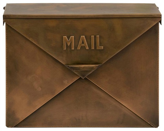
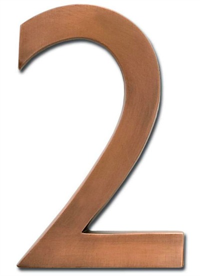
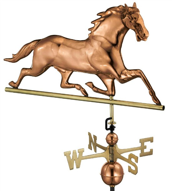
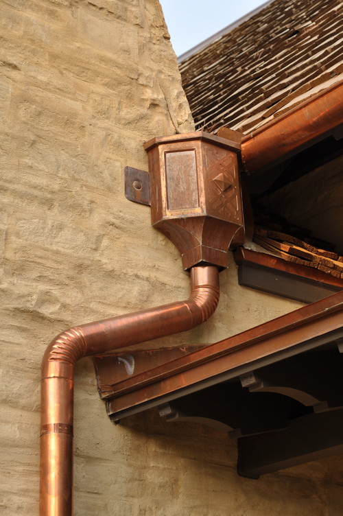
From the kitchen to the front exterior of the house, copper accessories make their presence known.
When we moved into our home I accessorized the exterior with copper and copper inspired treated items.
I chose treated items for their resistance to weather and time.
The copper mailbox, copper address plaque and copper weathervane look as new today as they did when purchased.
My late night SS (sourcing and surfing) sessions go well with an excellent cup of coffee and great music.
Feeding my love of the music of The Eagles, and realizing just how good their album Hotel California really is set the tone and the mood for an extended evening of discovering interior design and interior decorating similarities.
This was no wasted time.
Wasted Time.
The Eagles.
Get it?
Editing and refreshing design options is necessary to stay current with accessory and accent selections.
Color and accessory choices may shift, but the foundation of our tastes tend to stay solid.
Not all design and decorating moodboards are created equal, nor immediately put into project action.
I distinctly remember an episode of a since canceled reality television showthat featured the architecture and interior design process.
When the couple, who were deep into the interior design process, met with interior designers, architects and contractors, they produced a large look book full of images, articles and clippings detailing the furnishings, accents and accessories of preference.
This was way before the days of Pinterest, folks.
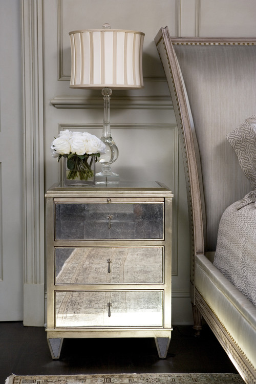
Working on the moodboard for our master bedroom remodel afforded me the opportunity to discover the gorgeous interior design work of Linda McDougald from Linda McDougald Design and Postcards from Paris.
The private South Carolina residence at The Cliffs at Keowee Springs is breathtakingly beautiful, as is the magnificent and impeccable interior design work of Linda McDougald.
Photography by Rachael Boling Photography.
The master bedroom images immediately captured my attention.
I noted the similarities in color, furnishings and accessory choices between her design and my selections and choices in my master bedroom moodboard.
The upholstered headboard with nailheads and the mirrored nightstands especially reflect my tastes.
Architectural elements and spot antique pieces complement the contemporary spacing.
The make no mistake strength of a soft color palette is this; it envelopes the space in a subtle yet strong whisper, that when paired with optimum furnishings, accessories, and accents, becomes a decorative roar.
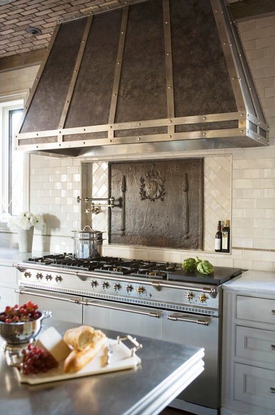
From the exposed brick ceiling, pewter and Carrara marble countertops and dual toned stainless steel French Lacanche range to the custom designed cabinetry crafted by Jose’ Florez, no culinary or decorative detail has been overlooked or left undone.
Features such as the pot filler and antique iron fire back lend charm, unique form and elegance to the function at hand.
I like a good surprise, but I love a great surprise!
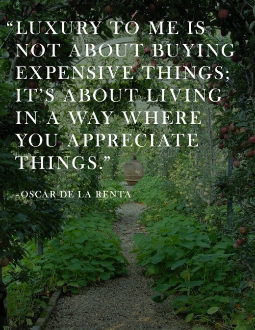
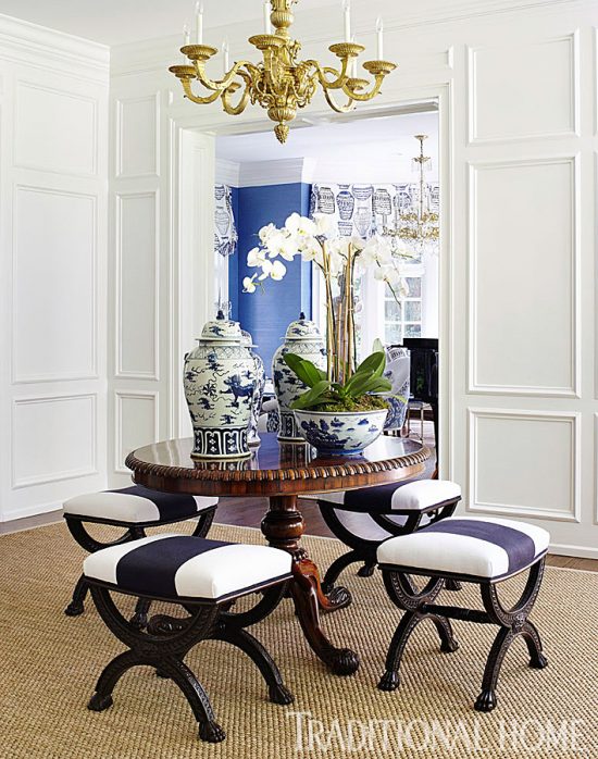
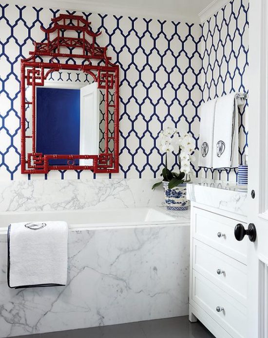
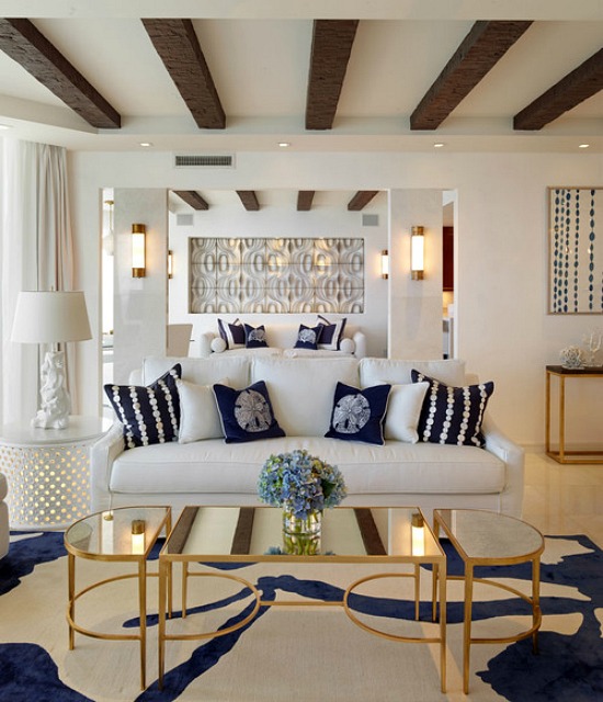
Classic touches cast a modern light on the traditional scale of the space, and a chic spotlight on the navy and white Moroccan trellis pattern wallpaper.
Navy blue carries the space as the predominant decor influence.
When paired with white home decor accessories and furnishings the perfect effect is achieved. It is all the visual explanation needed as to why this color pairing remains a classic choice.