Reflecting back on 2013 and looking forward to things to come in 2014 takes center stage for a whole lot of people at this time of year.
Once I weed through the resolution staples- lose weight, get organized, get healthy- I get down to the business of business that is decorating.
With decorating comes hours of sourcing, viewing and discovering interiors.
Commercial complexes, residential homes, restaurants, lounges, chain and luxury hotels- I’ve never met an interior I didn’t appreciate.
The common denominator of design swoon and decorative admiration becomes more clear with each and every image.
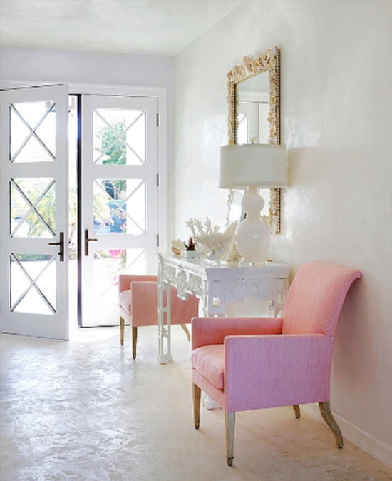
Fearless and fabulous color excites the eye, races the heart and commands attention.
Isn’t that the idea?
If we insist on beauty and style and in our homes, why not factor that in when we select places and spaces to celebrate a special occasion?
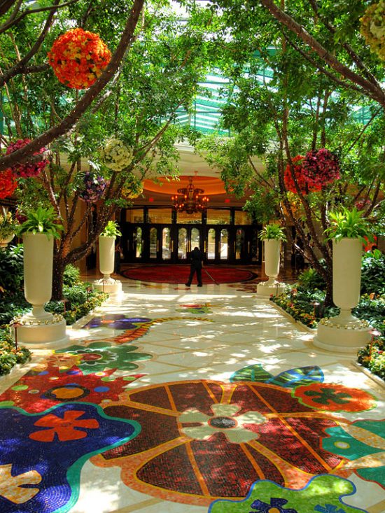
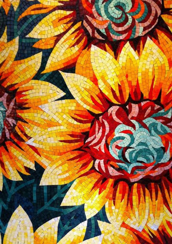
Wynn Las Vegas- photo by Barbara Kraft
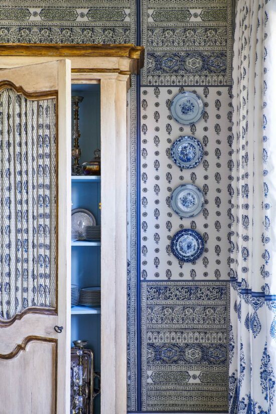
Color is at the core of detail.
Color excites, enhances and engages diners, travelers and celebrators. I
t is a measured ingredient, sometimes in appropriate hit you over the head excess, sometimes in take you by surprise I didn’t realize I like that color discovery.
My personal measure of fearless and fabulous color done right is when the balancing act of hue, tone and saturation come together to engage the eye in real time without sensory intrusion, but makes it’s biggest impact in memorable afterthought.
That’s a color your world impression, and isn’t that the idea?
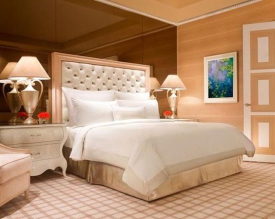
Wynn Las Vegas
Dave the Builder and I had the pleasure of staying at Wynn and Encore Las Vegas for our 25th anniversary.
The celebration and importance of the milestone could not have been better framed for a more memorable experience than by the impressive design and decor attributes richly bathed in color.
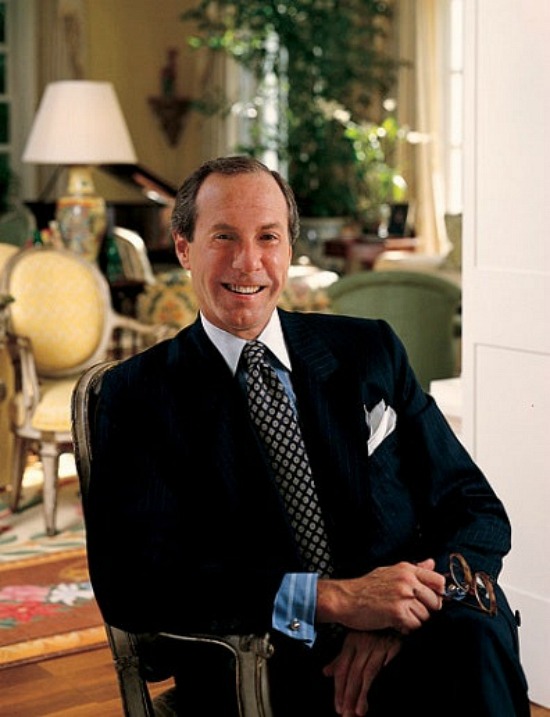
The vision, creation and execution of these memorable and notable interiors begin with Roger Thomas, Executive Vice President of Design for Wynn Design and Development.
Roger Thomas ~ Home Accents Today
There is absolutely nothing common about the design and decor details of the common areas.
I do like and appreciate the tone down of color in the guest rooms.
At home or on the holiday road, decompressing and relaxing is so much easier when a space is done in a tasteful, tranquil palette.
In the case of Wynn and Encore, the serene Californicated neutrality reserved for the guest rooms is a well thought out color application.
Switching gears and geographical locations to further the point is the fabulous guest rooms of the SLS Hotel South Beach.
Philippe Starck
Architect and designer Philippe Starck brilliantly succeeds in pairing quintessential South Beach elegance with French influences that fascinate the eye and relaxes the soul.
Let me ask you this:
How long did it take to draw your eye straight to the pink accent pillow?
There are times when just a blush touch of color is all it takes.
Stark (no pun intended) white with a fearless hint or fabulous from floor to ceiling saturation – fearless and fabulous color has the will and the power to influence, inspire and impress.
“I learned that passion about objects and furnishings makes for fearless decorators—and that if you are comfortable in your home, everyone else will be too. That sense of authenticity is what gives a home its soul.”
—Courtnay Daniels Haden, interior designer
“Turn off cell phones!”
—Joan Michaels, interior designer
“A room should start a conversation before people actually start exchanging words.”
“Make a home-cooked meal, even if it’s just a bowl of chili and a salad with garlic bread. There’s nothing better than simple and delicious.”
—Lisa Fine, textile designer
“In case of an entertaining crisis, take a deep breath and ask, ‘What would Auntie Mame do?’ If a guest accidentally breaks something, regardless of value, simply say, ‘Thank you. I’ve been looking for a reason to replace that old thing.'”
“When I was in Italy one summer, our hosts served cashews and potato chips in crystal bowls while we sipped Prosecco. It was a revelation: right-out-of-the-bag snacks become sophisticated when they’re served in a gorgeous dish.”
—Stephanie Ballard
“Handwritten thank-you notes after being entertained are a must.”
—Grant K. Gibson, interior designer
Apartment Therapy
“You can never have too many white plates, platters, and bowls.”
—Cheryl Katz, interior designer
“I try to greet my friends with a drink in my hand, a warm smile on my face, and great music in the background, because that’s what gets a dinner party off to a fun start.”
–Ina Garten, celebrity chef and author
“In life as in design, it is not perfection you should be after. There’s beauty in the faded and worn, the well loved, and the sentimental…After all, life has seams. Your home should be like a loosely woven fabric of desires, memories, practical, notions, and even compromises.”
My late night SS (sourcing and surfing) sessions go well with an excellent cup of coffee and great music.
Feeding my love of the music of The Eagles, and realizing just how good their album Hotel California really is set the tone and the mood for an extended evening of discovering interior design and interior decorating similarities.
This was no wasted time.
Wasted Time.
The Eagles.
Get it?
Editing and refreshing design options is necessary to stay current with accessory and accent selections.
Color and accessory choices may shift, but the foundation of our tastes tend to stay solid.
Not all design and decorating moodboards are created equal, nor immediately put into project action.
I distinctly remember an episode of a since canceled reality television showthat featured the architecture and interior design process.
When the couple, who were deep into the interior design process, met with interior designers, architects and contractors, they produced a large look book full of images, articles and clippings detailing the furnishings, accents and accessories of preference.
This was way before the days of Pinterest, folks.
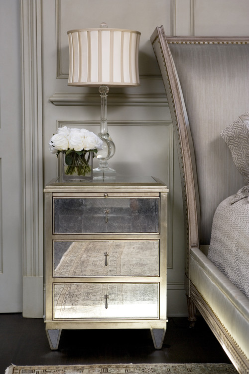
Working on the moodboard for our master bedroom remodel afforded me the opportunity to discover the gorgeous interior design work of Linda McDougald from Linda McDougald Design and Postcards from Paris.
The private South Carolina residence at The Cliffs at Keowee Springs is breathtakingly beautiful, as is the magnificent and impeccable interior design work of Linda McDougald.
Photography by Rachael Boling Photography.
The master bedroom images immediately captured my attention.
I noted the similarities in color, furnishings and accessory choices between her design and my selections and choices in my master bedroom moodboard.
The upholstered headboard with nailheads and the mirrored nightstands especially reflect my tastes.
Architectural elements and spot antique pieces complement the contemporary spacing.
The make no mistake strength of a soft color palette is this; it envelopes the space in a subtle yet strong whisper, that when paired with optimum furnishings, accessories, and accents, becomes a decorative roar.
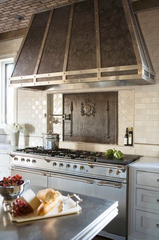
From the exposed brick ceiling, pewter and Carrara marble countertops and dual toned stainless steel French Lacanche range to the custom designed cabinetry crafted by Jose’ Florez, no culinary or decorative detail has been overlooked or left undone.
Features such as the pot filler and antique iron fire back lend charm, unique form and elegance to the function at hand.
I like a good surprise, but I love a great surprise!