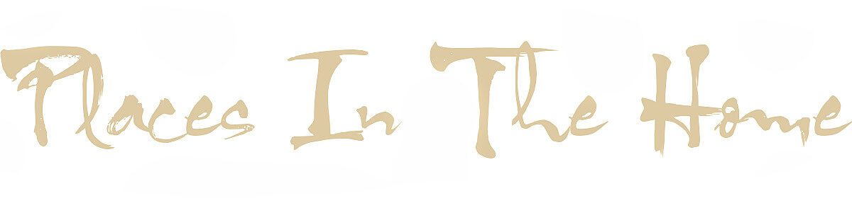
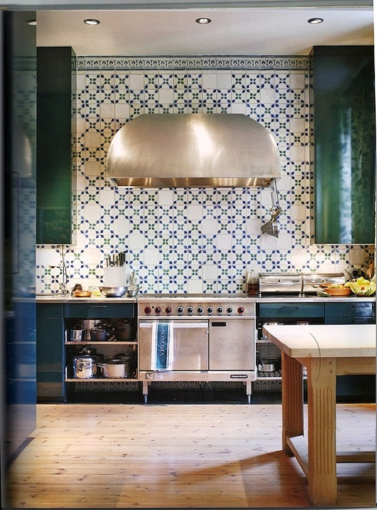
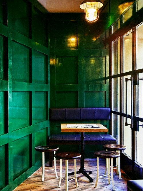
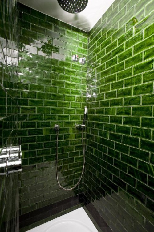
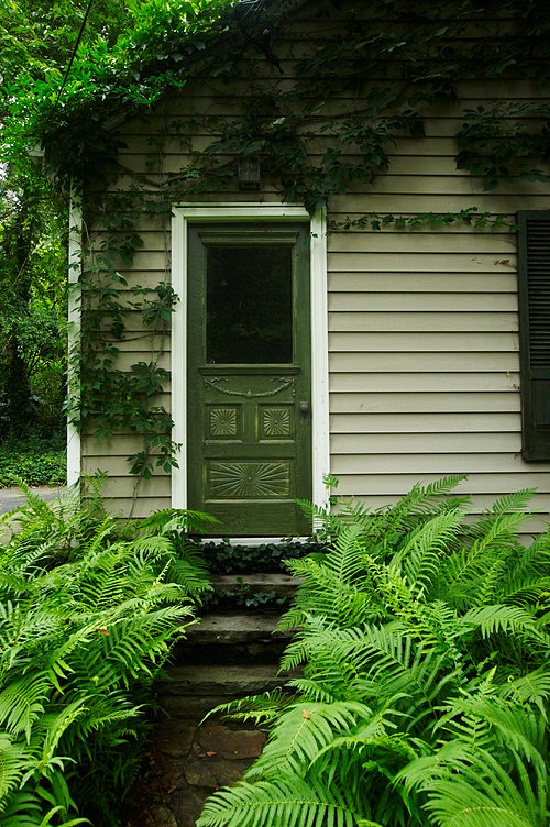
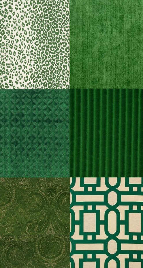
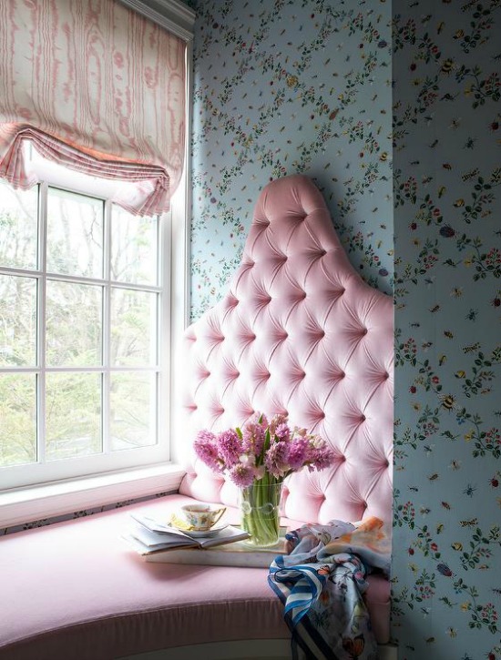
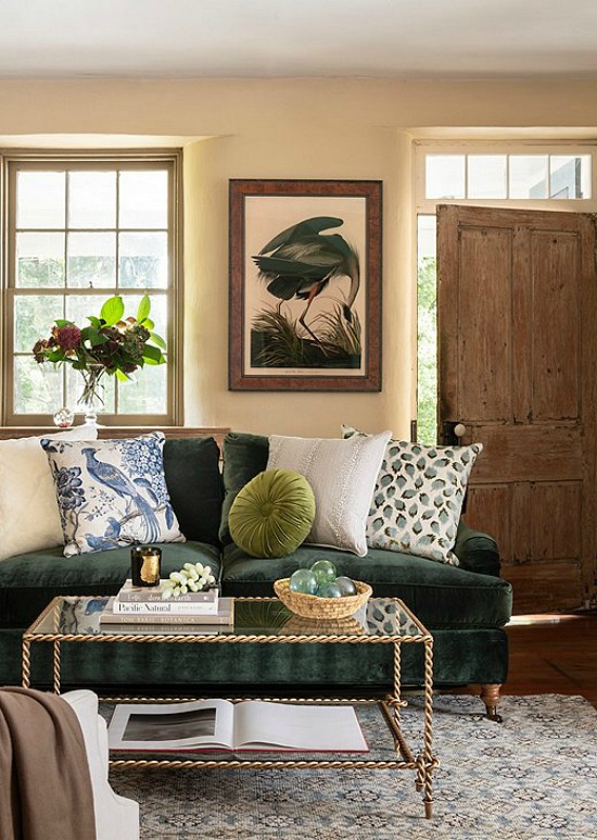
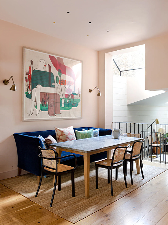
Decorating with green beautifully creates lush and lavish interiors. It’s a classic color that evokes the splendor of the outdoors, four-leaf clovers, St. Patrick’s Day, and the essential recipe for spring.
Shades will vary, however, the beauty delivered from decorating with green never wavers.
When I can’t sleep I don’t count sheep, I try to recall the stores and shops that lined the downtown area from when I was a kid.
Do you remember shopping downtown at Christmas time?
Santa Claus in his red house with white trimmed windows, Christmas lights and tinsel stars strung from store front to store front, and department stores display windows decked out in holiday finery.
Lerner Shops, Bakers, JCPenney, W.T. Grant, S. H. Kress & Co., Rexall, Morgan & Lindsey’s…
Decorating for the holidays takes planning, and with planning the first line of defense is time.
It may still be November, but the window for decorating, trimming, and decking our houses, trees and halls to the point of what defines holiday perfection closes sooner than later.
My rule of holiday decorating thumb is as follows:
Give yourself at least ten days to admire the fruits of your holiday decorating labor.
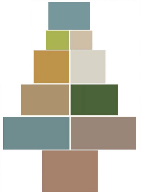
I’m deep in holiday color palette planning– leaning heavily toward a new traditional palette in the Christmas decorating color ideas department.
Traditional green and red remain timeless favorites, but have you seen some of the gorgeous color combinations decking the halls out there at the holidays?
I am so taken with some I thought a post matching interior paint colors with the holiday ornaments and decorations might inspire me and maybe some of you to take a more permanent position with the color palettes.
Inspiration is everywhere, especially at this time of year!
It’s a fabulous color choice, it’s a fabulous cause to support, and won’t it be fabulous when the cure is found!
For my mother, dear friends and old and new, the woman in the waiting room, the names and faces of cancer I will never know, the growing numbers of survivors and thrivers, and the walkers and runners uniting together in pink solidarity- this one’s for you.
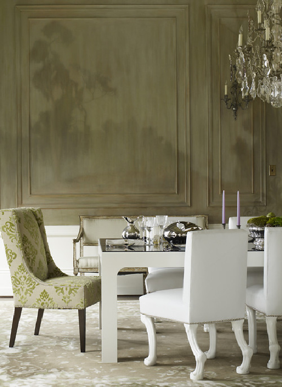
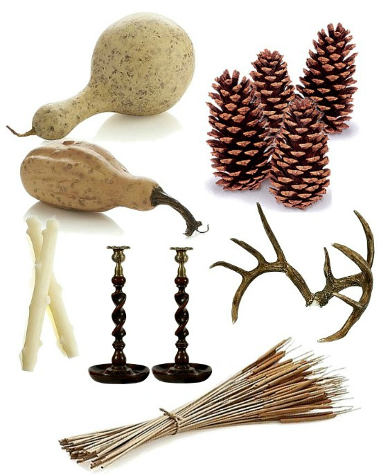
Thoughts of fall have naturally brought about seasonal home decorating ideas, reminding me it is time to begin putting together ideas for a fall tablescape.
Noting a stunning pair of barley twist bar stools seen on Pinterest turned my thoughts to the pair of vintage barley twist candlesticks I know I have somewhere.
Found the little darlings.
Isn’t it funny how an image or an item in that image can initiate the decorative snowball effect?
One Kings Lane
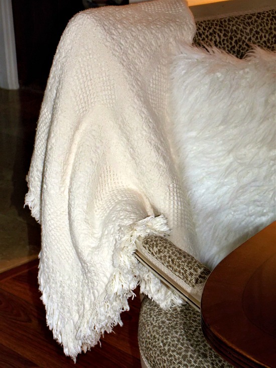
Textures, finishes, and color palettes evoke thoughts of warmth, coziness, and hominess- qualities so closely associated with cold weather days and nights.
Decorative throws and pillows infuse a space with the look and feel of warmth.
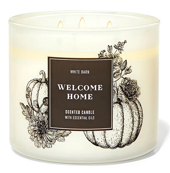
Candles in scents of the season treat the senses.
Seasonal home decorating ideas often are inspired by the senses.
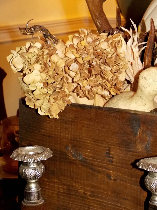
Forget the pie, this is my idea of a slice of pumpkin love!
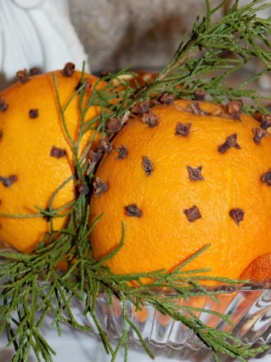
Pumpkin, ginger, and cinnamon- from kitchen to table to home decor accessories to color palettes.
Dering Hall
Traditional Home
In a few months from now I’ll be writing about how I can’t wait for spring flowers to bloom, summer colors, and there’s nothing better than the taste of barbecue.
For now, I’m looking forward to the first really cool night and the feel of a down comforter.
Also on the fall treats list is the delicious scent of cloves and oranges throughout the kitchen and dining room, and the highly anticipated first taste of a pumpkin spice latte.
Okay, now it’s your turn.
What is it that you hear, see, feel, smell or taste that reminds you of fall?
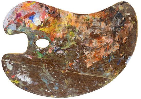
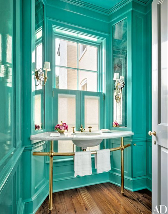
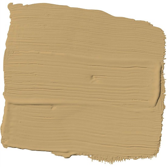
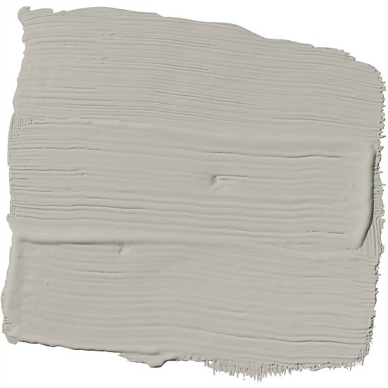
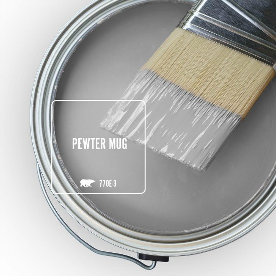
Choosing paint colors can be a daunting process, but it doesn’t have to be.
Exterior or interior painting is by far one of the most inexpensive, impressive, and immediate options for changing and refreshing home décor.
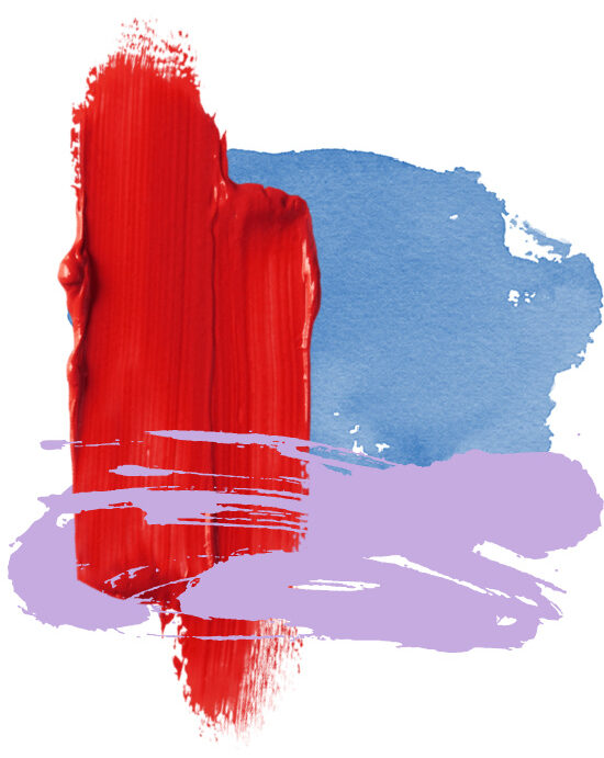
Think of color as personality plus in a gallon, quart, or sample size container. It holds the power to calm, excite, bore and entice- a fascinating concept that reflects our personality and taste.
Color has the ability to infuse a space with decorative drama, calming appeal, or high octane energy.
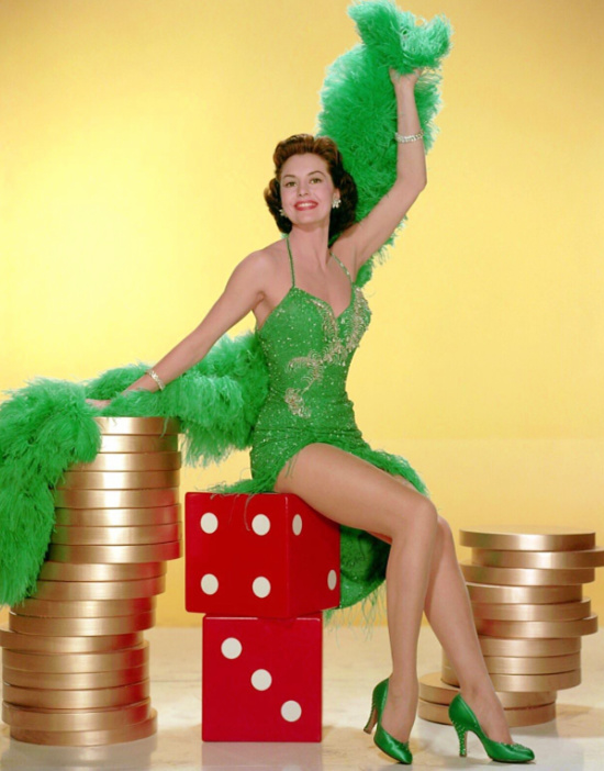
Several years back before one of our trips out to America’s playground I watched what proved to be a color your world show during Vegas Week on the Travel Channel focused on how environment and interior design affects gamblers.
Color plays a significant role in casino and gaming floor interior design, especially pertaining to the mood and behaviors of gambling guests.
Blue is typically avoided due to the perceived calming effect as red remains a popular color choice for the excitement factor, and purple evokes an intimate, warm, and inviting feeling.
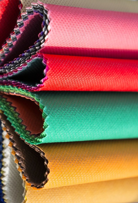
Inspiration is everywhere, and color choices can come from a favorite article of clothing, piece of jewelry, home décor accessory or fabric, or a treasured collectible.
When deciding what color to paint a space, these are a few of the factors I take into consideration:
What is the overall feeling this space needs to convey?
Formal or casual?
Relaxing bedroom or high energy kitchen?
Visual flow and compatibility with the overall color palette.
Texture and sheen, or lack thereof.
Flat matte or soft sheen satin eggshell?
Glosses shine in the vein of durability- the choice range being the easy to clean sheen semi-gloss to the woodwork, furniture, and high sheen-high traffic friendly high gloss.
Sure, there is both implied and true rules for color selection in interior design and decorating. Smaller spaces appear larger when a lighter color is used.
Lighting
A space blessed with plenty of natural light can support darker color choices.
Natural light will accent the prominent tone of the color.
Remember this; the color of the paint you see in the store will not be the color of the paint you see on the walls in your home.
Paint colors will cast different colors at different times of the day based on natural and artificial lighting (basically the same principal as photographing with natural light vs. night shots).
Small space + light colors = open up and say size
Small space + the b&b principal (balanced & bold) = hello, gorgeous!
Painting a ceiling with a contrasting color or sheen creates a dramatic focal point that will spread the color love by guiding the eye to the wall color.
Small spaces tend to appear larger if lighter colors are used, but large patterns or bold colors balanced with the proper lighting can make a dramatic statement.
Painting is a great way to test the waters and step out of the decorative comfort zone.
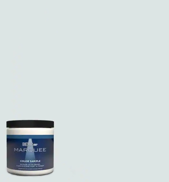
Most paint brands have paint samples for purchase.
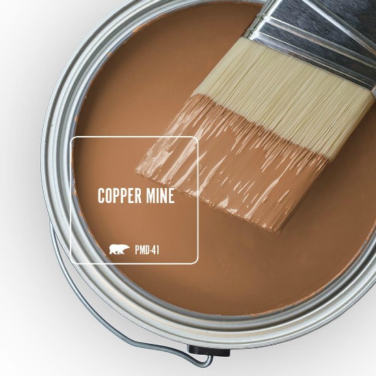
Behr Etched Glass One-Coat Satin Enamel Paint & Primer Sample
Take the time to purchase paint samples of the color or colors you have narrowed your choice down to.
Apply a couple of coats of the paint to an area on the wall you will be painting, allowing to completely dry.
Turn on the lights, pull back the curtains or open the blinds, shutters etc… and let the light in.
Hold that thought until later in the day when the light will be different.
Now, hold that thought until evening when the light has once again changed.
Tones will come to call at different times of day.
Color shows you how beautiful and right it is for you to live with at any time.
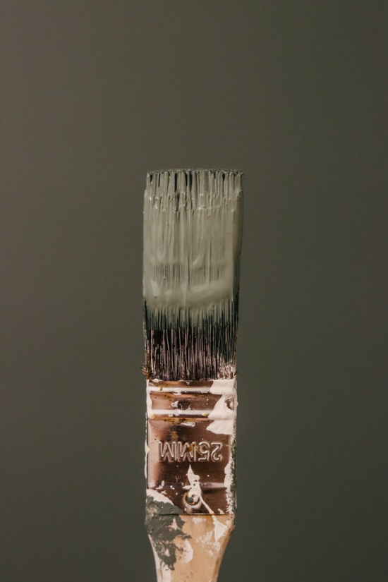
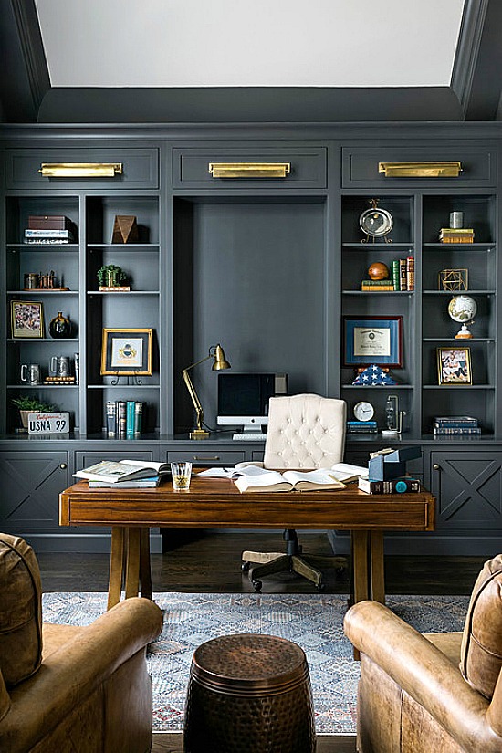
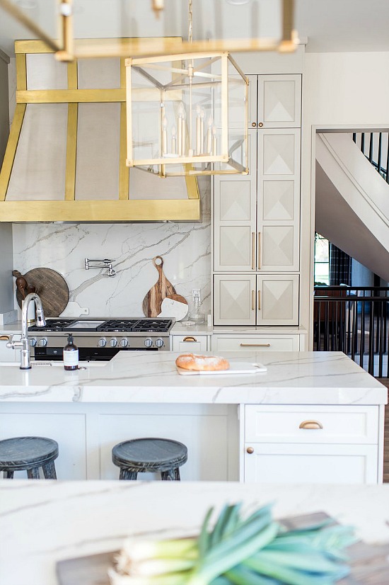
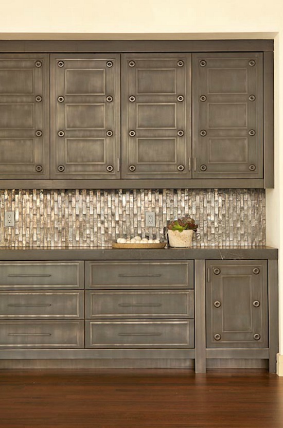
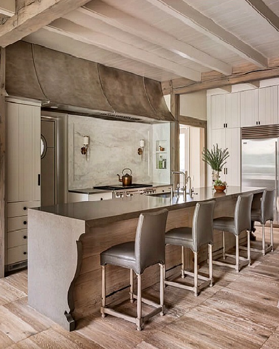
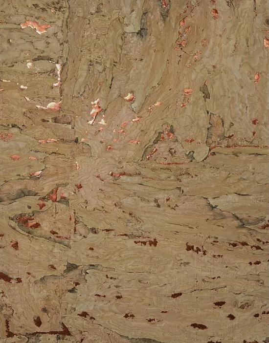
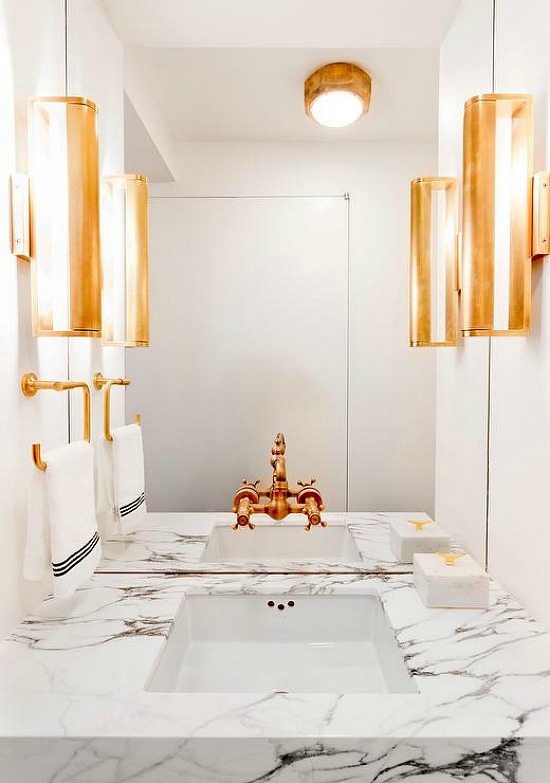
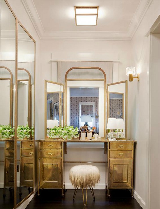
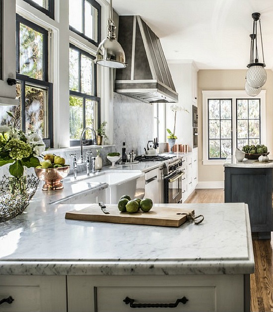
Keeping late project hours tend to catch up with you, but inspiring images and finds prove a powerful motivator so here I am, at the keyboard, typing out what I hope is informative as well as inspirational information for using metal colors in interior design and home decor.
In order to keep my painter happy the air is turned to artic blast, the coffee is brewing, and the radio dial is set to his favorite classic rock station.
Traditional Home
“Heavy Metal” by Don Felder played this morning, and now it is stuck in my head.