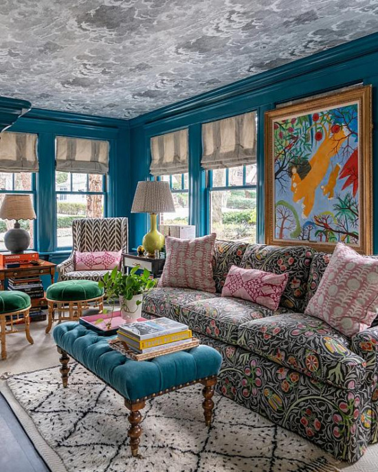
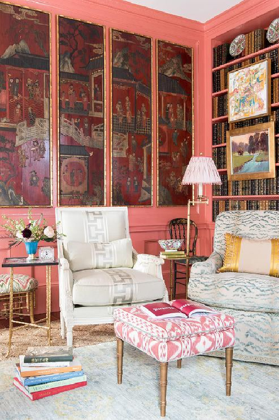
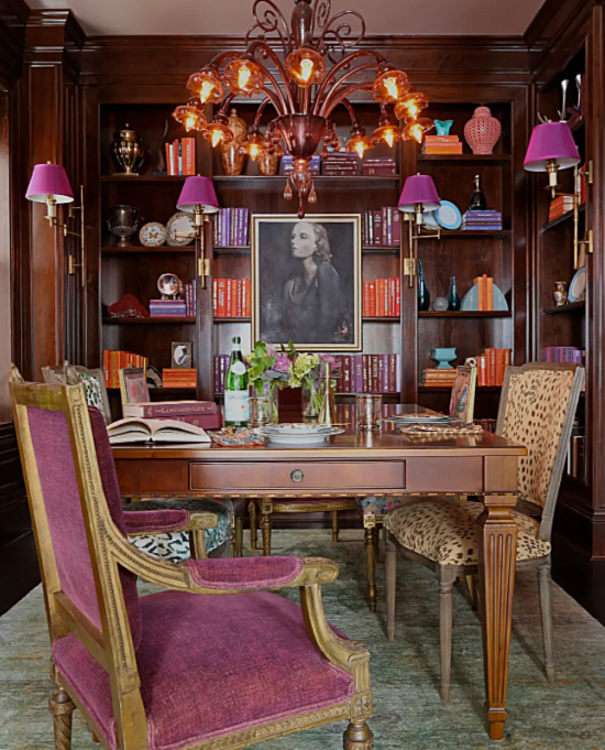
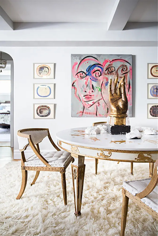
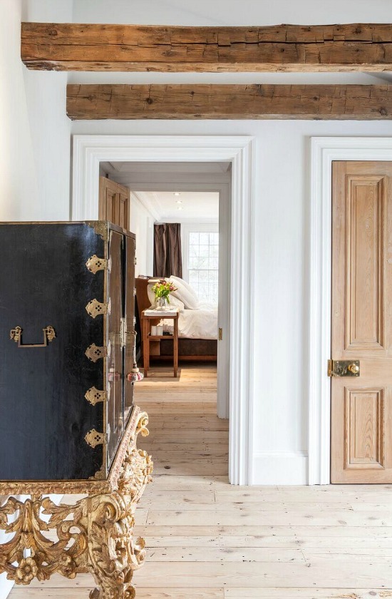
Going back over the years, trends, styles, and blog posts, here is one worthy to be refreshed and revisited. From trends to practicing tastemakers to the tastes of the times and all the choices in between, what’s your interior design style?
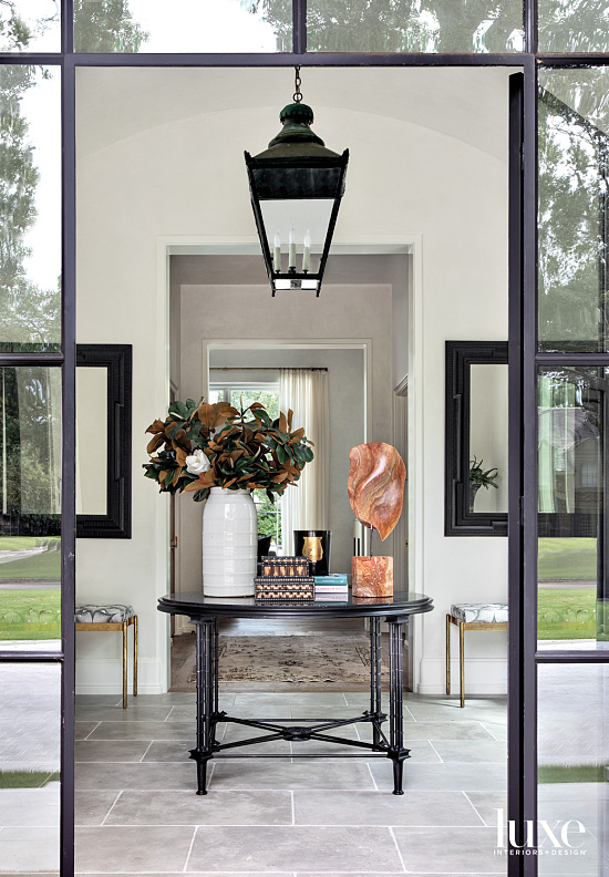
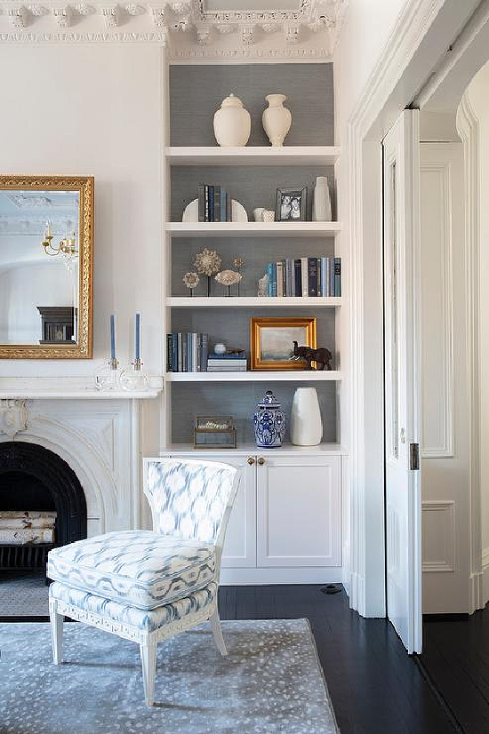
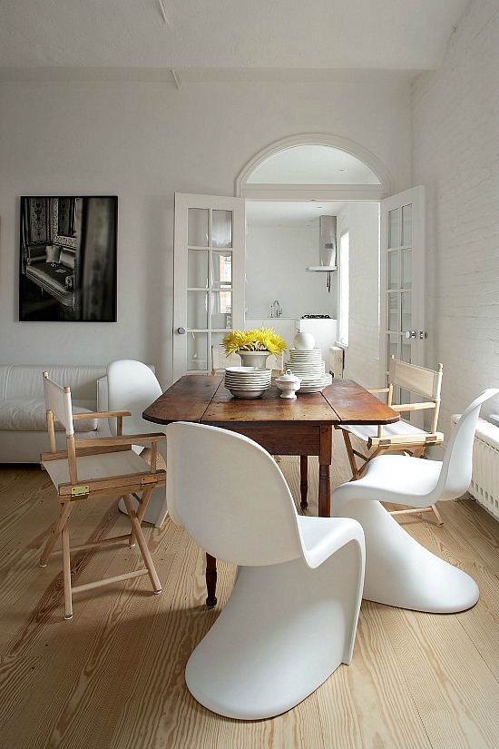
When time and trend of the early to mid-twentieth century gave life to monochromatic color palette, clean lines, natural materials, and natural light, modern design was born.
Do your decor choices take a stand against the cookie-cutter effect of interior decorating- firmly debunking the myth that you are a complete and utter failure in life if your decor doesn’t emulate the style or tend of the moment?
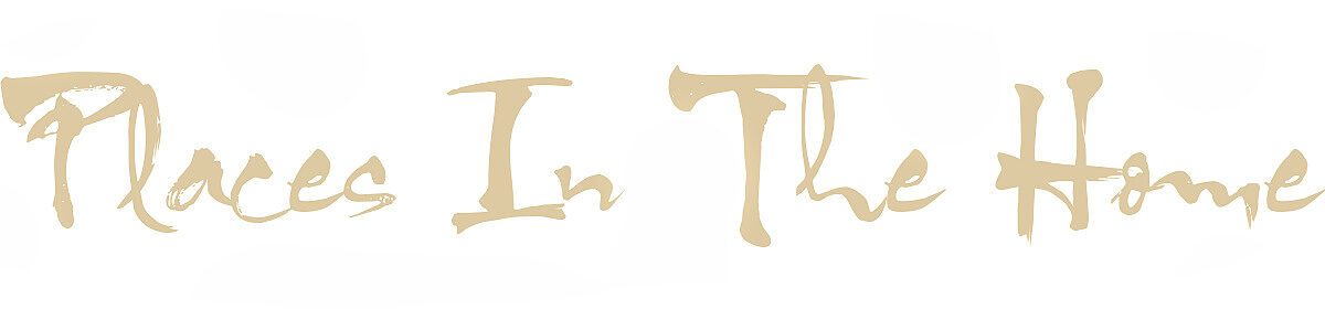
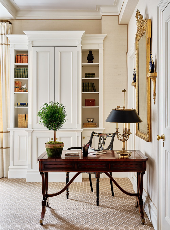
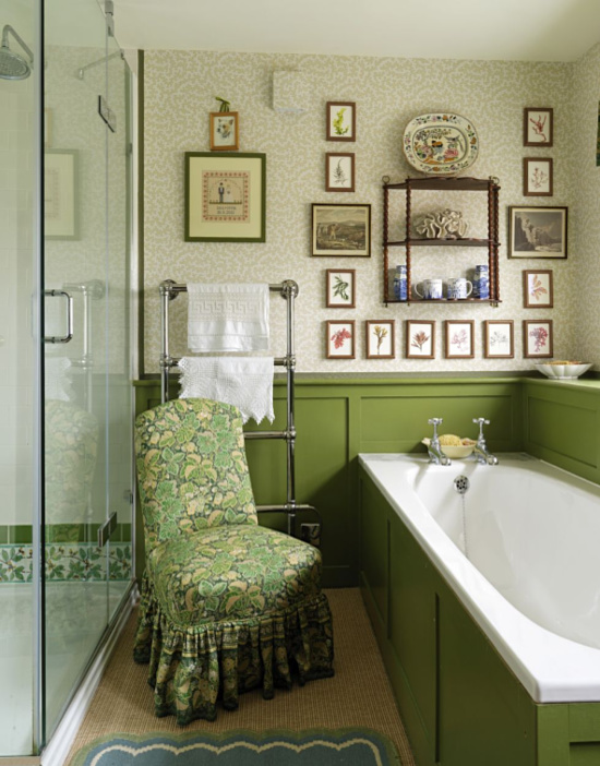
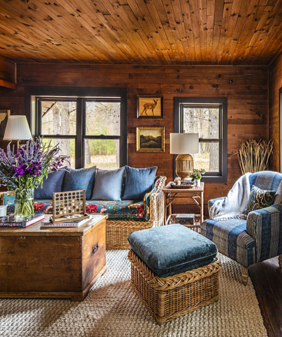
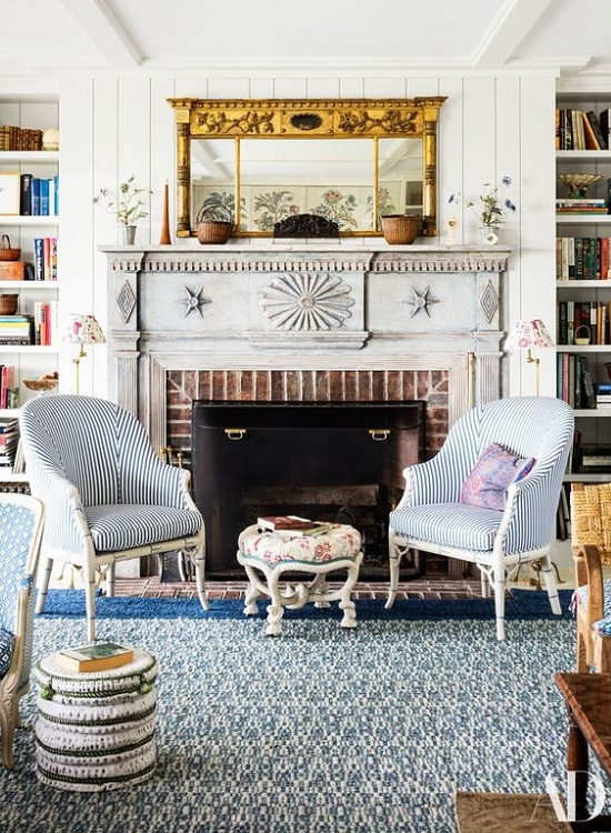
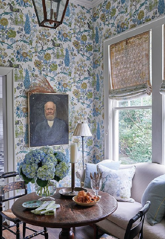
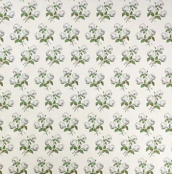
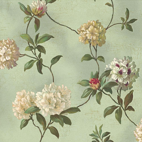
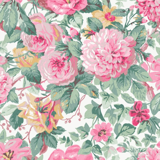
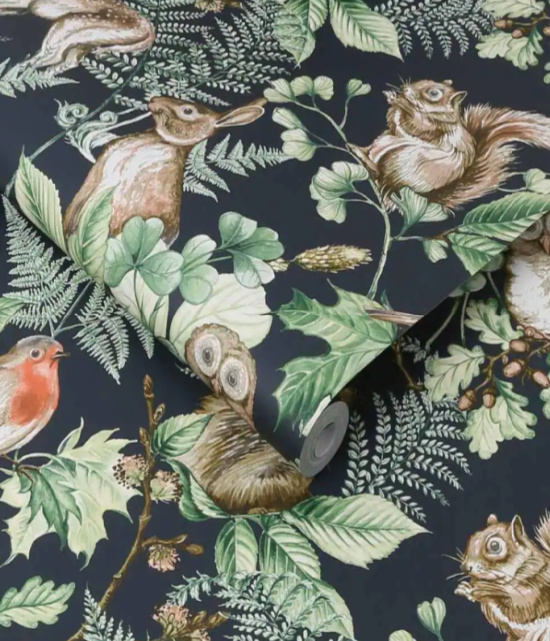
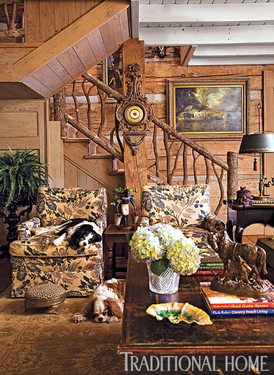
Steeped in colors mirroring the lush natural greens and classic floral patterns, do these lovely examples of life at the cottage intrigue and inspire?
There’s no question that staying true to your tastes and decorating your home with that in mind while making no apologies whatsoever for those unique choices is always the interior design style rule to follow.
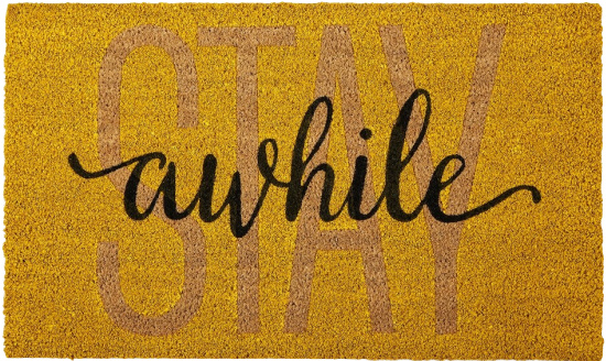
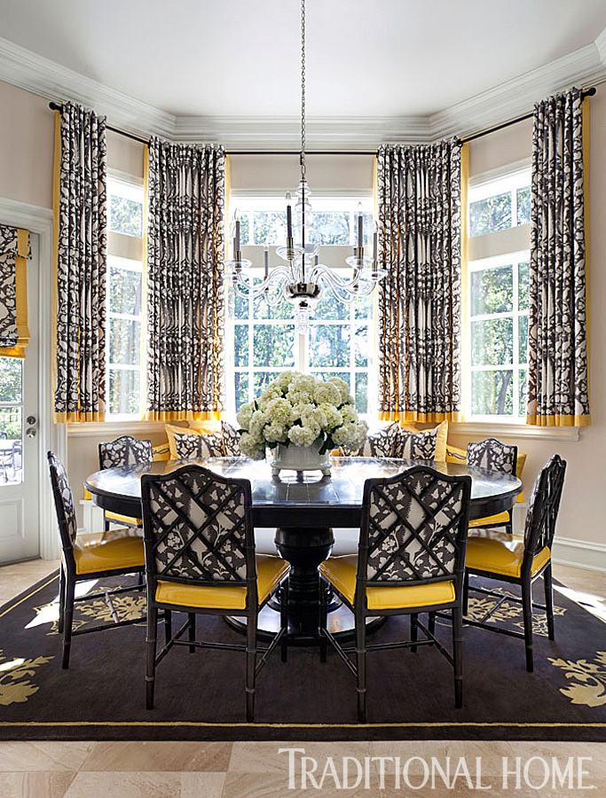
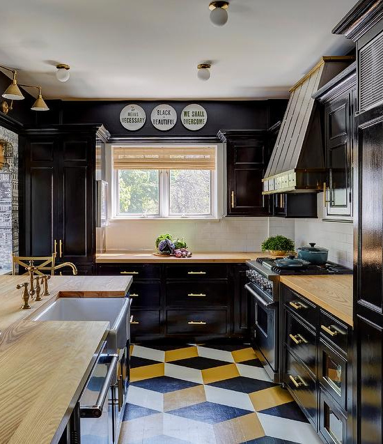
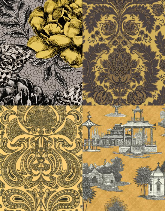
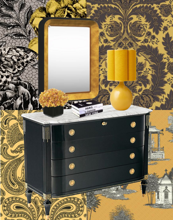
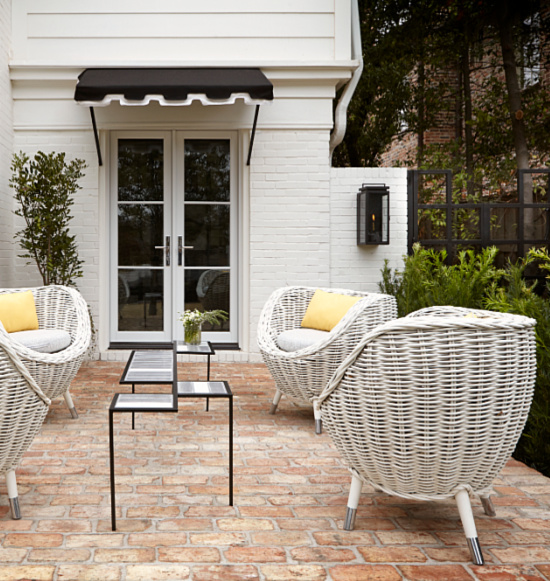
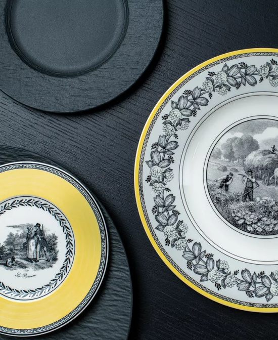
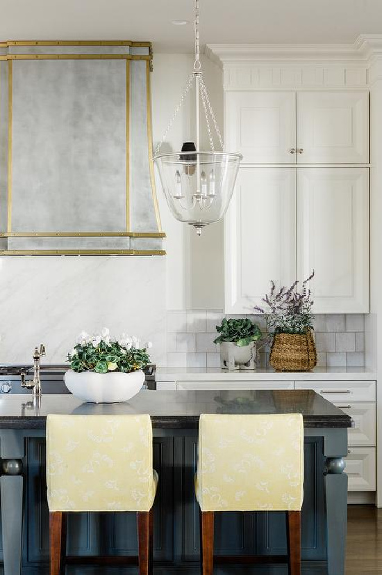
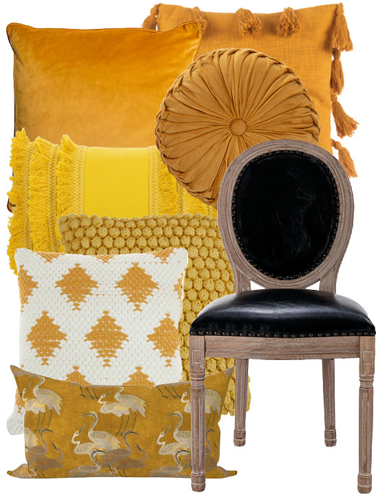
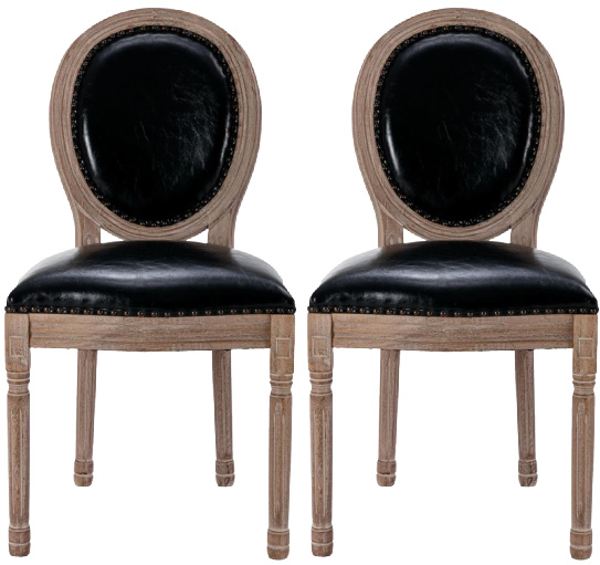
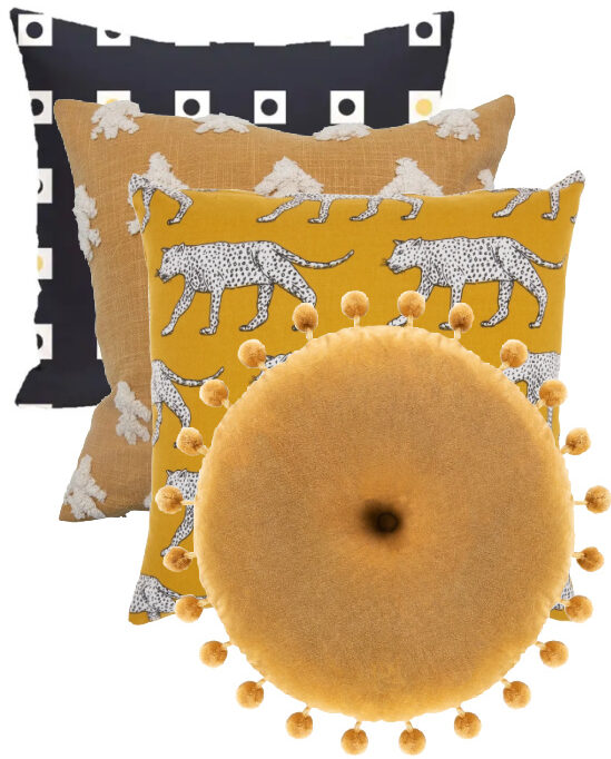
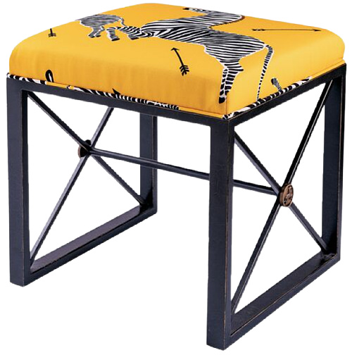
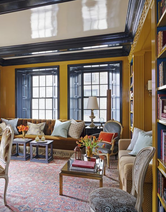
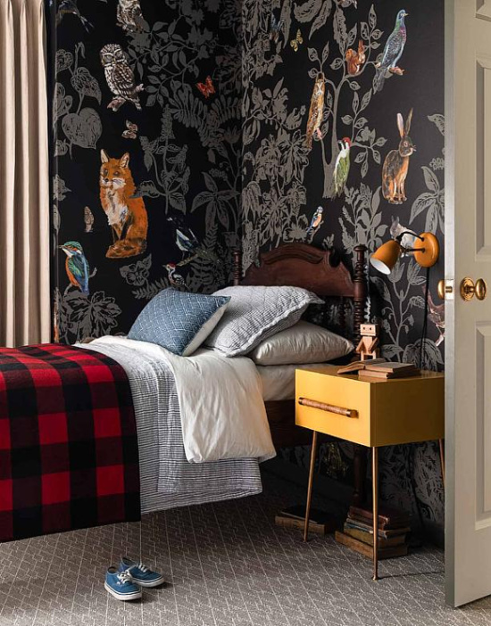
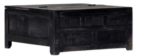
Decorating with black and yellow inspiration is courtesy of the lone bee buzzing around outside the window in front of my desk. February in Louisiana is known for its temperature swings and early spring previews.
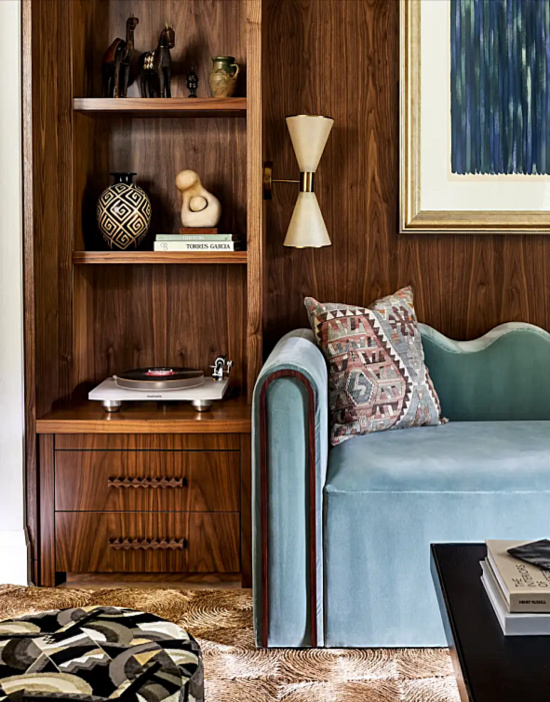
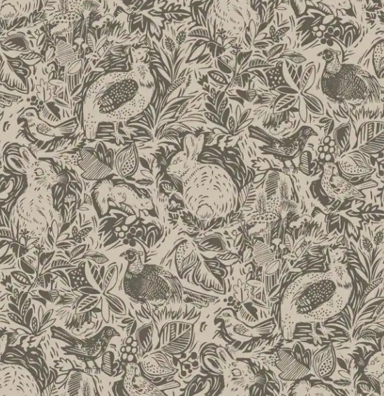
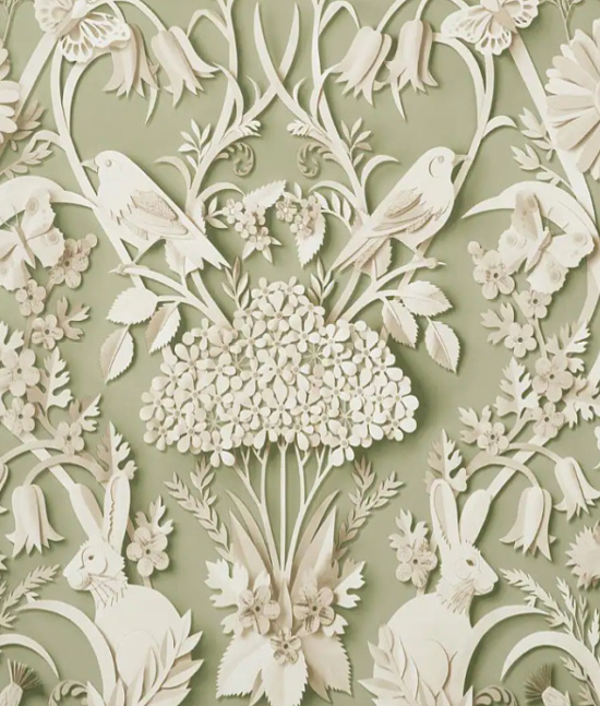
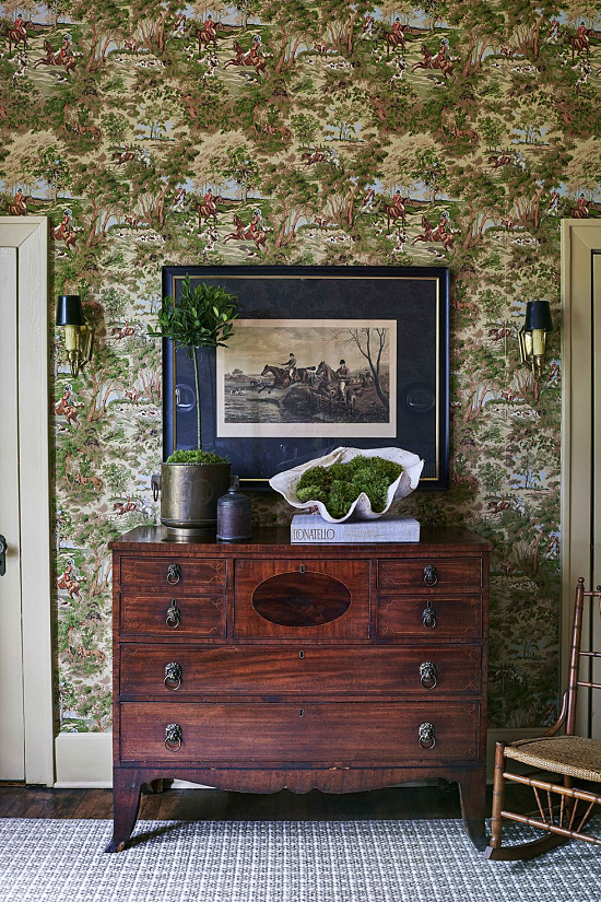
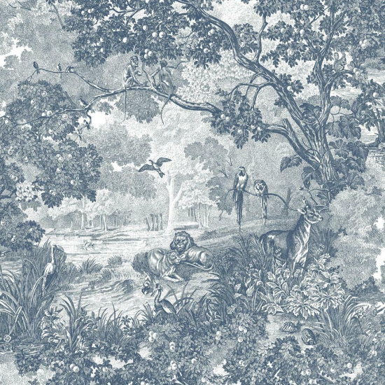
Interior designers, decoristas, bloggers, photographers and fashion mavens glean some of their best ideas by taking a page from the book of natural beauty.
Inspiration is everywhere and nature proves a powerful muse.
Several weekend getaways ago Dave the Builder and I treated ourselves to a leisurely afternoon drive through the garden district of a particular North Louisiana town complete with curb appeal ideas in mind and camera in hand.
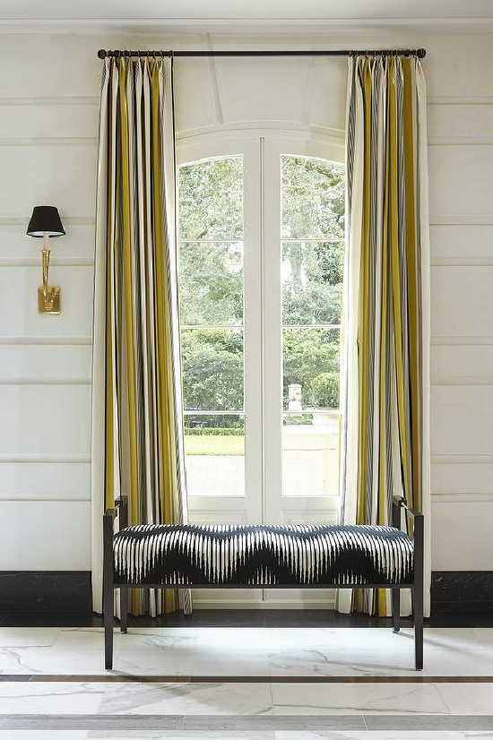
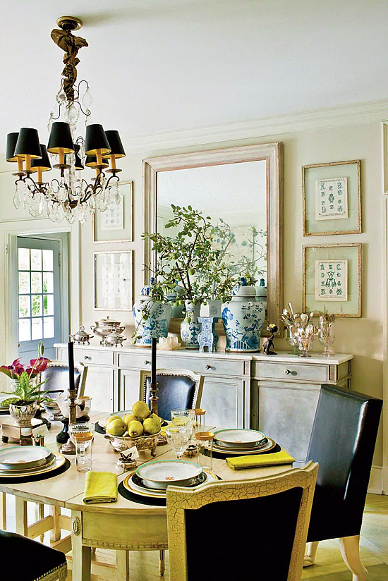
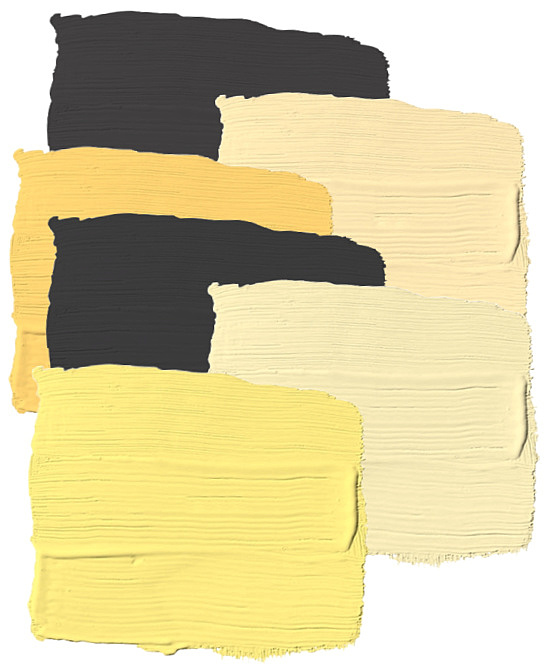
Realizing a total color combination immersion does not always provide the best palette complement to the whole, consider introducing color combination styling through accents and accessories.
Don’t you hate when you decide upon the color combination to suit space and style and the striking decor pieces perfect in the scheme of things can’t be found?
Look at it this way; the walls of the space serve as a blank canvas, and your vision in unison with your personal style stamp the design elements that create the palette.
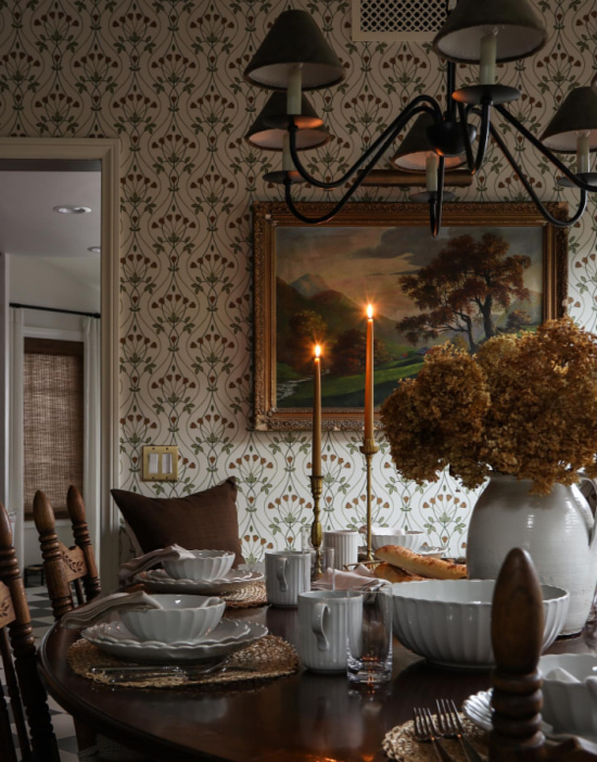
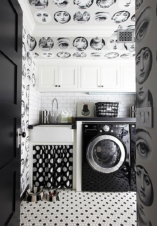
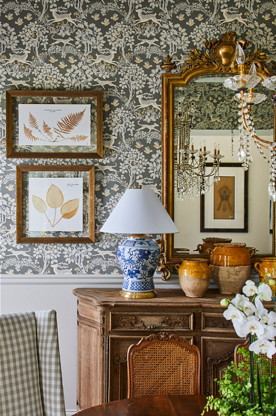
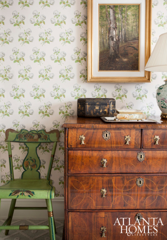
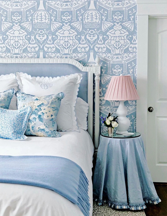
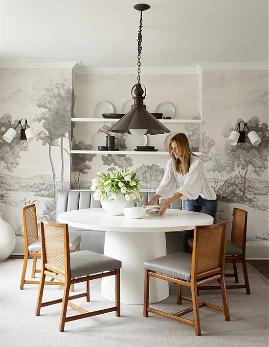
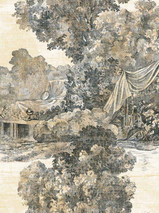
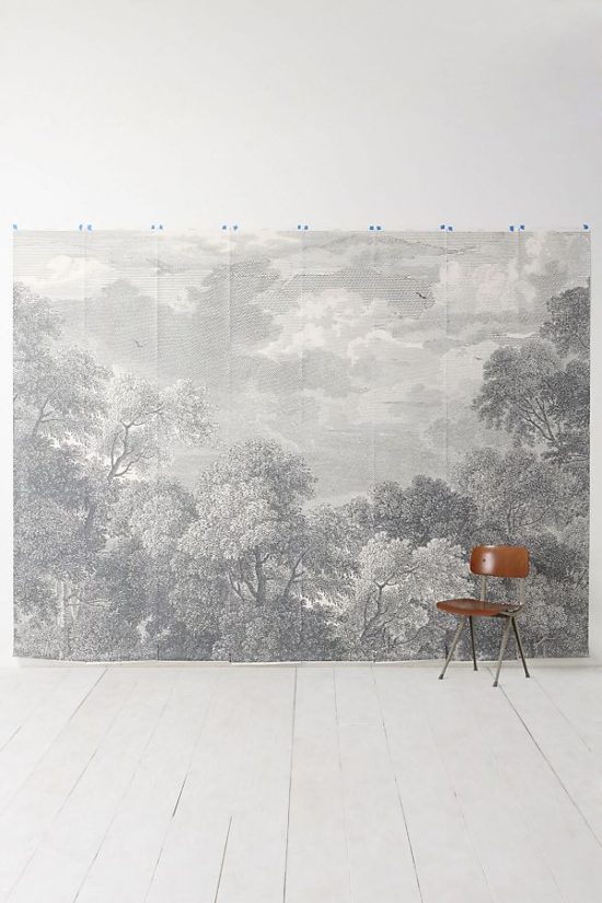
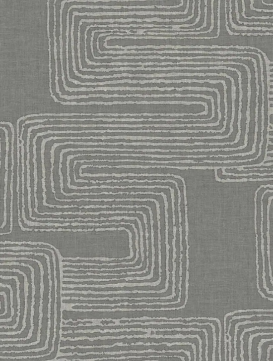
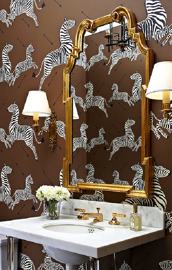
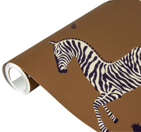
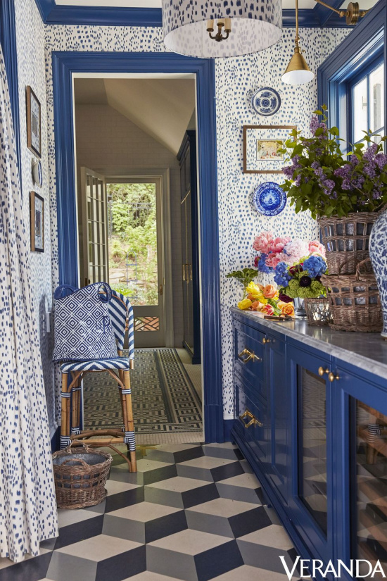
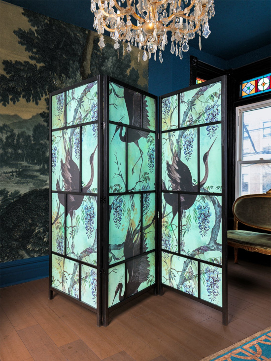
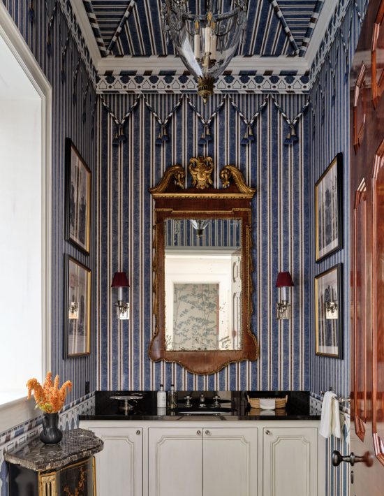
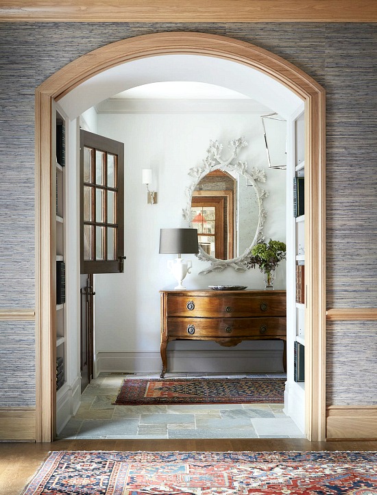
Decorative vision factored in with personal style creates the palette, and when wallpaper makes the design cut the visual impact is magnified through distinct colors, patterns and textures.
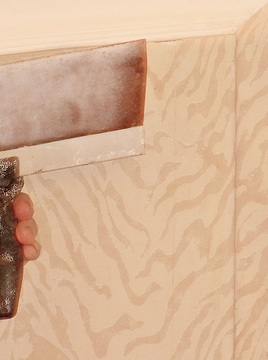
I’ll let Martha Stewart and Company explain How to Hang Wallpaper (click on the link for instructions), and I’ll cover the differences between traditional and removable aka peel and stick options.
Application options grant homeowners and renters alike decorating freedom.
Traditional wallpaper wins out in the following categories:
Overall quality of the product.
Staying power.
Ease of positioning on the wall during application.
Most traditional wallpaper comes pre-pasted. To activate the paste, the wallpaper is soaked in water.
Removal of traditional wallpaper is not a quick process when compared to the rather easy removal process of peel and stick paper. From personal experience I learned using a wallpaper steamer to remove traditional wallpaper is the way to go.
Removable wallpaper is peel and stick apply today, easy removal tomorrow.
Renters sing the praises of peel and stick. DIY friendly in many cases, it lives up to its peel and stick label with no pasting or soaking required, but application does require patience and precision.
Correcting placement once applied proves a bit of an issue with the need to remove the panel and begin again almost a guarantee.
Mama Places In The Home and I were having a conversation the other evening about first one thing than two when the focus of our chat turned toward why we favor the design styles we do.
Traditional with a fresh perspective pretty much best describes my preferred design style.
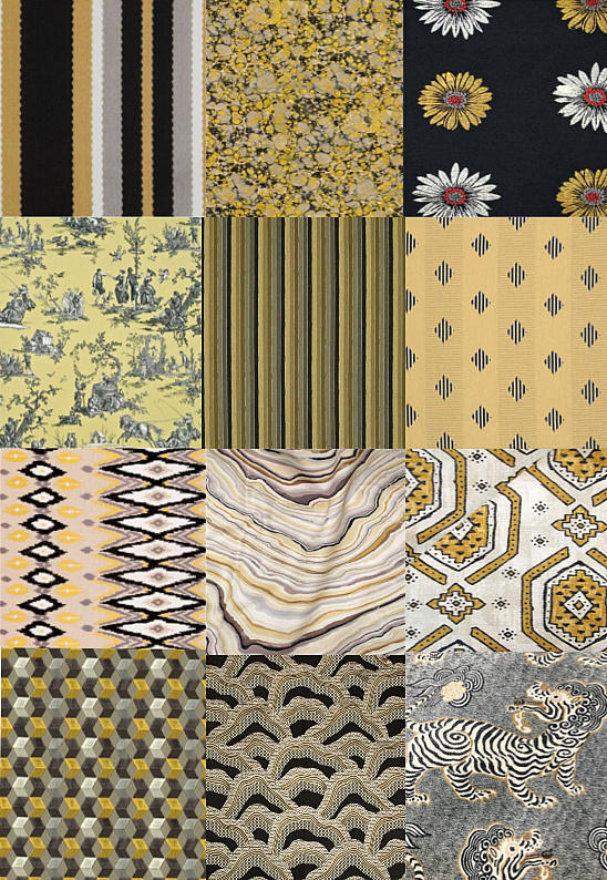
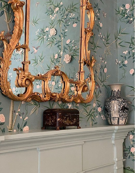
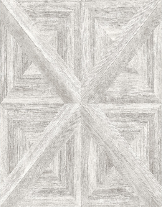
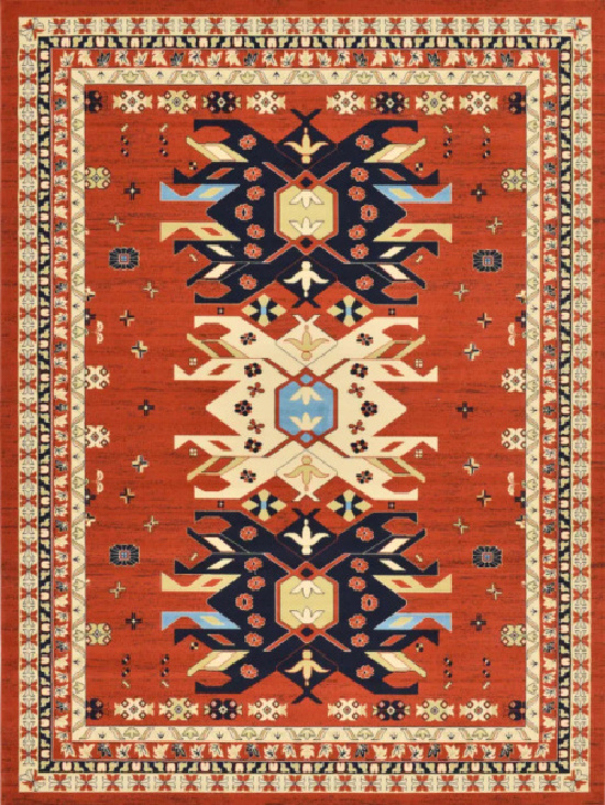
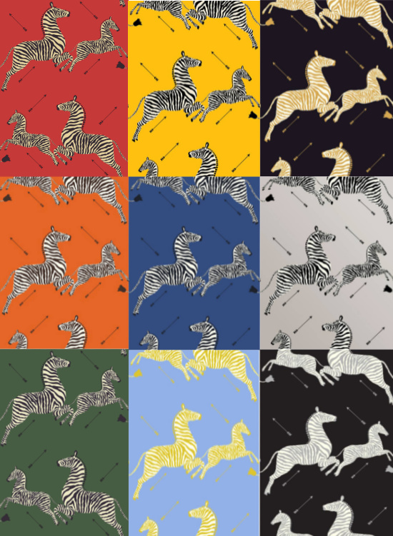
Factors to consider when deciding on a pattern, texture, and type basically involves personal style preferences and what space the paper will be used in.
Of course scale, flow, and balance in regards to the neighboring rooms must be taken into consideration when selecting patterns.
Matchy-matchy isn’t necessary, however, pattern power clashing gets awfully busy with the eye, and runs the risk of overpowering the intended design statement.
What a modern adaptation has the ability to do is suit today’s personal decorating preferences while acquainting the eye with a fresh take that immensely enhances the core design style.
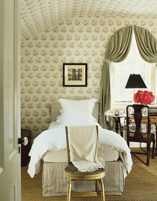
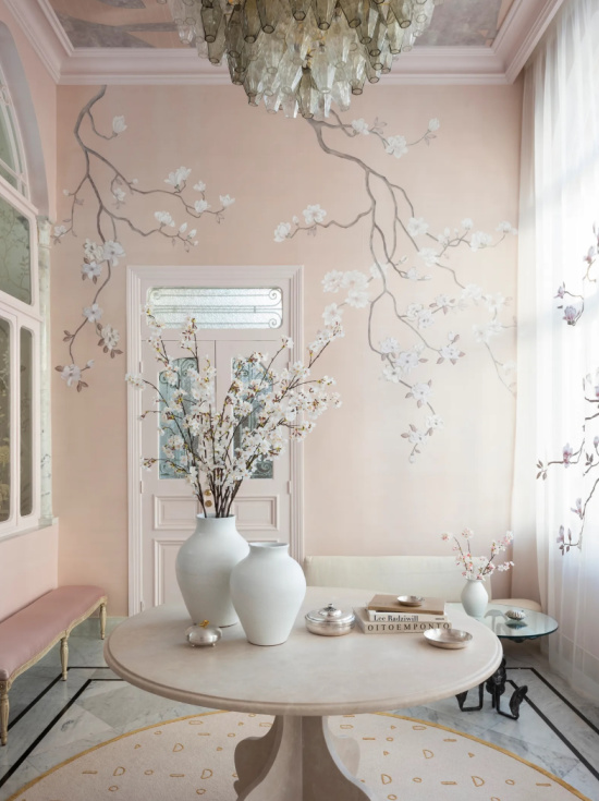
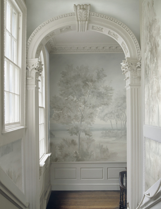
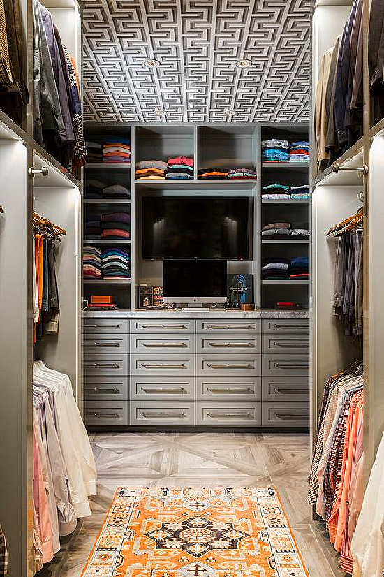
“Use wallpaper in unexpected places: on the ceiling in a paneled room,
in closets, hallways, and small foyers.
A great pattern or texture in small spaces
can be a prodigious twist!”
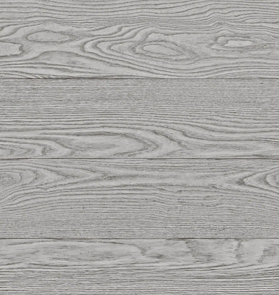
The once a flipper, always a flipper side of my brain together with my decorating eye spies the divine flooring and thinks flip that beauty from floor to ceiling with this choice.
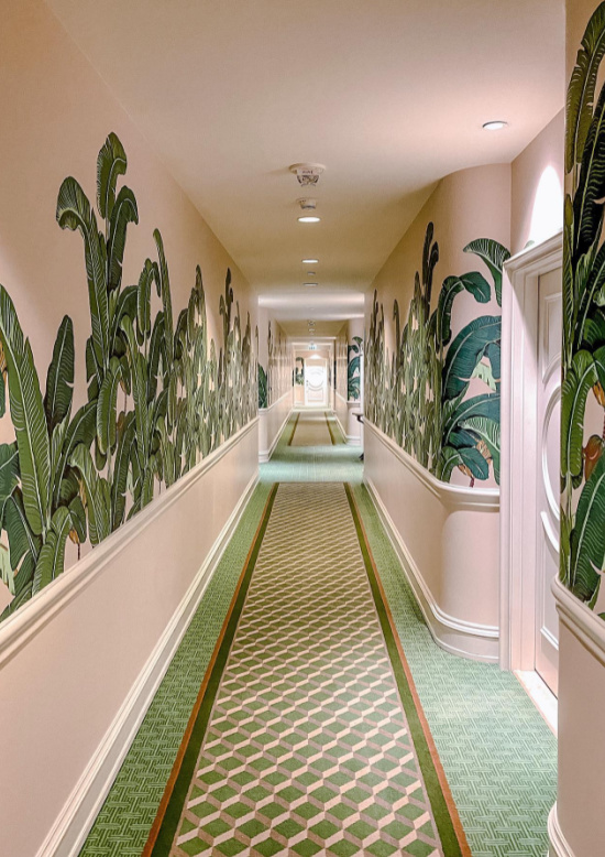
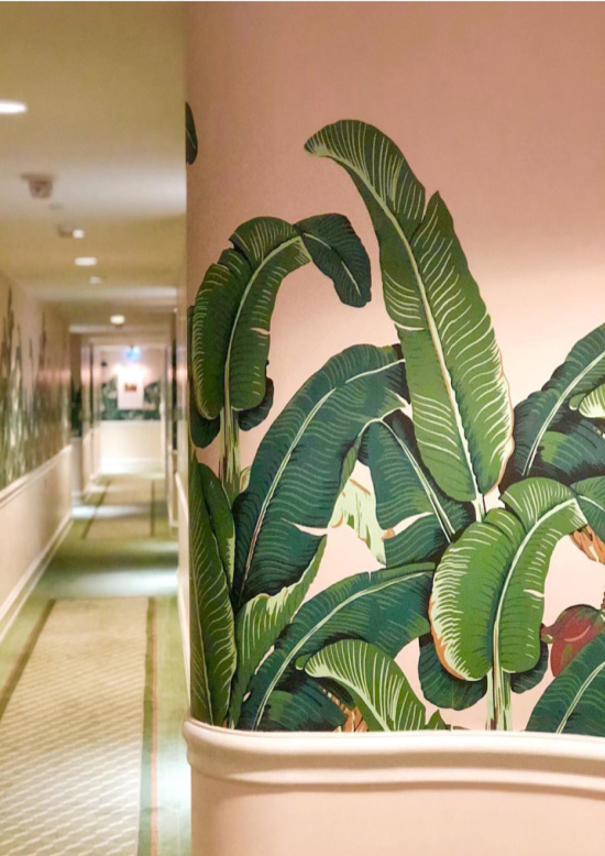
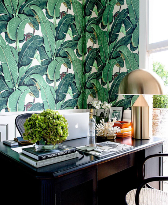
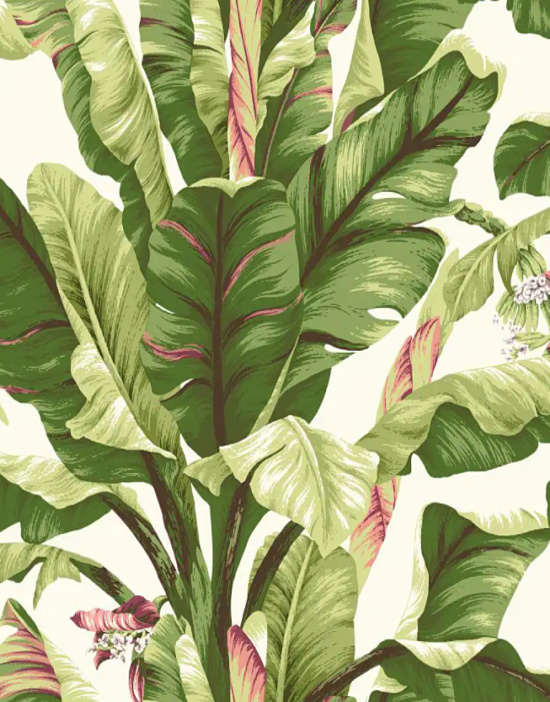
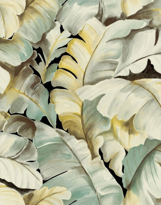
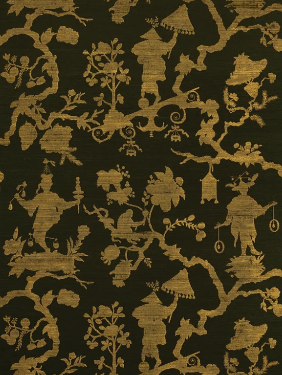
Iconic pairing of color and pattern, the instantly recognizable banana leaf design Martinique wallpaper designs and decorates the equally famous Beverly Hills Hotel.
Rules apply for balance and form, but consider this- the unexpected use of color or well thought out and very intentional placement of a design or décor element in a “I would have never thought of that” place keeps things interesting.
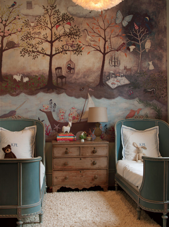
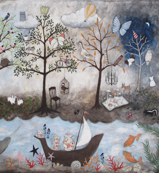
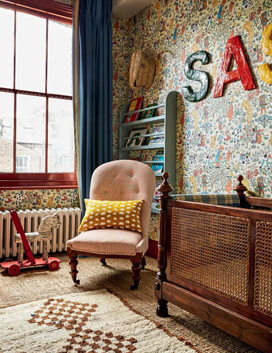
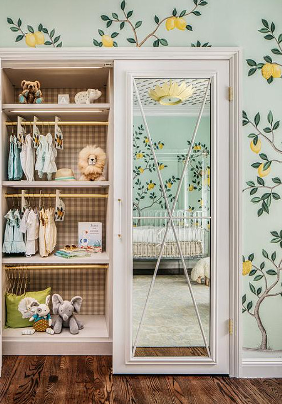
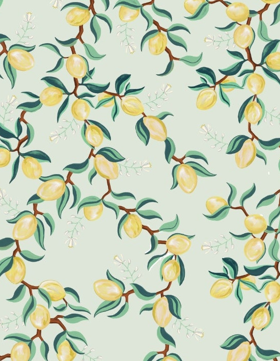
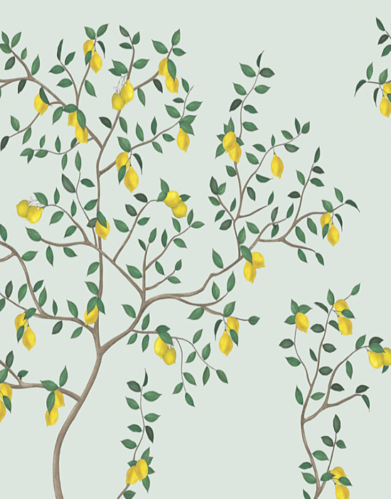
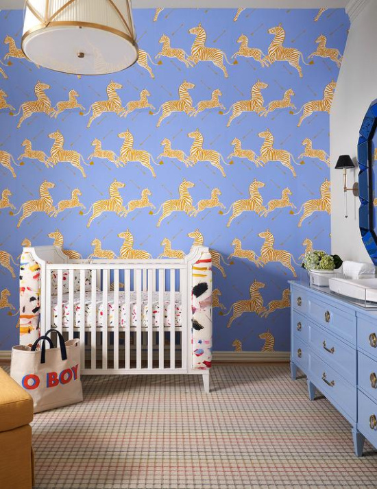
As noted in my Lemon Influenced Home Décor post, nursery through to kids room design and décor has made great strides in the big style for little ones game.
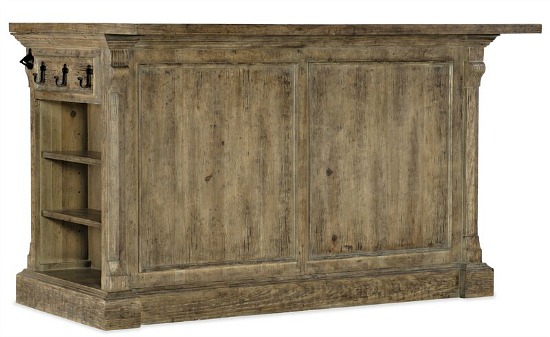
When farmhouse/modern farmhouse design style flooded the screens and scrolls of the design and decorating loyal, textured and the look of textured found a resurgence in popularity.
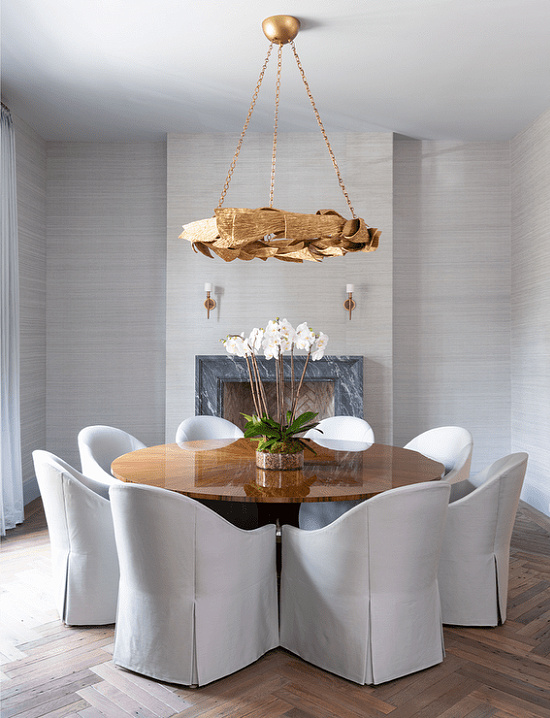
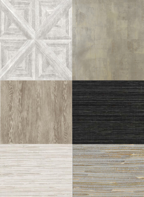
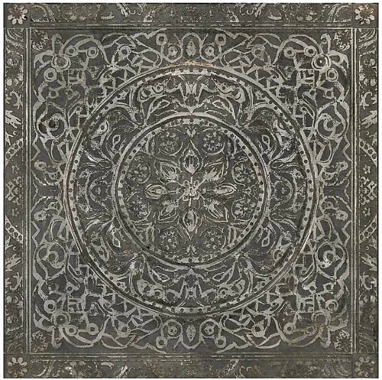
Many associate textured wallpaper with commercial installs, and though it is true you will find it a decorating darling of commercial spaces for the sake of durability in both style and quality of product, textured wallpaper conforms to residential use in spectacular fashion.
I’ve installed, suggested, and used grasscloth many times over the years in properties we flipped, commercial and residential design jobs, and in our personal homes to rave reviews.
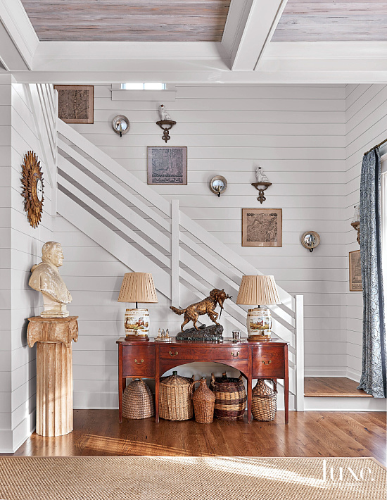
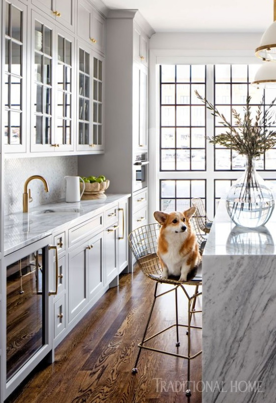
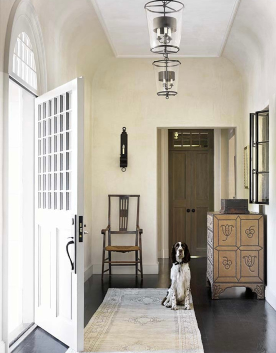
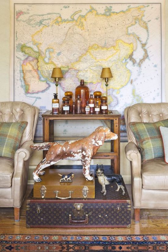
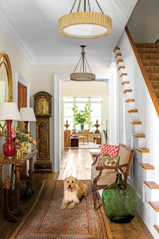
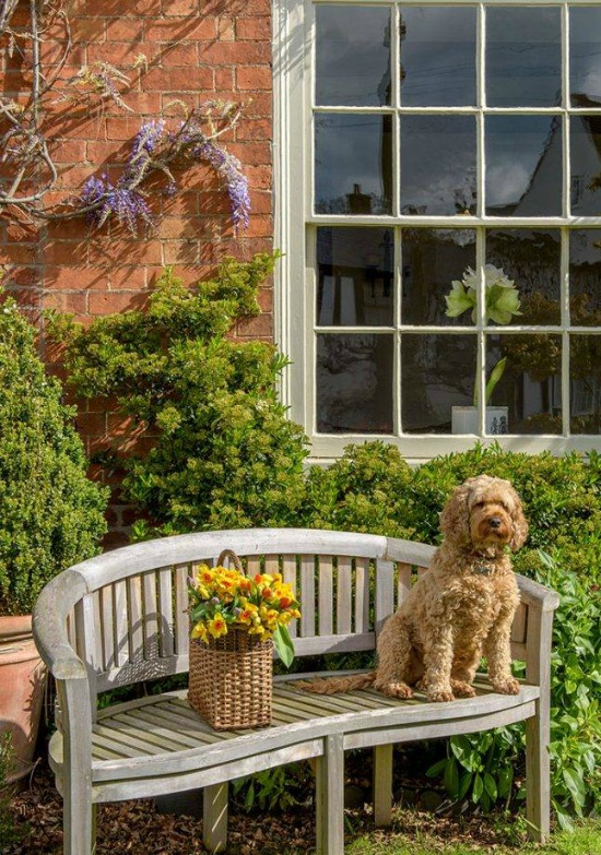
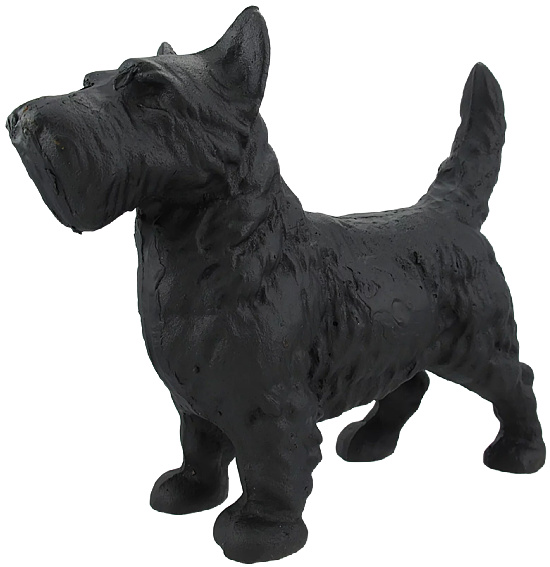
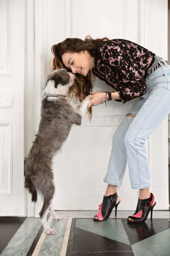
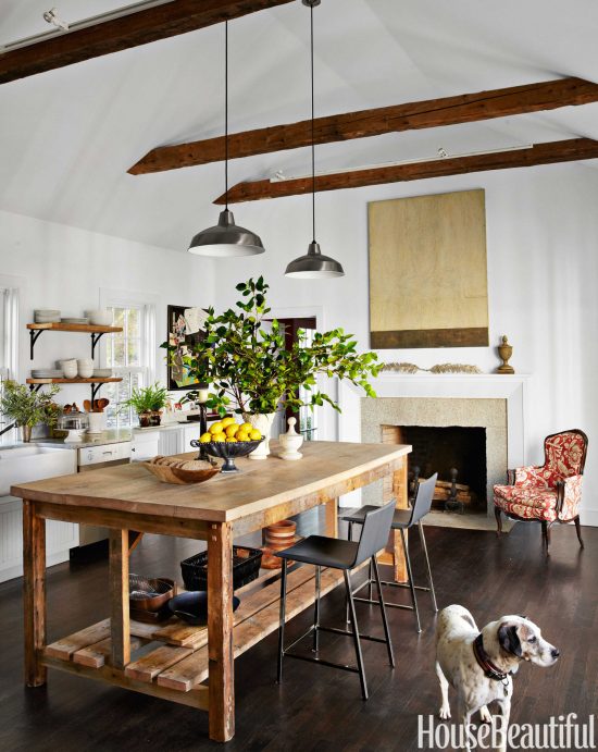
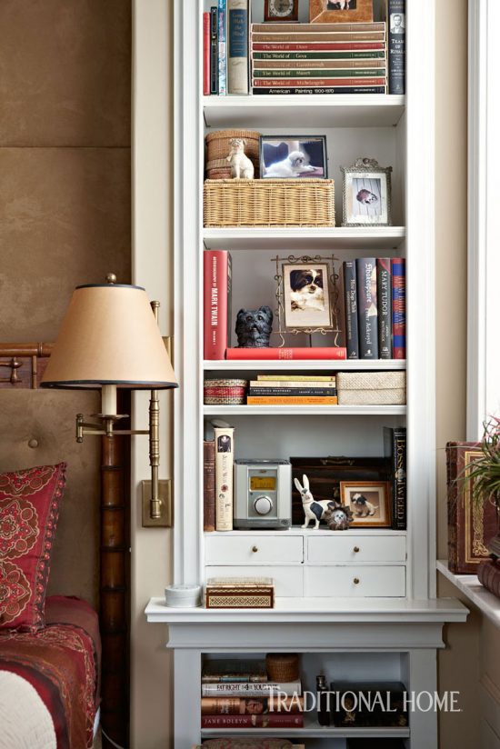
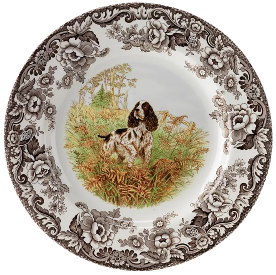
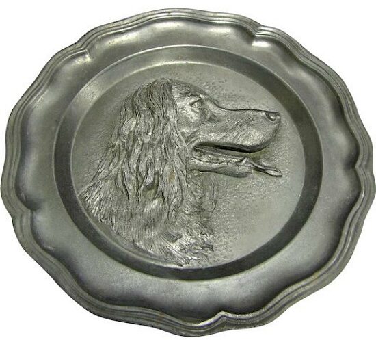
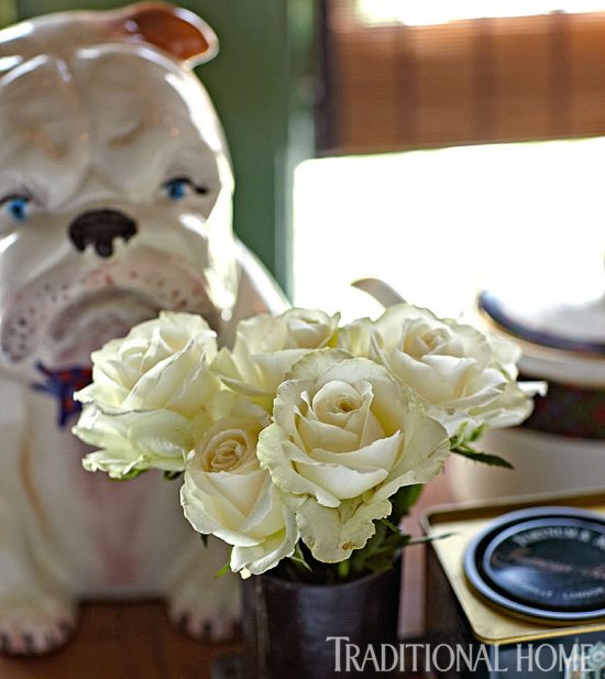
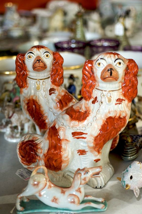
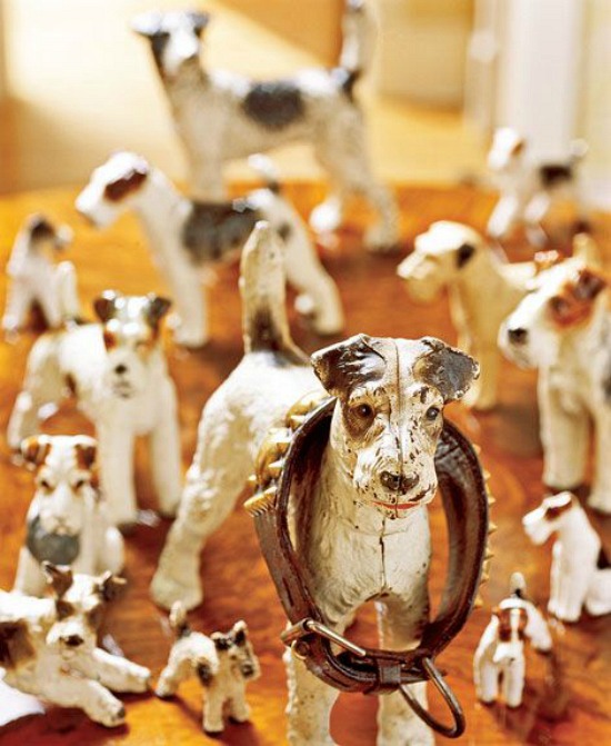
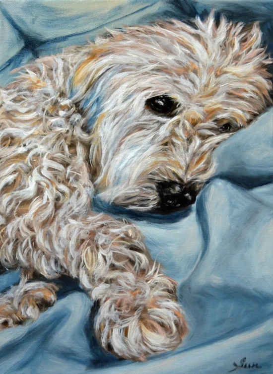
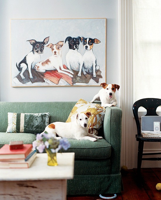
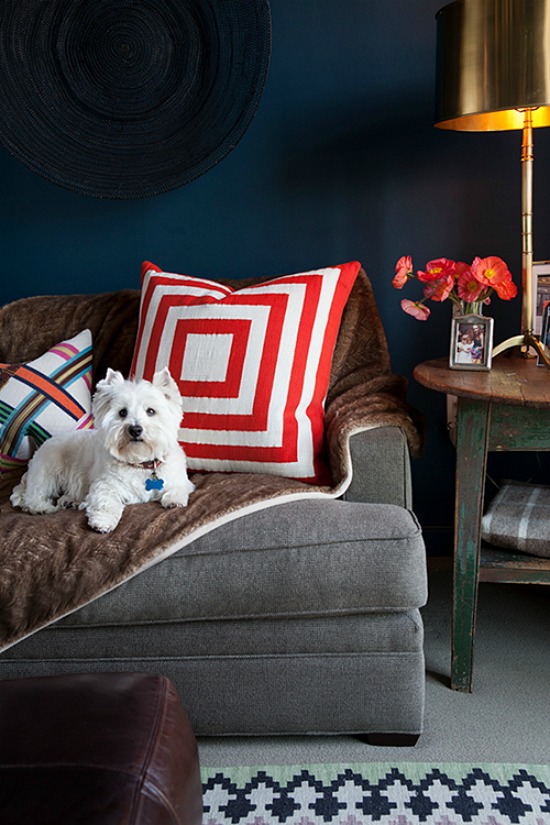
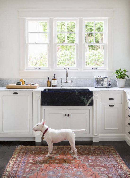
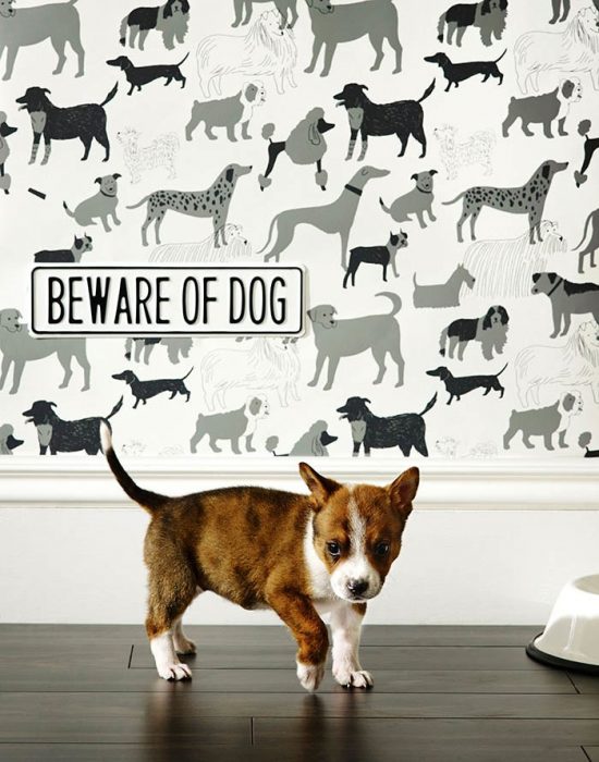
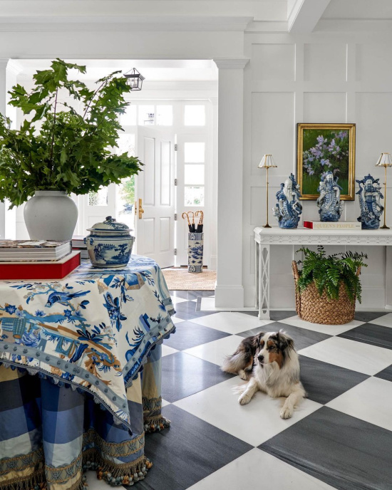
Unconditional love given to us by our beloved four-legged friends enriches our daily lives and the life lived within our homes.
“I think dogs are the most amazing creatures;
they give unconditional love.
For me they are the role model for being alive.”
—Gilda Radner
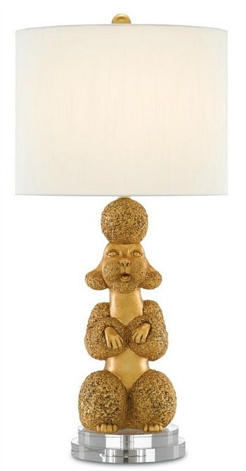
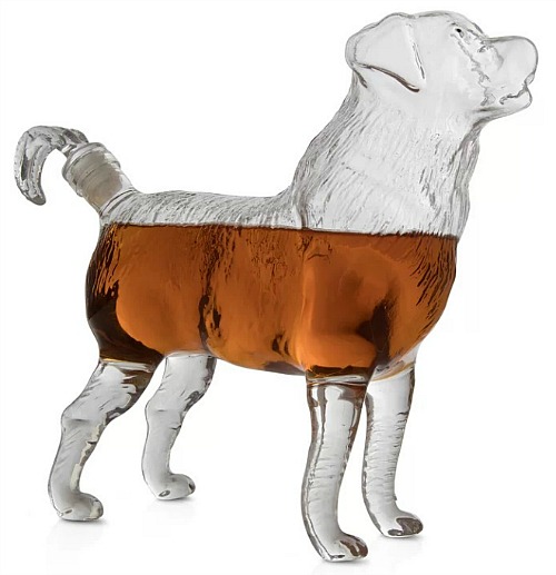
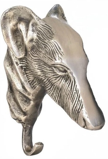
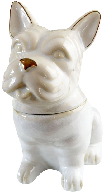
I, like many other dog lovers, love the idea of a special day designed to celebrate dogs “decorating” designer rooms with the wow and the woof factor for National Dog Day.
The dog days of summer refer to the hottest days of the season, but the dog days of interior design and decorating refer to the hottest four-legged accessories for the look of the season.
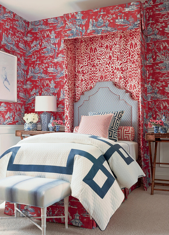
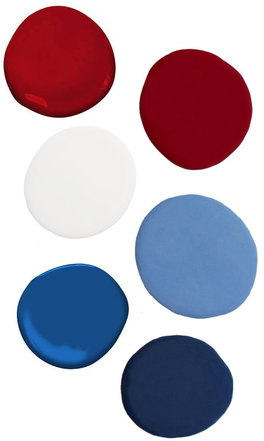
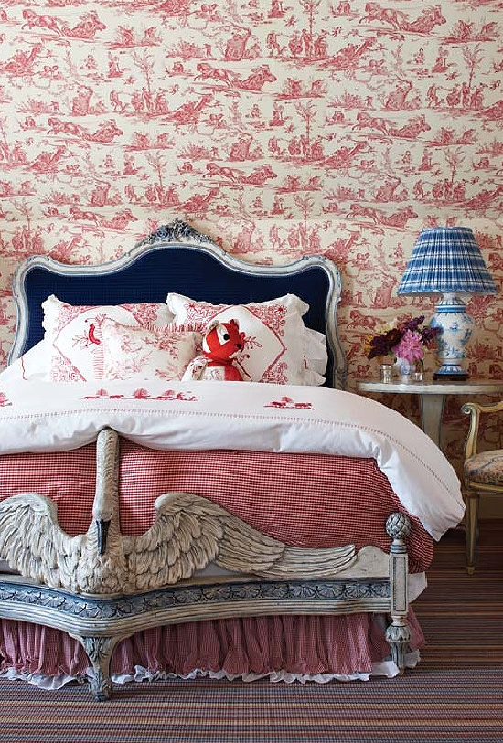
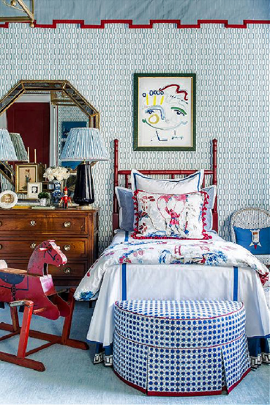
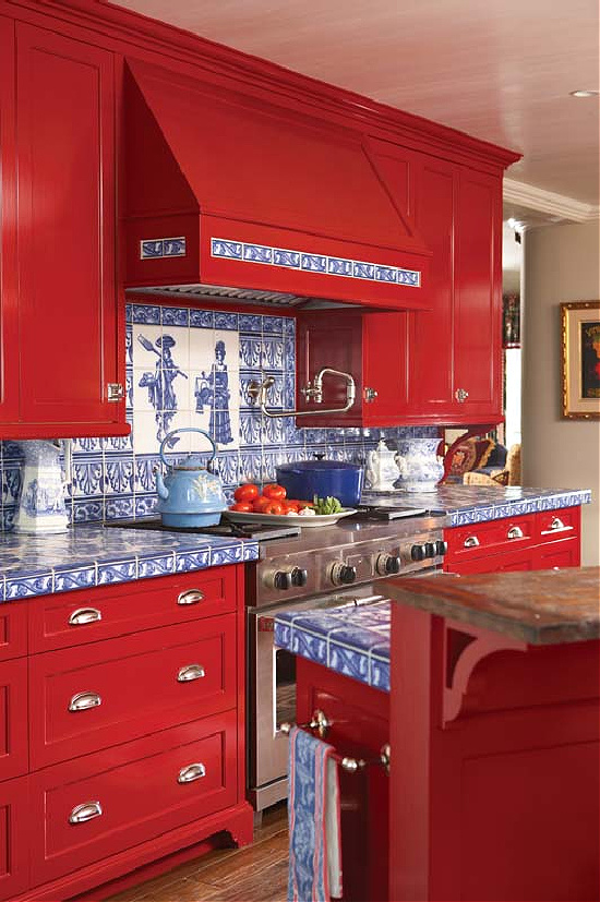
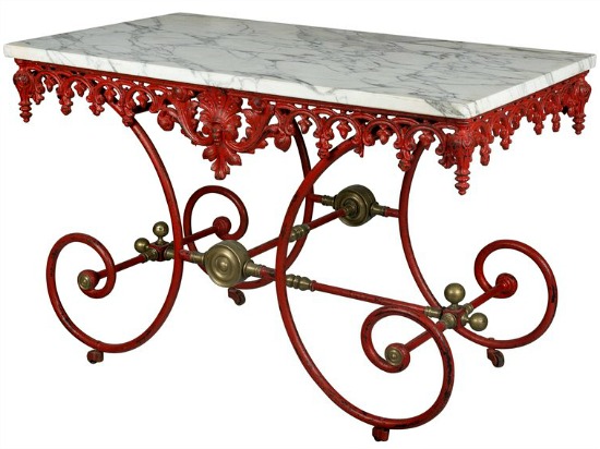
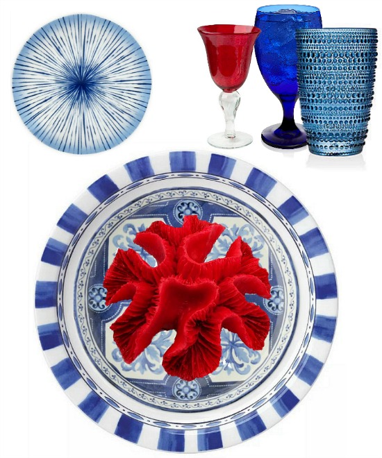
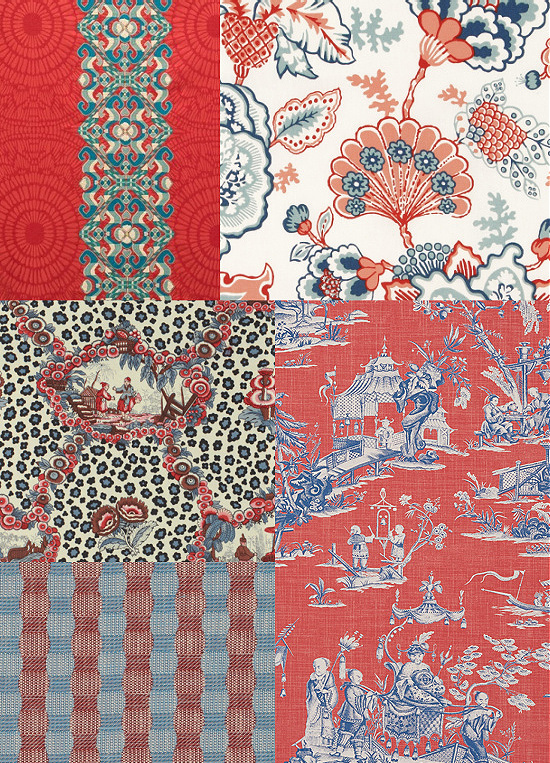
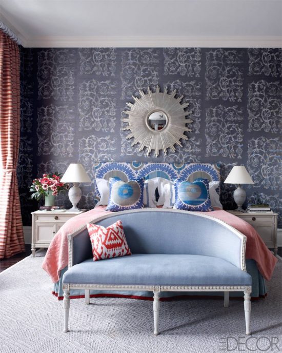
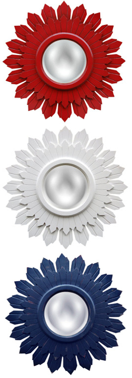
Red, white and blue accents inspired by stellar color choices, engaging stripes, and timeless patterns star in this showcase featuring the bold and bright patriotic inspired palette- the original grand pop of color.
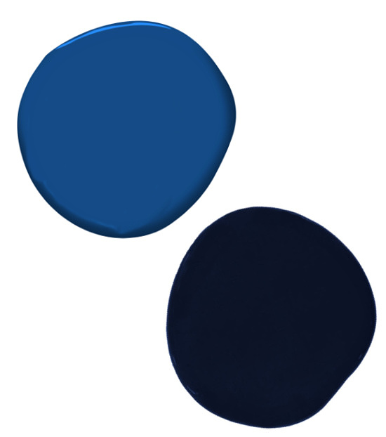
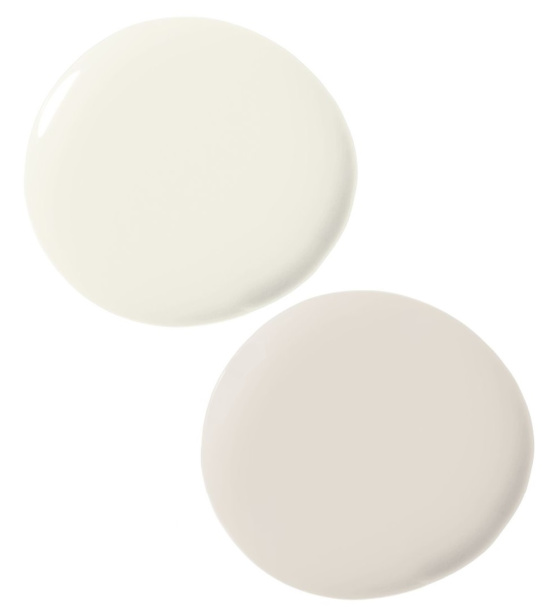
Red, white and blue paint colors in deep, rich, vibrant, and dramatic tones and shades promote a full-on color blast, burst, and boom of visual fireworks.
There’s nothing kiddie about the look created in these kids’ rooms.
Enticing the eye is mixture accomplished by Eclectic Recipes and this red, white and blue stack of red velvet pancakes topped with coconut syrup and fresh blueberries.
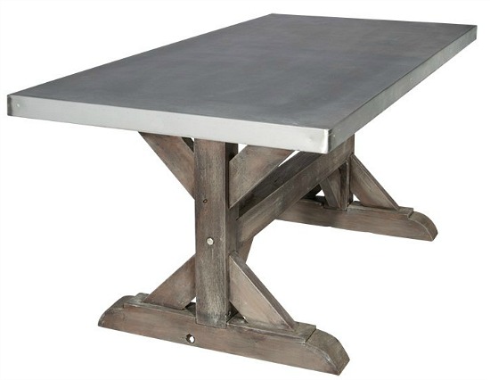
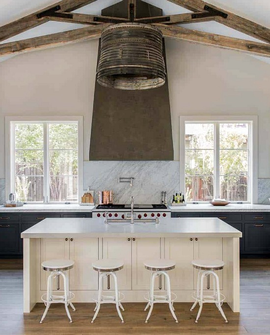
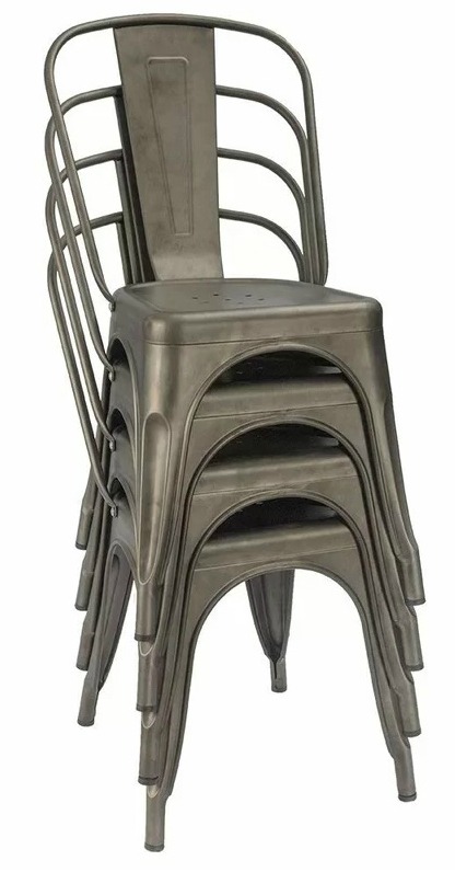
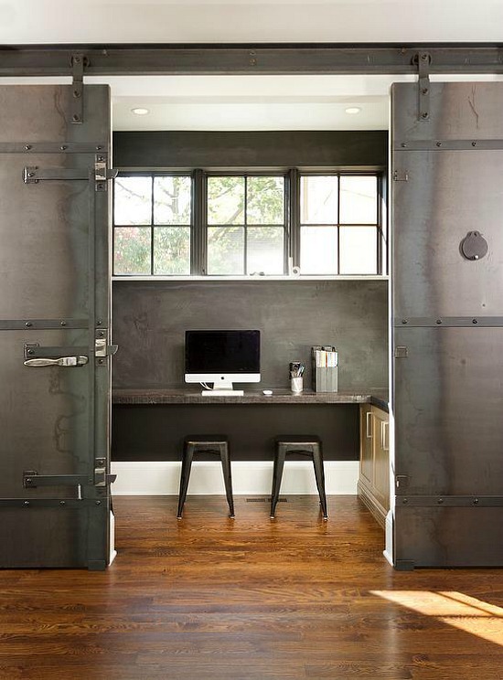
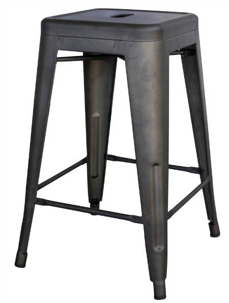
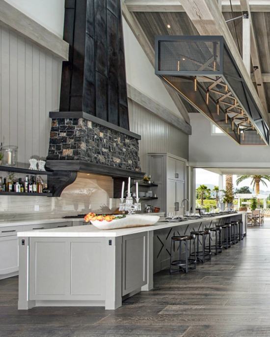
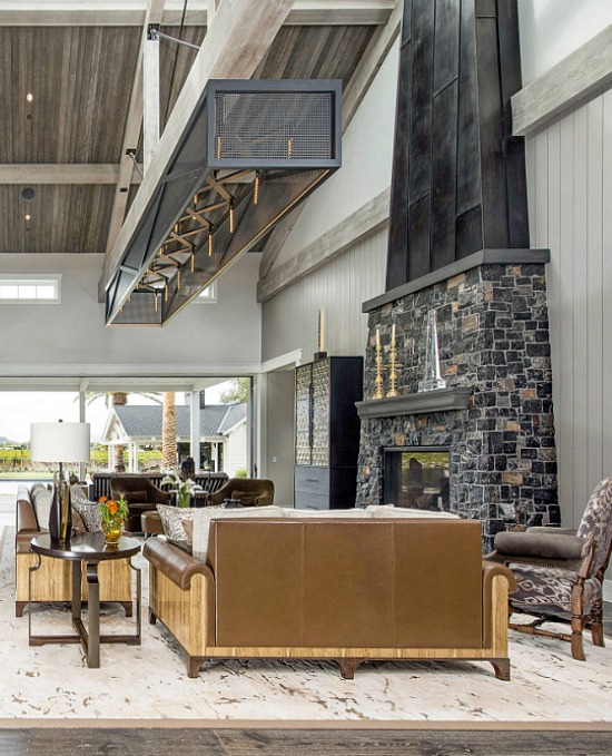
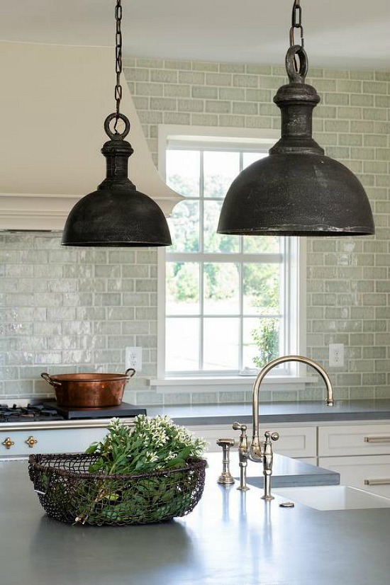
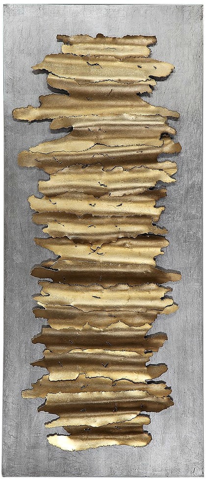
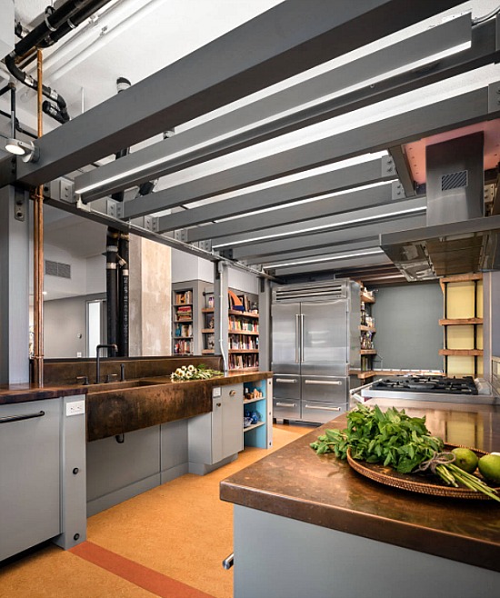
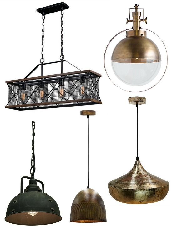
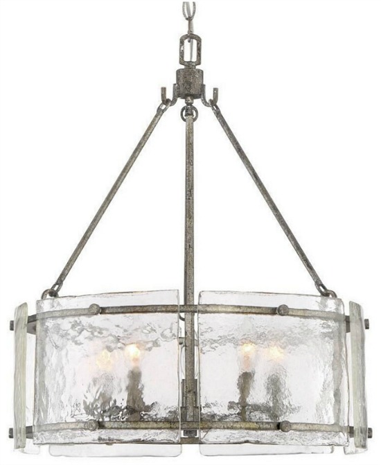
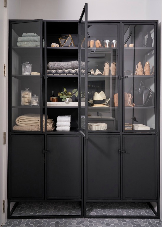
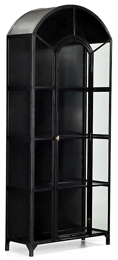
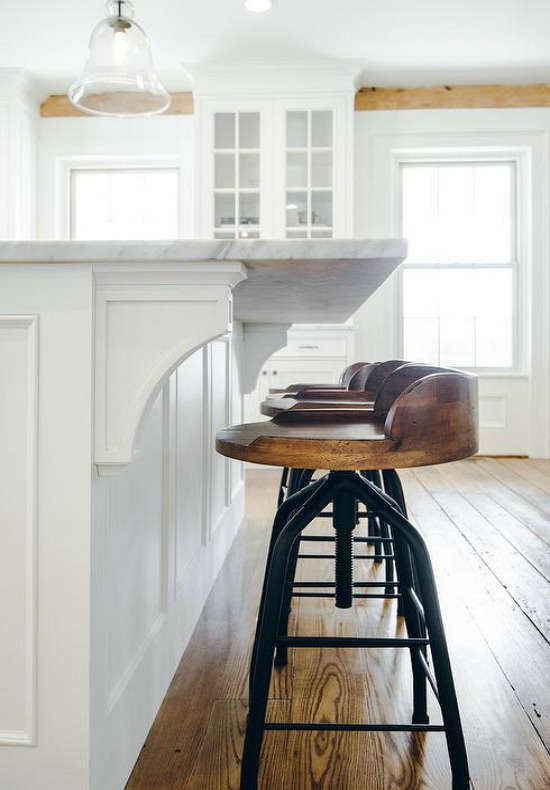
A distinct modification to the hard edge of industrial style is afoot- a reinterpretation best described as rustic industrial style.
Change is constant, and the world of design and decor is not exempt from changes or adaptions.
Rustic is often assigned to several different design styles, casting a broad net over the design application.
Industrial style is not a personal favorite, however, the present softening of hard edges in favor of tipping the scales ever so slightly towards a new traditional modern farmhouse look has the decorative oomph to win me over.
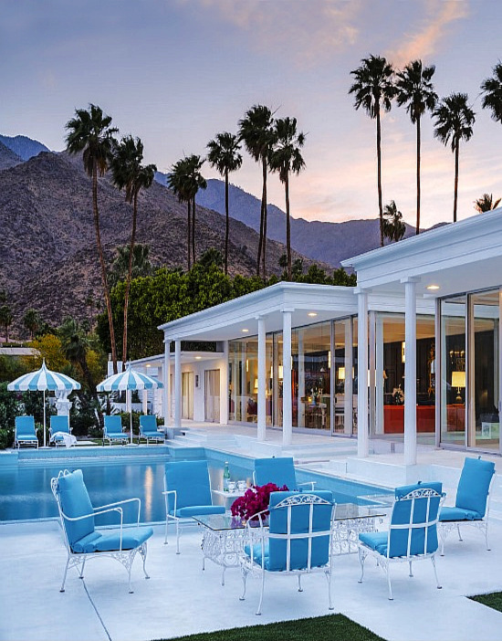
Back in the early 1980s, Dave the Builder became enamored with the modern meets contemporary design style that was all the rage.
Glass.
Chrome.
Metal color palette.
Dave the Builder was intrigued, and I was perplexed.
We met in the middle of are you kidding me and we’ll give it whirl.
We remodeled the living room/dining room combination to suit the style, and when completed we ended up with a space that was stark, cold, and characterless.
With rustic origins relating to vintage wares, industrial style typifies a commercial appeal through the incorporation of wood and metal into the interior design and decor.
The phrase pop of color is rooted in the lexicon of interior design and interior decorating, however, not all color palettes necessarily reflect the broad brush stroke of what we commonly consider color.
Pulling home decor accents and accessories from other design styles avoids, or at least greatly diminishes, the risk of the space becoming locked into the hard line look of a particular decorating style.
Staying true to one particular decor style proves a comfort zone of sorts, while the constant discovery of what accents and accessories best fit your decorative style portfolio results in a satisfying experience.
When the winds of design and decor change and blow inspiration your way, step out of the box and try a new decor style.
Inspiration is a motivational powerhouse, and the driver behind selecting a word of the year.
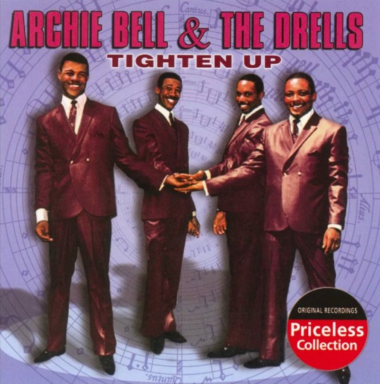
After a blowout Christmas holiday of eat, drink, spend, and give merriment, let’s just say we’re doing the tighten up dance around here with a little Archie Bell and the Drells thrown in for fun.
I’m embracing the new year with a clear 2020 vision for recognizing the areas of my life that could greatly benefit from a bit of improvement.
Resolutions tend to run their course about mid-February, so I go with a plan of action that I can easily meet and master.
Giving as much attention to cleaning up my mouth as I do cleaning up the house on a Monday morning is first up on the new and improved list.
Next up is working on being the kind of person to family, friends, neighbors, and strangers that you would want to go on a vacation with- the true litmus test of a person’s character, patience, and joy of life.
Diet?
The word itself has a negative connotation to it, so, no.
Awareness of smart and sensible eating, food choices, and portion control is a more realistic goal.
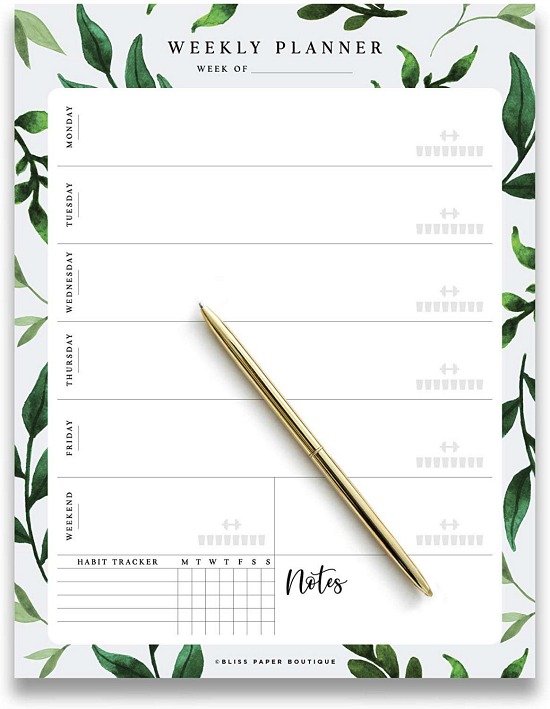
This brings me to my word of the year share.
Choosing one word to guide, ground, and direct you over the next 365 days is the optimum daily, weekly, and monthly planner.
My word of the year is not the typical word one would associate with motivation, inspiration, and the like, however, it turns out it’s a word with a purposeful meaning.
tight
adjective
\ ˈtīt \
: fitting very close to the body
: marked by unusual tension (as in the face or body)
: difficult to cope with
: relatively difficult to obtain
// money is tight just now
Several years ago after a traumatic financial turn of events in our normal (what the hell is normal?) self employed-go to work to pay bills and put food on the table-keep the lights on-doing all this to make a better life for our family part of life, we were left broke, broken, worried, scared to death, and frazzled to the core.
The how will we survive losing two businesses (one the bread & butter operation and the other the hobby turned luxury business) questions seemed to have no answers.
This was 2008 folks, and the residual angst remains with me to this day. The economic downturn gripping the nation was beating the crap out of us, but I’ve never been one to find comfort in the it’s happening to some degree to everyone way of looking at things.
Sitting alone in the office staring down at numbers, balances, and bills, the word tight popped into my head.
Money was tight and getting tighter by the day.
I was feeding my feelings, so my clothes were tight.
Fear set in quickly, taking me from happy go lucky motormouth to dejected mute resulting in my throat growing closed and tight.
Tight certainly summed up the situation.
I picked up a pen and wrote the word tight vertically on a piece of scratch paper.
As I sat and stared at the word standing out among figures and fear, what came to me was a Mary Tyler Moore (you’re gonna make it after all) moment of clarity, courage, and comfort.
I picked up the pen and put the pieces of what seemed an unsolvable puzzle together.
This Is God Handling Things
HE did, and he does every single day.
The takeaway boils down to this:
I knew, and continue to know, the importance of listening to that little voice inside you. More times than not it’s the true voice of reason.
Give yourself permission to take time for an alone moment to gather yourself and clear the noise life has a way of amplifying at times.
From designing, decorating and all the life changing decisions in-between, silence is golden, essential, and a hot commodity in the decision making process.
Not all closed doors open up again the way we think they should or want them to, but swing out in a whole new direction that over time and in HIS time pave the way to peace, promotion, provision, and understanding.
With 2020 vision, I realize how my personal relationship with God in prayer, word, love, work, thought, pen, and paper guides me through the good, the bad, the old, the new, the beautiful, the stylish, and the tight.
The creative process includes designing ourselves to be the very best we can be.
Grab 2020 by the new year with a word of the year that will make each day, week, and month the year of the very best you.
Gearing up to add a touch of fall to house and home, the creative process requires giving thought to the elements of design and decorating that will best welcome personal style home.
With a discerning eye, I evaluate what makes the cut.
Many of us derive our personal design and decorating choices from affecting colors, textures, patterns, scents, sounds, and ingredients we’ve impressively seen, felt, heard, smelled, and tasted.
If something leaves a lasting impression on you, one strong enough to influence your design and decorating choices, by all means bring it home!
The life lived within a home comes alive through personal style and taste, and there is nothing more chic than the home that beautifully demonstrates this.
Regardless of season or occasion, design and decorate with a sense of you in order to distinctly welcome personal style home.
Enlist the senses to aid in a frank assessment of what is working for you in the space and what is not.
Picture a tree and its branches.
The tree trunk represents your signature design style preference- the all things house that make a home foundation.
Branch from the “trunk” with transitional pieces.
Select a reference point for color, pattern, and/or texture and “branch” out from there.
If the date stamp on certain pieces has expired, purge these items from your decorating portfolio.
I catch myself attempting to justify keeping pieces long past their decorative prime because somewhere in time it appealed to me, and perhaps it may again strike my fancy.
No, Hattie Hoarder, it won’t.
Say goodbye to the stale, the outdated, and the expired in lieu of something or nothing (less is more sometimes) better suited in its place to welcome personal style home.
Our interior design, decorating, and home decor choices reflect our core design style preferences.
It’s these thoughtful and personal choices that resoundingly welcome personal style home.