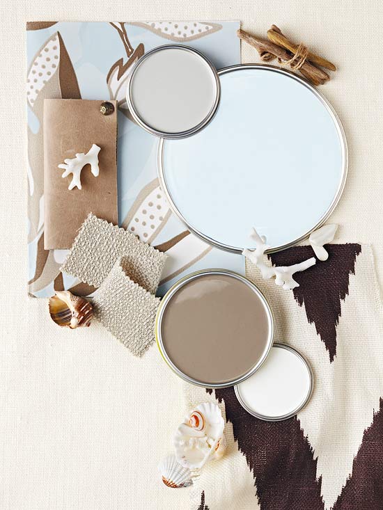
The color spotlight for this week shines on the palette perfection brought forth by the calm, serene and often understated elegance of a blue, brown and aqua color palette.
Traditional Home
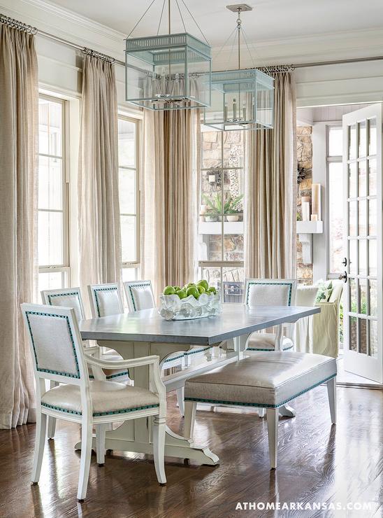
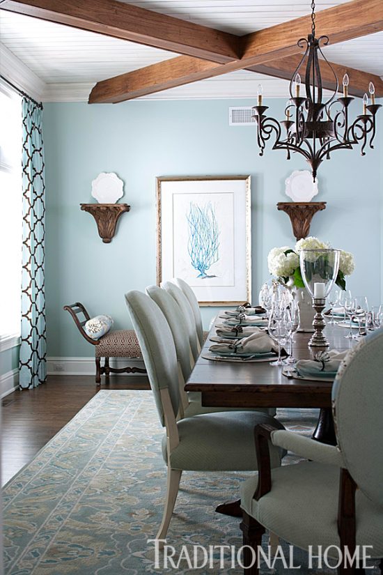
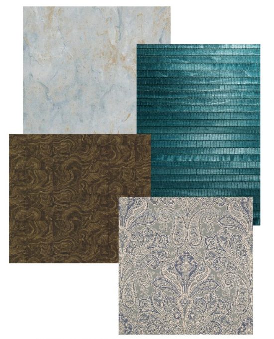
A tried and true color palette choice, a blue, brown and aqua color palette is not your average lock you down to basic run-of-the-mill color palette option.
Selections of varying shades work together to serenely frame a space regardless of decorative style.
Glynis Wood Interiors
From the subtle shades of coastal blues and tranquil aquas to a bold turquoise paired with a warm Moroccan, the blue, brown and aqua color palette strikes a perfected balance of blended shade and tone culminating in flawless color palette execution.
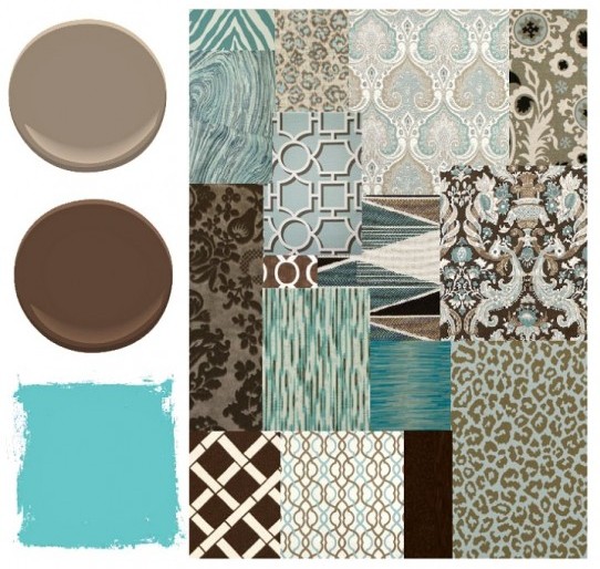
Working with classic color palette combinations as the decorating foundation and building from there allows for a fresh perspective in the grand color palette scheme of things.
Aqua, turquoise, Tiffany or Wedgwood- the many tones, colors and shades available in the current paint, fabric, upholstery and wallcovering marketplace reflects the popularity of this palette and how it fits in with the design and decorating styles and tastes of today’s decoristas.
Our son is on the move once again in the pursuit of higher education and stylish digs, and thus begins our adventures in decorating rental property.
He has clear and concise idea of what he wants on the education front, but questions his decorative decisions on the latter.
I’m considering replacing my LSU Mom bumper sticker with a custom sticker stating “My son and my money and my furniture, home furnishings, and home decor accessories go to LSU.”
It’s important when decorating rental property to be fully aware of the rules and limitations regarding changes to the existing decor, but to also keep a personal stamp of style in mind.
Color does just that.
The color palette I’m suggesting consists of his all time favorite colors.
It’s been established the living area and kitchen colors will remain as is for the following two reasons:
Our kitchen repaint is nearing the final stages however, my accessorizing vision is not quite at 20/20.
When we started the initial remodel of our house, the color choices I selected really made an impression on me.
My tastes change, lighting becomes unflattering, and I begin to question my past decor choices.
Do you do that?
I have the luxury of not being on a time clock when selecting the color, design, and decor of my own home.
The process is slow, thorough, and one I try to make right the first go round.
Do I get it right the first time every time?
Of course not.
“Re” is a big part of my design and decor vocabulary.
The color selecting process has purposely been at a snail’s pace.
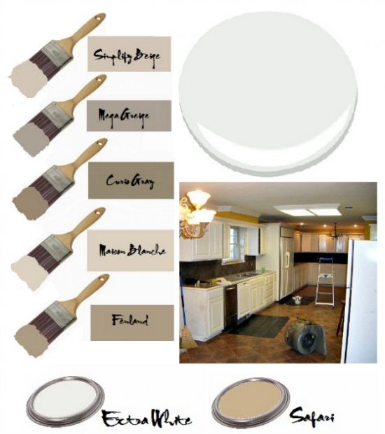
I wanted a rich color to complement the countertops and backsplash.
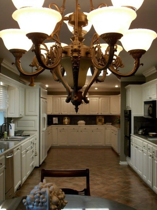
The space is blessed with natural light, white cabinets and molding, and tile flooring that is a decorative chameleon.
With all that going for the space one big issue went against it.
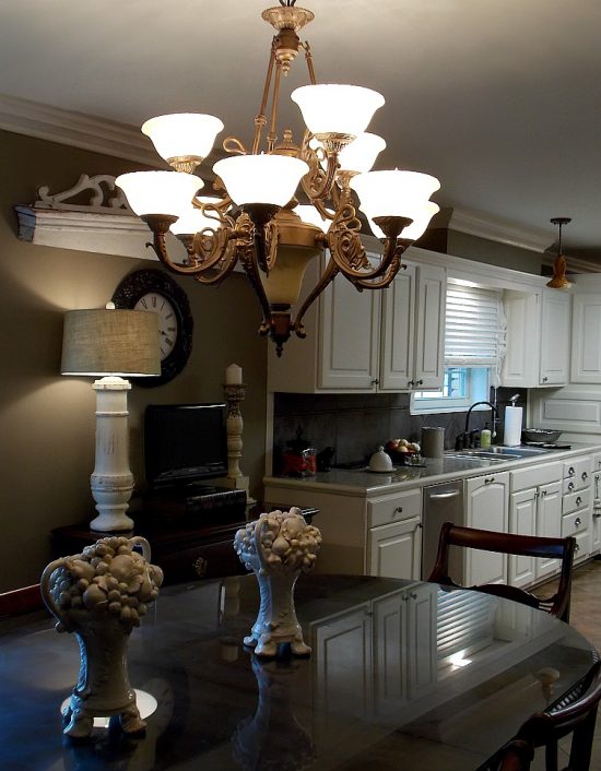
The previous kitchen paint color, Anjou Pear by Sherwin-Williams, was beginning to rot.
Anjou Pear is a beautiful color, but it was time for a change.
Dave the Builder was surprised to find out the kitchen was the redo target.
This all came about with me thinking I wanted to change the color of the dining room.
The more I studied the space, sketched out the ideas, and walked by the dining room 900 times a day, the more I realized I did not want to change the color.
The second I came to the realization it was in fact the kitchen in need of a change, the master plan decoratively began to come together.
Hello, Curio Gray by Sherwin-Williams.
Ours was not an instant attraction, but my how you have grown on me.
I fought the good fight against a television in the kitchen, but as you can see I lost.
The electrical and cable outlets are leftovers from my parent’s kitchen-office combo design.
Dave did not move them when he remodeled the kitchen because he wasn’t sure what we would do with the space.
Instead of moving the outlets he has suggested we simply buy a bigger television.
A master problem solver, that Dave the Builder.
The eyesores outlets will be relocated sooner than later.
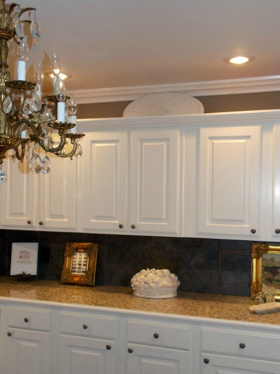
The point of the image is to show the new home of the architectural pediment and the new lamp.
I have an antique iron fence piece in mind to complete the look.
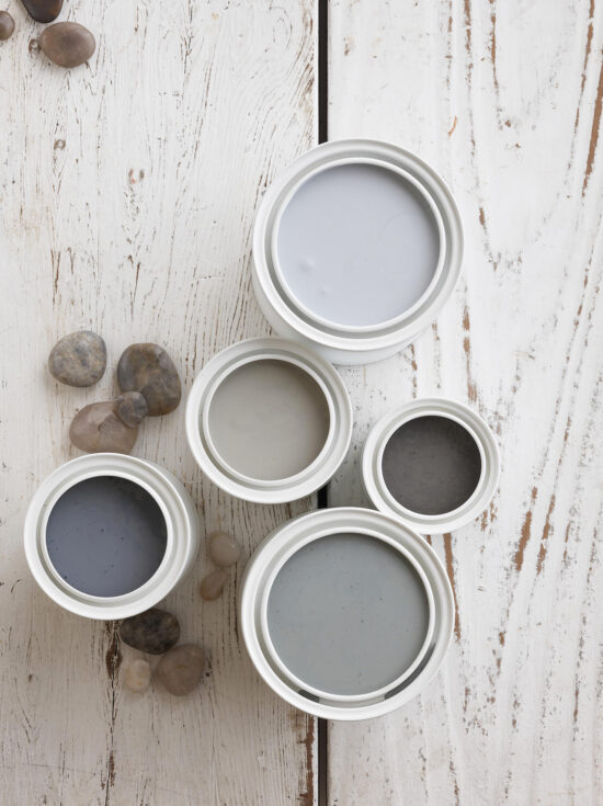
An Italian iron lantern in storage is the light fixture I’m leaning toward to replace the current alabaster chandelier in the breakfast area.
Paint colors choices for the perfect lantern patina are narrowed to three~