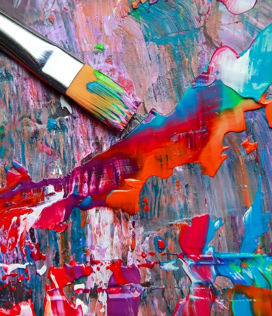
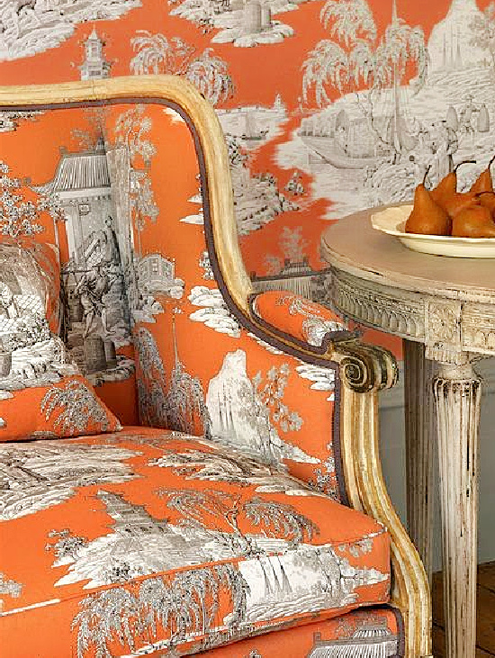
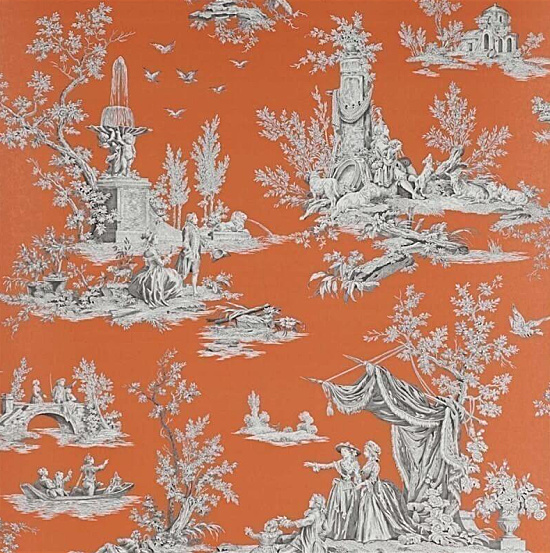
I thought I would bring back my A Most Fetching Friday series for the spring and summer season. Today’s spring and summer fetching Friday kicks off the series with a collection of images drenched in color and seasonal decorating inspiration.
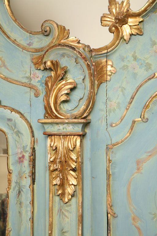
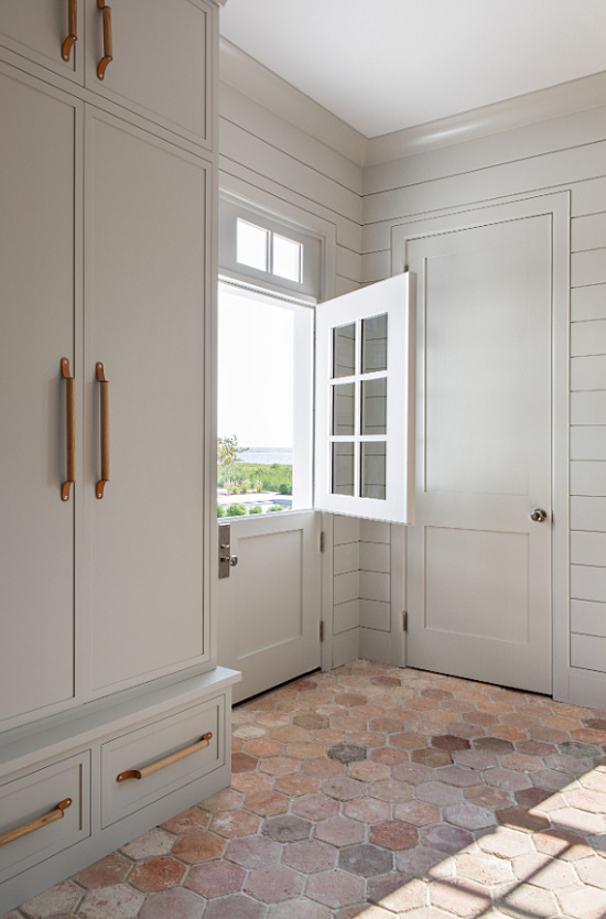
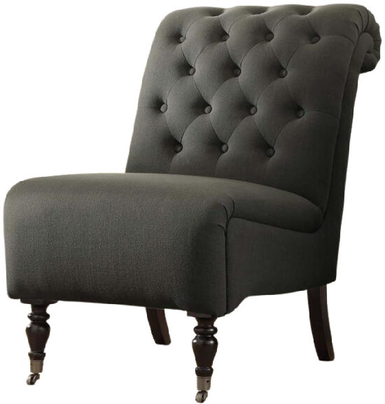
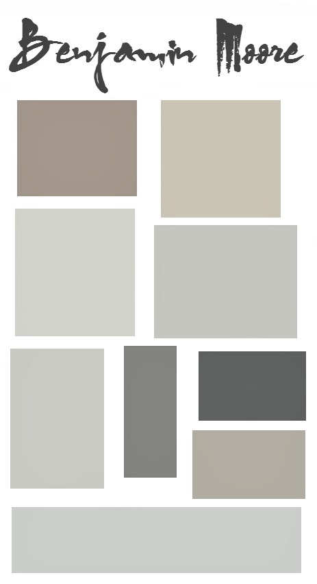
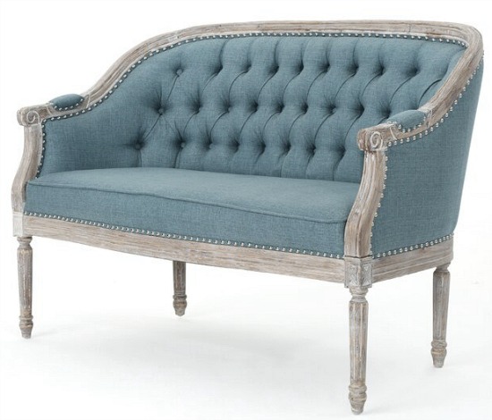
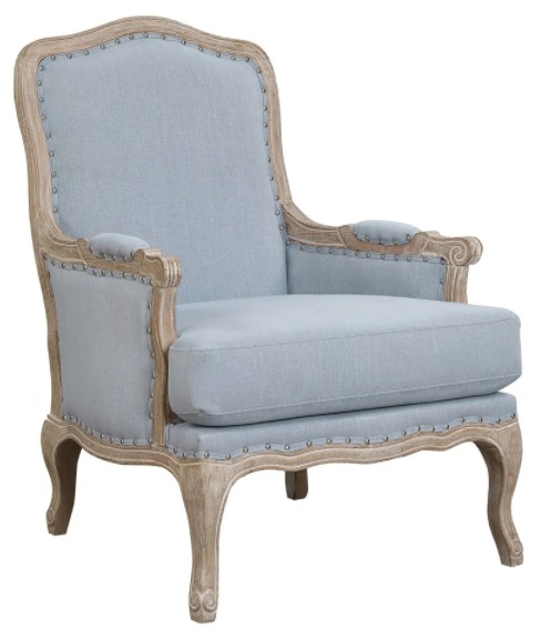
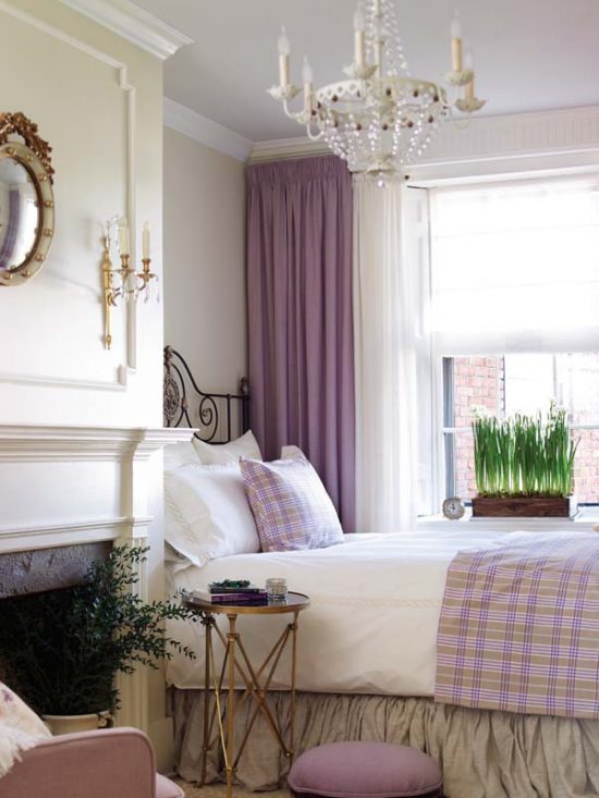
Gray is experiencing quite the color your world love affair with many a living room, bedroom and kitchen.
Design and decorating relationships between a proven color base of space and go-to neutral is color palette perfection; one that beautifully creates flawless and inspiring gray rooms.
Neutral colors are no longer being thought of as dull, boring or unimaginative home decorating, accents, paint and furnishings options.
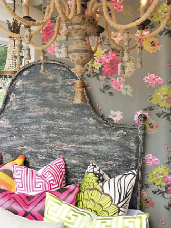
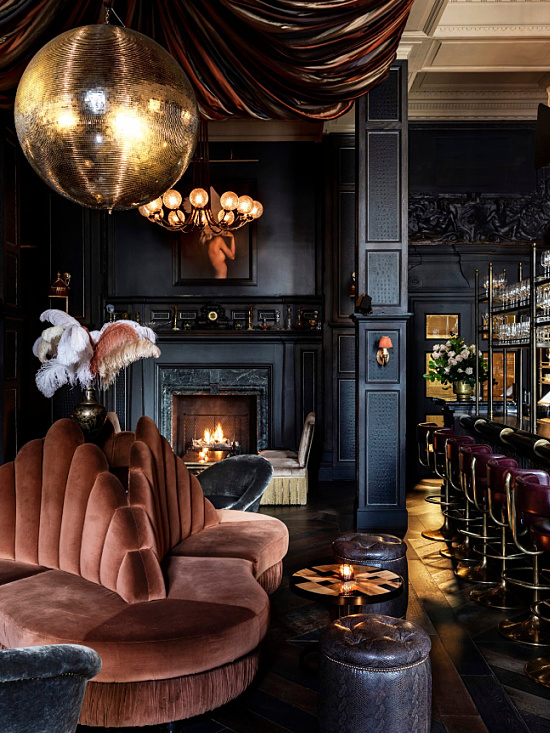
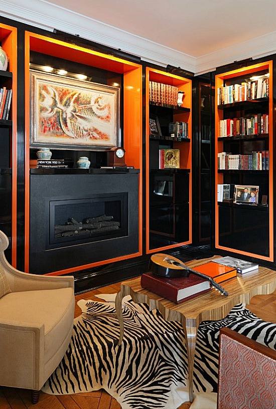
As seen in the image above, gray is a strong neutral- a formidable color that refuses to simply fade away into the background of the wallpaper, chandelier patina, or the headboard.
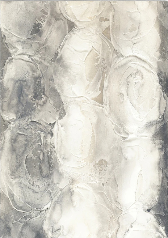
Tones subtlety take control, guiding the eye to the prevalent and pronounced color pops.
As the color foundation of the space, gray does not overpower nor underwhelm. It this case, however, the different shades do command attention to detail.
Recognized in design circles as a space changing tour de force, a gray color palette exhibits the decorative power trio we all look for in design and decorative execution- drama, elegance and style.
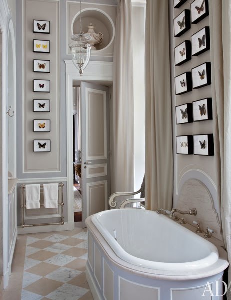
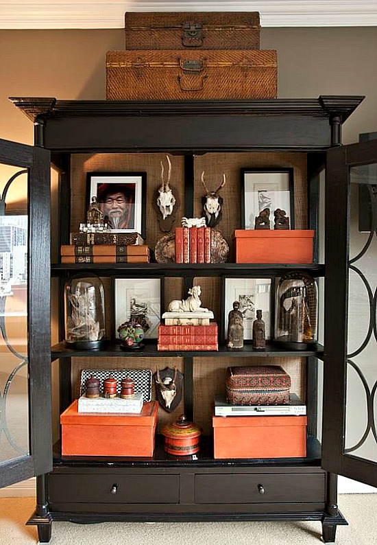
If that’s not reason enough to consider incorporating the color gray in your décor take a look at the gorgeous image below.
Shades of gray, when paired with elegant accents in think outside the matchy-matchy box contrasting colors, give the space its personality and command a sublime reaction.
I’m not one who normally detours (much) from established, traditional, time honored, and proven design and decorating institutions, but there is a time and a space that calls for doing just this.
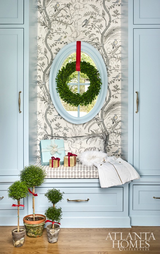
Holiday foundation colors complement home decor accents and accessories, and guide the directed holiday theme or pattern in decorated spaces.
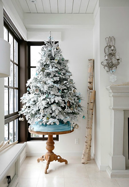
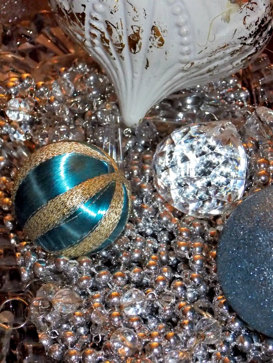
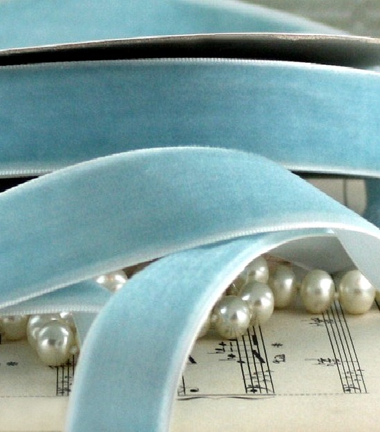
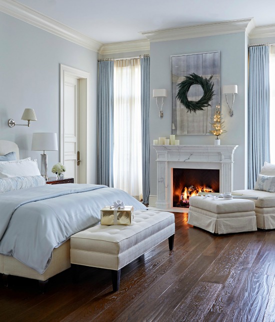
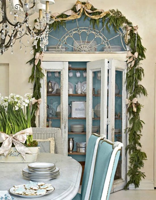
Decorating with blue this holiday season drives my inspiration to invite this accent color to stick around after the holidays.
As it is the case in most design and decorating endeavors, color is the starting point for inspired creativity.
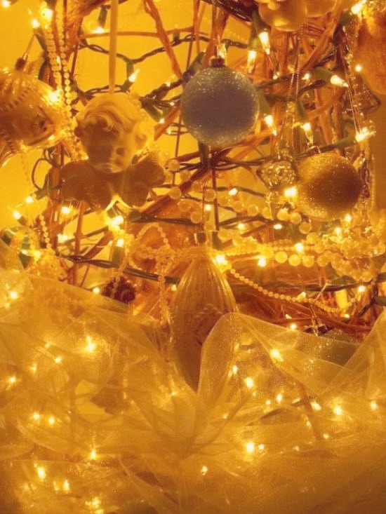
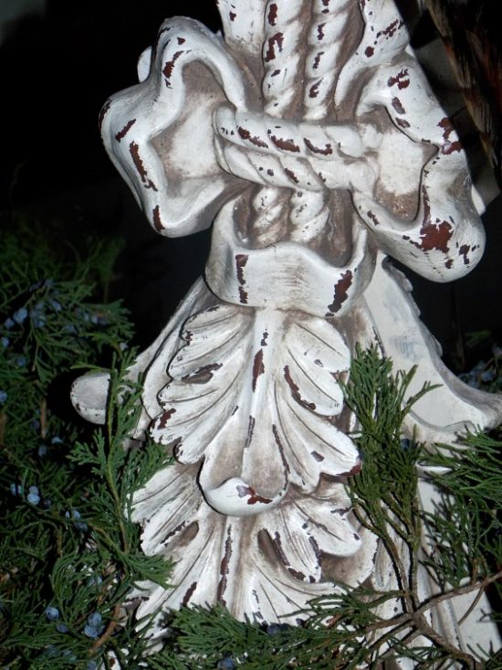
A new dining room paint color and a beautiful angel figurine in ethereal blue guided the decorative selections for our Louisiana French themed holiday tree.
Decorating with home decor accents and accessories in new traditional holiday colors broadens our palette horizons and inspires the look long past the holiday season.
Reflecting back on 2013 and looking forward to things to come in 2014 takes center stage for a whole lot of people at this time of year.
Once I weed through the resolution staples- lose weight, get organized, get healthy- I get down to the business of business that is decorating.
With decorating comes hours of sourcing, viewing and discovering interiors.
Commercial complexes, residential homes, restaurants, lounges, chain and luxury hotels- I’ve never met an interior I didn’t appreciate.
The common denominator of design swoon and decorative admiration becomes more clear with each and every image.
Fearless and fabulous color excites the eye, races the heart and commands attention.
Isn’t that the idea?
If we insist on beauty and style and in our homes, why not factor that in when we select places and spaces to celebrate a special occasion?
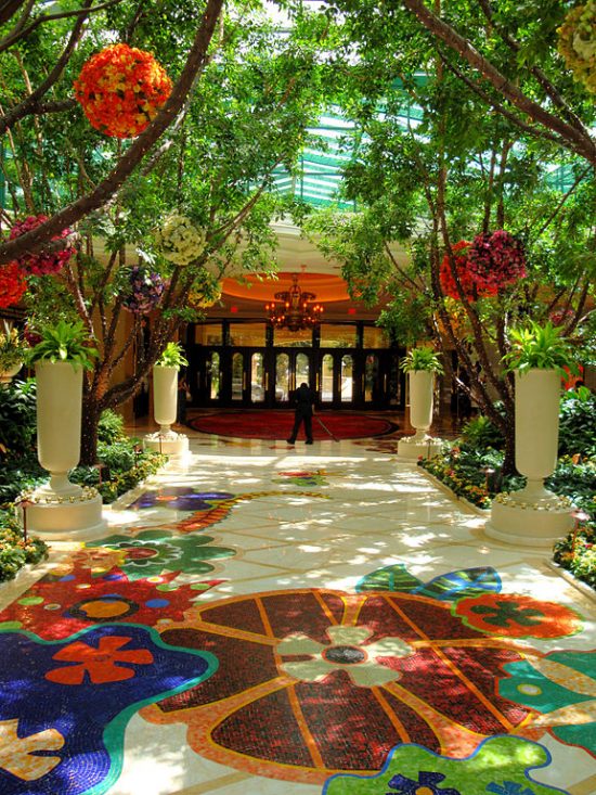
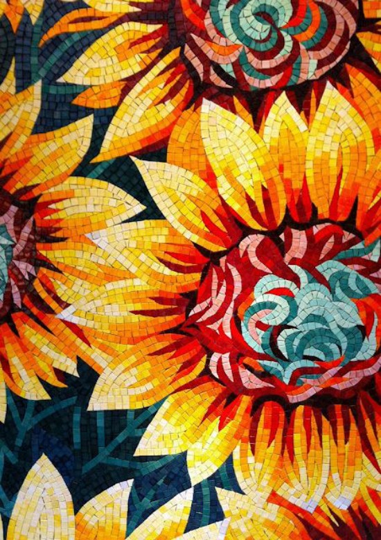
Wynn Las Vegas- photo by Barbara Kraft
Color is at the core of detail.
Color excites, enhances and engages diners, travelers and celebrators. I
t is a measured ingredient, sometimes in appropriate hit you over the head excess, sometimes in take you by surprise I didn’t realize I like that color discovery.
My personal measure of fearless and fabulous color done right is when the balancing act of hue, tone and saturation come together to engage the eye in real time without sensory intrusion, but makes it’s biggest impact in memorable afterthought.
That’s a color your world impression, and isn’t that the idea?
Wynn Las Vegas
Dave the Builder and I had the pleasure of staying at Wynn and Encore Las Vegas for our 25th anniversary.
The celebration and importance of the milestone could not have been better framed for a more memorable experience than by the impressive design and decor attributes richly bathed in color.
The vision, creation and execution of these memorable and notable interiors begin with Roger Thomas, Executive Vice President of Design for Wynn Design and Development.
Roger Thomas ~ Home Accents Today
There is absolutely nothing common about the design and decor details of the common areas.
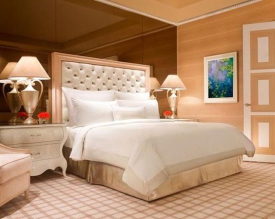
I do like and appreciate the tone down of color in the guest rooms.
At home or on the holiday road, decompressing and relaxing is so much easier when a space is done in a tasteful, tranquil palette.
In the case of Wynn and Encore, the serene Californicated neutrality reserved for the guest rooms is a well thought out color application.
Switching gears and geographical locations to further the point is the fabulous guest rooms of the SLS Hotel South Beach.
Philippe Starck
Architect and designer Philippe Starck brilliantly succeeds in pairing quintessential South Beach elegance with French influences that fascinate the eye and relaxes the soul.
Let me ask you this:
How long did it take to draw your eye straight to the pink accent pillow?
There are times when just a blush touch of color is all it takes.
Stark (no pun intended) white with a fearless hint or fabulous from floor to ceiling saturation – fearless and fabulous color has the will and the power to influence, inspire and impress.
Life often revolves around the color wheel, demonstrating the power of color.
The influence of color touches lives far beyond pattern, palette, and walls.
In the wake of the tragedy at Sandy Hook Elementary, I find I am more and more amazed at the power of color.
It’s no coincidence that color is closely associated with traditional rights of passage and milestones in our lives.
The pink or blue of a baby nursery,
The religious significance of white baptism robes and christening gowns.
Graduation caps and gowns in school colors.
White and ivory wedding dresses.
Black tie affairs.
Golden and silver anniversaries.
You get the idea.
Whatever is true, whatever is noble, whatever is right, whatever is pure, whatever is lovely, whatever is admirable–if anything is excellent or praiseworthy–think about such things.
Philippians 4:8
Emilie Parker, Josephine “Joey” Gay, Grace McDonnell, and Victoria Soto share obvious and tragic circumstances, but choosing to define their memories by those circumstances is not fair to the lives they lead.
I am so struck by one particular detail, a shared commonality lovingly revealed and colorfully expressed.
We’ve learned how color defined their individuality and its impact in each of their lives, memorials, and funerals.
Josephine loved all things purple, Emilie the color pink, Grace claimed both as her favorites, and Victoria adored the color green.
Big sister Emilie Parker nurtured way far beyond her young years.
Comfort came to those who remembered her caring qualities by a simple and colorful request- to wear the color pink, Emilie’s favorite, in a united show of love and remembrance of the little girl who loved pink.
Isn’t it beautiful how color is a sweet and strangely comforting testament to the creativity, imagination, and strength of Grace, Victoria, Josephine, and Emilie.
Color gives hope through the green and white ribbons that stand strong with Sandy Hook and the citizens of Newtown, Connecticut.
Unity echoes through music, small voices, and somewhere over the rainbow colors in support of the families and in remembrance of Charlotte Bacon, Daniel Barden, Rachel Davino, Olivia Engel, Ana M. Marquez-Greene, Dylan Hockley, Dawn Hochsprung, Madeleine F. Hsu, Catherine V. Hubbard, Chase Kowalski, Jesse Lewis, James Mattioli, Anne Marie Murphy, Jack Pinto, Noah Pozner, Caroline Previdi, Jessica Rekos, Avielle Richman, Lauren Rousseau, Mary Sherlach, Benjamin Wheeler, and Allison N. Wyatt.