During a recent all in the family design consultation the question how would mom approach decorating rental property was asked and answered.

Flickr
Our son is on the move once again in the pursuit of higher education and stylish digs, and thus begins our adventures in decorating rental property.
He has clear and concise idea of what he wants on the education front, but questions his decorative decisions on the latter.

I’m considering replacing my LSU Mom bumper sticker with a custom sticker stating “My son and my money and my furniture, home furnishings, and home decor accessories go to LSU.”

It’s important when decorating rental property to be fully aware of the rules and limitations regarding changes to the existing decor, but to also keep a personal stamp of style in mind.
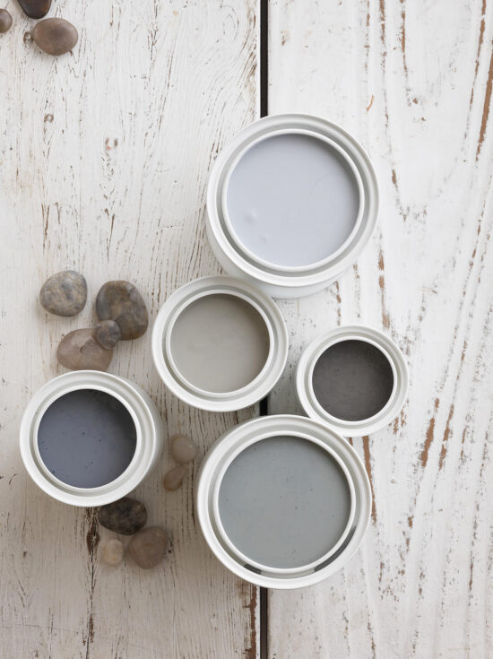
Color does just that.
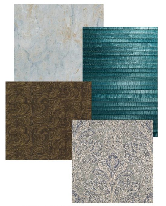
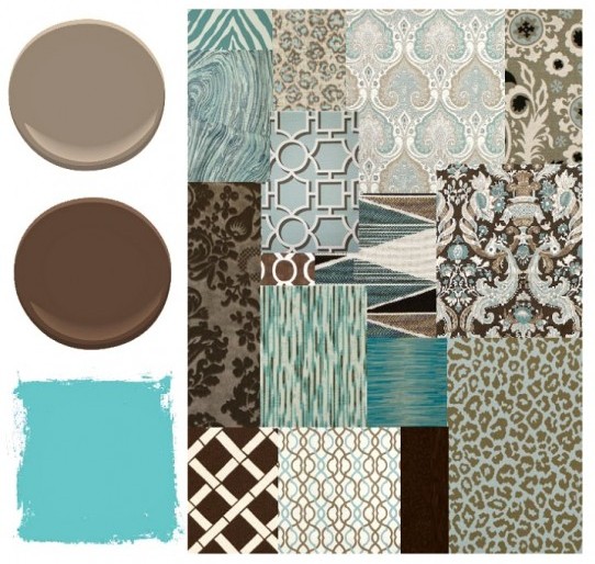
The color palette I’m suggesting consists of his all time favorite colors.
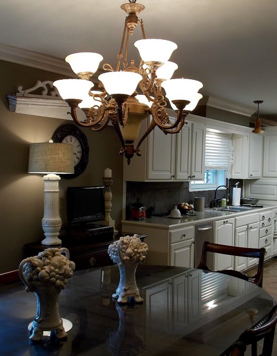
It’s been established the living area and kitchen colors will remain as is for the following two reasons:
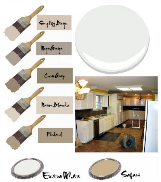
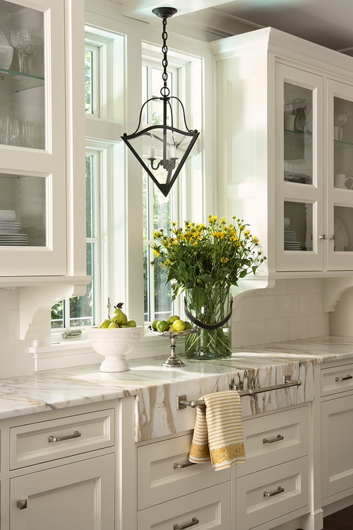
A neutral color palette in a common area works to your advantage.
Better Homes & Gardens – Photo by Marty Baldwin
Neutral colors are wildly popular because most everyone lives well with them.
With that in mind, it’s a safe assumption a neutral color palette in shared areas will reduce the risk of conflicting tastes with the roommate.
Your security deposit dollars and post graduation time schedule thank you in advance for your consideration.
Introduce color through accent pieces and home decor accessories.
It’s much easier to add and subtract on a smaller scale than to go big or repaint at this stage of the college housing game.

The decorative emphasis is on the bedroom.
The floor plan offers enough space and full walls for better furniture placement.
Windows are great, but can wreak havoc with furniture placement.
Thankfully, this will not present a problem.
Storage and a sufficient work area remain big considerations in the overall plan.

Let me share with you a renter/lessee tip.
Before painting the interior or exterior of a property, obtain written permission from the landlord or property management firm.
With written permission from the property management firm giving the okay to paint firmly in place, we’ve reached a color compromise of sorts.
We both agree the 14′ X 13′ bedroom is better equipped to do a core color decorative justice as a focal point color.
Enter the accent wall.

“I Heart NY” is one of my favorite Sex In The City episodes.
Moon River.
A red accent wall.
The charismatic Chris Noth as Mr. Big.
That one red wall is captivating!
Other than my gush, our son has no point of reference.
Unfortunately, Dave the Builder does due to the years of overexposure to my obsession.
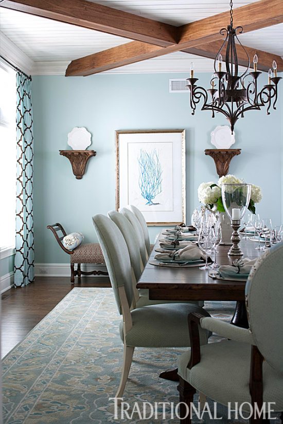
Dave suggested the above image for visual reference.
The decision has been made and we have a winner.

Sherwin-Williams Hyper Blue SW 6965 is the one color he is set on.
Dave the Builder insists on making a custom upholstered headboard.
It’s a practical and affordable way to bring more color into the space and to create a striking look.
One sheet of plywood, a jigsaw, upholstery foam, batting, upholstery fabric, and a staple gun will get the DIY job done.
For the next two months one thing is for sure- college decorating days are here again.
This is a refresher course for me in the ABC’s of decorating rental property, an all in the family affair, and I’m loving every stylish minute of it!

 Traditional Home
 Glynis Wood Interiors
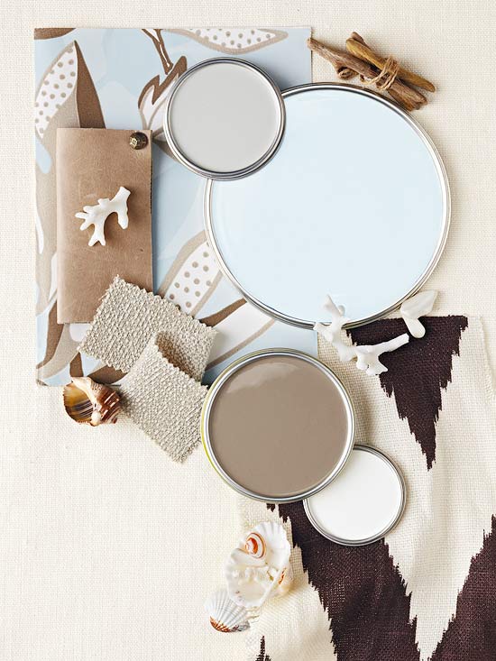
 Hotel Saint James
 Traditional Home