It’s Time For A New Dining Room Paint Color

A tedious decor project I’ve been working on collided head on with my consulting duties last week.

My schedule got crazy busy and caused a delay in my posting.

Taking a break from the monotony of term sheets and contracts, I shifted my attention to an at home project long overdue.

It’s time to choose a new dining room paint color.

It’s no secret how much I love Sherwin-Williams Fired Brick, but with the lack of natural light in the dining room it is proving to be on the dark side.

The lighting of a space (or lack thereof) is a crucial factor to consider in the selection of paint colors.

Sherwin Williams Fired Brick

I’m heading in the direction of a barely there classic color palette that will:

  •  frame the flow of  bookend color from foyer to butler pantry
  • bring the French inspired ooh la la factor to the space
  •  allow a better showcase for the existing light fixtures

Valspar Mesa Sand

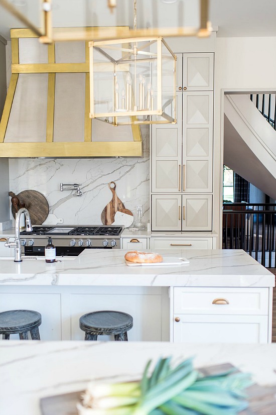
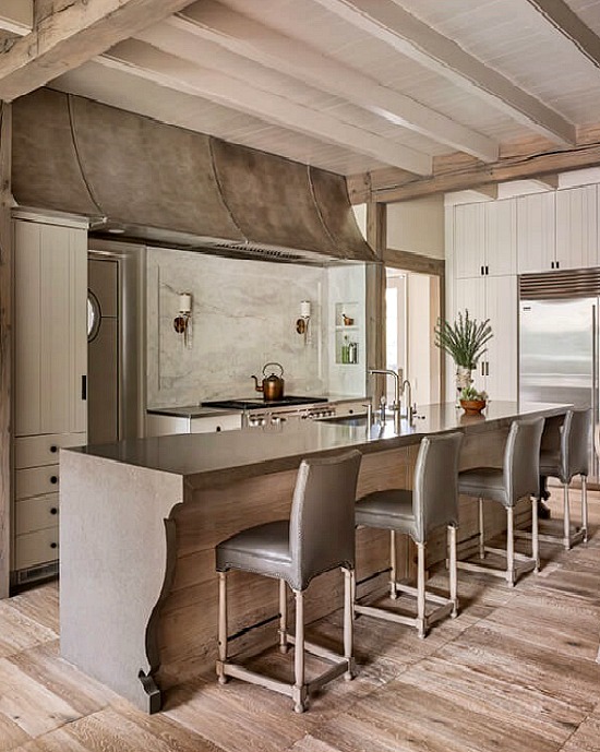
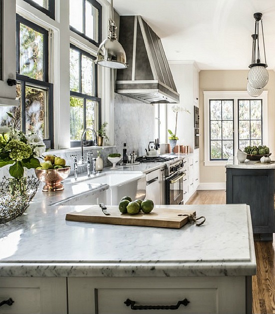
The color choice needs to complement the new kitchen paint color, Curio Gray.

Considering the foyer wallpaper, drapes, and dark finish of the living room suite (not my fav, but it keeps the peace), I’m leaning towards the pink/red family of colors- one with a whisper, a scant hint of pink with a café au lait base.

When done right, pink defies the connotation of  frill and femininity so closely associated with the color.

Achieving light, tone, and shade synergy is the trick.

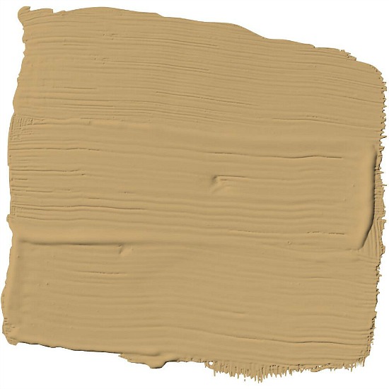
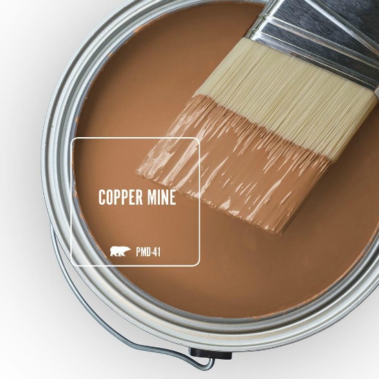
First up is Valspar Mesa Sand.

dining room paint color

Paint color samples can fool the eye.

I highly suggest purchasing a sample container of the color(s) you are considering and trying it out on the wall.

Paint a large enough area of the wall and let the paint completely dry in order to get a good and proper color read.

Mesa Sand sample

Well that’s a big no go on the Mesa Sand!

What a paint color sample looks like on a chart or in a can is very different from what it will actually look like on the wall.

Mesa Sand looks to be the perfect shade of  brownish pink in the first image, a peachy salmon with a brown base in the paint sample image, and a flat beige on the wall.

On to the next choice.

Farrow and Ball Setting Plaster

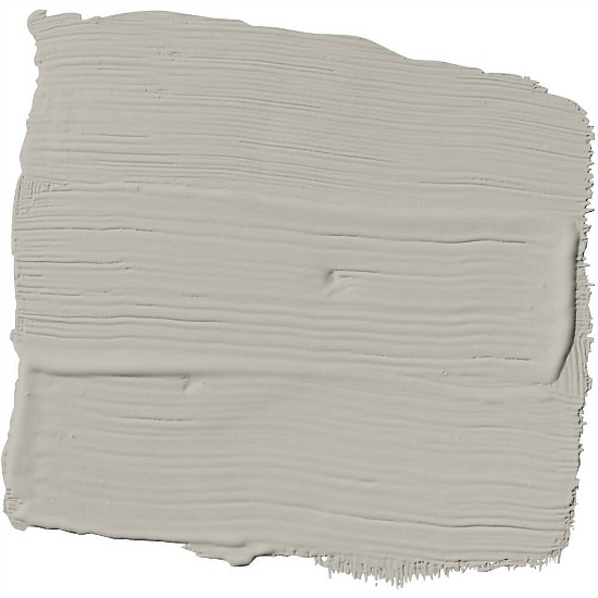
Farrow & Ball Setting Plaster is working for me.

The sample is en route and my fingers are crossed.

crystal chandelier

What project Dave the Builder will be tackling on his summer vacation is no longer a mystery.

I’ll show you what else I have in mind later in the week.

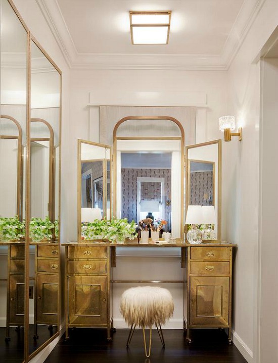
Think light fixture.


Using Metal Colors in Interior Design and Home Decor

Keeping late project hours tend to catch up with you, but inspiring images and finds prove a powerful motivator so here I am, at the keyboard, typing out what I hope is informative as well as inspirational information for using metal colors in interior design and home decor.

transitional home office Webber Coleman WoodworksWebber Coleman Woodworks

In order to keep my painter happy the air is turned to artic blast, the coffee is brewing, and the radio dial is set to his favorite classic rock station.

Traditional Home

“Heavy Metal” by Don Felder played this morning, and now it is stuck in my head.

Whittney Parkinson DesignWhittney Parkinson Design

The catchy tune and the on-trend metal parade gave me the idea for this using metal colors in interior design and home decor post.

Inspiration is everywhere, my friends.

gold-paint-swatch


taylor borsari industrial style kitchen cabinets Taylor Borsari

nickel-paint-swatch

Pursley Dixon Architecture kitchen

Pursley Dixon Architecture

Mihai Cork Metallic Wallpaper RollMihai Cork Metallic Wallpaper Roll

white-bathroom-brass-fixtures-marble-washstand

 Tamara Magel 

copper-mine-behr-ultra-paint-colors

gold-trunk-the-Brick-HouseThe Brick House

 kristen panitch interiors Kristen Panitch Interiors

pewter-mug-behr-ultra-paint-colors

kelley flynn interior design

Kelley Flynn Interior Design

Using metal colors in interior design and home decor adds depth, warmth, and sophistication to the feel of the space.

Match Game: Matching Paint Colors

Matching paint colors to our favorite collections and collectibles is one way to carry out a personal treasure theme.

Game Shop Utopia

When a client, friend or family member enlist my services in the color selection process,  it often begins like a Kohler faucet commercial.

I am shown an item and asked to design or decorate around the color(s) of the collection.

Let the match game matching paint colors magic begin!

matching-paint-colors

I’ve been introduced to new blogs this week via fall/autumn link parties, with one particular fall mantel display immediately captured my attention.

The author used pieces of blue and white French china from her personal collection.

Another blog showed how a beautiful collection of leather books influenced the color scheme of a space.

Decorating inspiration comes from many different influences.

I realized I am among those who have been, and will continue to be, influenced by items they collect or hope to start collecting.

I also thought it might be informative to play a round or two of Match Game: matching paint colors to items known to be collected for future decorative reference.

turquoise-box-white-ribbon

Probably one of the most recognizable colors in the world, iconic Tiffany Blue® was the referenced example used time and time again when selecting the paint color for our bedroom.

Sweet Rhapsody by Behr is close, close, close.

Behr-Sweet-Rhapsody

Little Blue Box by Sherwin Williams is my second choice.

sherwin-williams-little-blue-box

Gone With The Wind remains one of the most watched and loved Hollywood classics of all time.  

green-dress-Vivien-Leigh

I fell in love with the movie when I was six years old, and it still comes in as an all-time favorite.

GWTW-Scarlett-portieres-paint-colors

Vegas Green – Valspar
Mecca Gold – Olympic
Offbeat Green – Sherwin Williams

Blue & white porcelain and pottery collections are both popular and stylish.

blue-and-white-porcelain

Traditional blue and white wares of Chinese, English and Italian origin merge well with modern patterns to create beautiful displays.

The varied shades of blue play well off of each other and the result is a visual treat.

blue-white-china Pinterest

Olympic-bluesOlympic

Blueberry Buckle ||  Rainbow Bright ||  Annapolis Blue || Stunning Sapphire 

benjamin-moore-blues1

Benjamin Moore

Prussian Blue ||  Blue Suede Shoes ||  Delphinium ||  Stratford Blue

SW-blues

Sherwin-Williams
Loyal Blue ||  Georgian Bay  ||  Commodore  

Staffordshire dogs are highly collectible ceramic items.

Dating back to the 1700’s, Staffordshire figurines were made in pottery companies located in the County of Staffordshire, England.

Authentic Staffordshire figurines are rare beauties with proper and notable markings.

staffordshire-dog-figurineAntique Staffordshire King Charles Spaniel dog

Vintage Staffordshire dog figurines can be valued in the hundreds of dollars.

Staffordshire inspired reproductions or in the style off knock-offs are less expensive copies, making ownership more affordable.

ralph-lauren-palazzo

I’ve come to love authentic Staffordshire spaniel figurines, and some of the better quality reproduced Staffordshire dog figurines.

Benjamin-Moore-Old-Navy

Old Navy – Benjamin Moore

Coins come in as one of the top ranked collectibles.

Years ago when my parents were big time Vegas visitors, my mother would bring back silver fifty cent pieces as souvenirs.

half-dollarGreat American Coin Company

My fascination with the metallic paints began right then and there.

The fifty cent pieces are long gone and spent, but I’m rich in my love of the colors silver and copper.

French-Silver-Behr-paint

French Silver – Behr

US_One_Cent_Obv

Behr-Maple-GlazeMaple Glaze – Behr

This iconic example speaks for itself.

The-Beatles-Green-Apple-Sticker

Sherwin-Williams
Tricorn Black ||  Caviar ||  Paradise  || Overt Green ||  Nervy Hue

It’s no surprise that matching paint colors to collections resonates with the decorating choices made by collectors.

Love your style!